

I menu a discesa consentono agli utenti di fare clic su un'icona, un campo di testo o un altro componente e poi di selezionare un'opzione da un elenco su una superficie temporanea. Questa guida descrive come creare sia menu di base sia menu più complessi con divisori e icone.

Piattaforma API
Utilizza i componenti DropdownMenu, DropdownMenuItem, IconButton e ExposedDropdownMenuBox per implementare i menu a discesa. I componenti DropdownMenu e DropdownMenuItem vengono utilizzati per visualizzare le voci di menu, mentre IconButton o altri componenti possono attivare la visualizzazione del menu.
ExposedDropdownMenuBox viene utilizzato per creare un menu collegato a un campo di testo.
I parametri chiave per il componente DropdownMenu includono:
expanded: indica se il menu è visibile.onDismissRequest: utilizzato per gestire la chiusura del menu.content: i contenuti componibili del menu, che in genere contengono componibiliDropdownMenuItem.
I parametri chiave per DropdownMenuItem includono:
text: definisce i contenuti visualizzati nella voce di menu.onClick: callback per gestire l'interazione con l'elemento nel menu.
Crea un menu a discesa di base
Il seguente snippet mostra un'implementazione minima di DropdownMenu:
@Composable fun MinimalDropdownMenu() { var expanded by remember { mutableStateOf(false) } Box( modifier = Modifier .padding(16.dp) ) { IconButton(onClick = { expanded = !expanded }) { Icon(painter = rememberVectorPainter(AppIcons.MoreVert), contentDescription = "More options") } DropdownMenu( expanded = expanded, onDismissRequest = { expanded = false } ) { DropdownMenuItem( text = { Text("Option 1") }, onClick = { /* Do something... */ } ) DropdownMenuItem( text = { Text("Option 2") }, onClick = { /* Do something... */ } ) } } }
Punti chiave sul codice
- Definisce un
DropdownMenudi base contenente due voci di menu. - Il parametro
expandedcontrolla la visibilità del menu come espanso o compresso. - Il parametro
onDismissRequestdefinisce un callback che viene eseguito quando l'utente chiude il menu. - Il componibile
DropdownMenuItemrappresenta gli elementi selezionabili nel menu a discesa. - Un
IconButtonattiva l'espansione e la compressione del menu.
Risultato
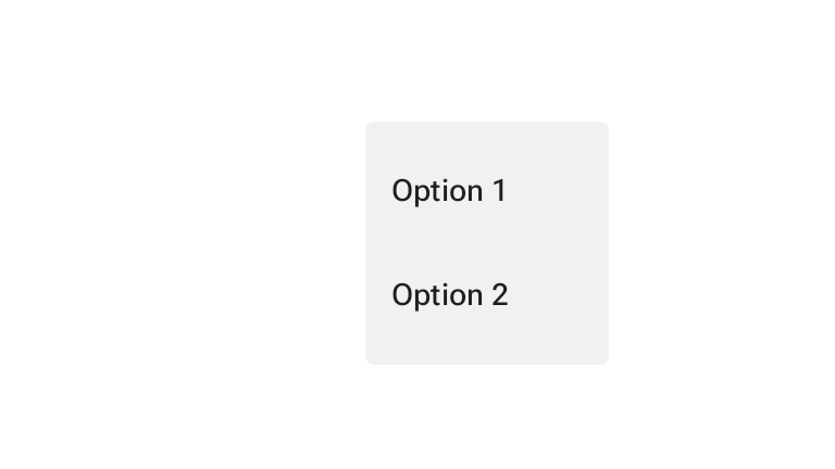
Crea un menu a discesa più lungo
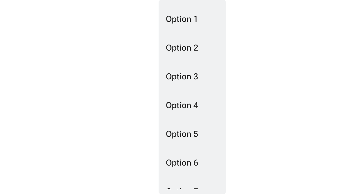
Per impostazione predefinita, DropdownMenu è scorrevole se non è possibile visualizzare tutte le voci di menu contemporaneamente. Lo snippet seguente crea un menu a discesa più lungo e scorrevole:
@Composable fun LongBasicDropdownMenu() { var expanded by remember { mutableStateOf(false) } // Placeholder list of 100 strings for demonstration val menuItemData = List(100) { "Option ${it + 1}" } Box( modifier = Modifier .padding(16.dp) ) { IconButton(onClick = { expanded = !expanded }) { Icon(painter = rememberVectorPainter(AppIcons.MoreVert), contentDescription = "More options") } DropdownMenu( expanded = expanded, onDismissRequest = { expanded = false } ) { menuItemData.forEach { option -> DropdownMenuItem( text = { Text(option) }, onClick = { /* Do something... */ } ) } } } }
Punti chiave sul codice
DropdownMenuè scorrevole quando l'altezza totale dei suoi contenuti supera lo spazio disponibile. Questo codice crea unDropdownMenuscorrevole che mostra 100 elementi segnaposto.- Il loop
forEachgenera dinamicamente i componibiliDropdownMenuItem. Gli elementi non vengono creati in modalità lazy, il che significa che tutti i 100 elementi del menu a discesa vengono creati ed esistono nella composizione. IconButtonattiva l'espansione e la compressione diDropdownMenuquando viene fatto clic.- La funzione lambda
onClickall'interno di ogniDropdownMenuItemconsente di definire l'azione eseguita quando l'utente seleziona una voce di menu.
Risultato
Lo snippet di codice precedente genera il seguente menu scorrevole:
Crea un menu a discesa più lungo con i divisori
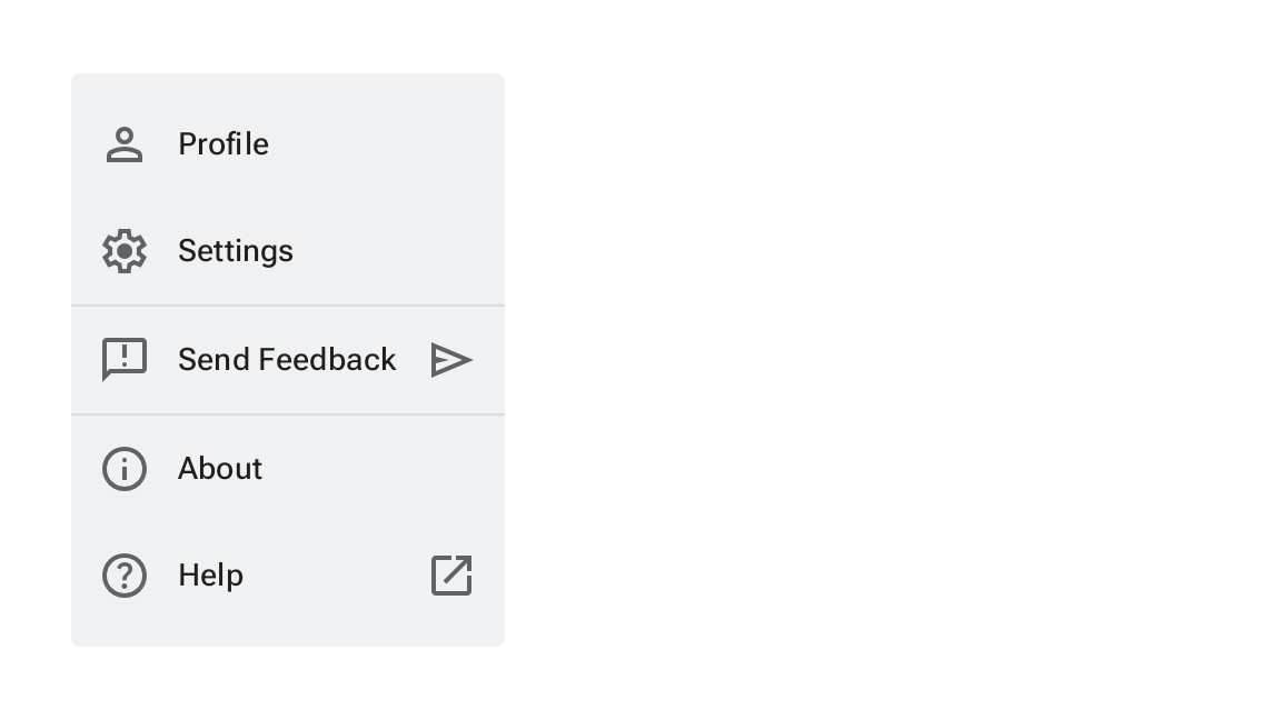
Il seguente snippet mostra un'implementazione più avanzata di un menu a discesa. In questo snippet, le icone iniziali e finali vengono aggiunte alle voci di menu e i divisori separano i gruppi di voci di menu.
@Composable fun DropdownMenuWithDetails() { var expanded by remember { mutableStateOf(false) } Box( modifier = Modifier .fillMaxWidth() .padding(16.dp) ) { IconButton(onClick = { expanded = !expanded }) { Icon(painter = rememberVectorPainter(AppIcons.MoreVert), contentDescription = "More options") } DropdownMenu( expanded = expanded, onDismissRequest = { expanded = false } ) { // First section DropdownMenuItem( text = { Text("Profile") }, leadingIcon = { Icon(painter = rememberVectorPainter(AppIcons.Person), contentDescription = null) }, onClick = { /* Do something... */ } ) DropdownMenuItem( text = { Text("Settings") }, leadingIcon = { Icon(painter = rememberVectorPainter(AppIcons.Settings), contentDescription = null) }, onClick = { /* Do something... */ } ) HorizontalDivider() // Second section DropdownMenuItem( text = { Text("Send Feedback") }, leadingIcon = { Icon(painter = rememberVectorPainter(AppIcons.Feedback), contentDescription = null) }, trailingIcon = { Icon(painter = rememberVectorPainter(AppIcons.Send), contentDescription = null) }, onClick = { /* Do something... */ } ) HorizontalDivider() // Third section DropdownMenuItem( text = { Text("About") }, leadingIcon = { Icon(painter = rememberVectorPainter(AppIcons.Info), contentDescription = null) }, onClick = { /* Do something... */ } ) DropdownMenuItem( text = { Text("Help") }, leadingIcon = { Icon(painter = rememberVectorPainter(AppIcons.Help), contentDescription = null) }, trailingIcon = { Icon(painter = rememberVectorPainter(AppIcons.OpenInNew), contentDescription = null) }, onClick = { /* Do something... */ } ) } } }
Questo codice definisce un DropdownMenu all'interno di un Box.
Punti chiave sul codice
- I parametri
leadingIconetrailingIconaggiungono icone all'inizio e alla fine di unDropdownMenuItem. - Un
IconButtonattiva l'espansione del menu. DropdownMenucontiene diversi elementi componibiliDropdownMenuItem, ognuno dei quali rappresenta un'azione selezionabile.- I componibili
HorizontalDividerinseriscono una linea orizzontale per separare i gruppi di voci di menu.
Risultato
Lo snippet precedente genera un menu a discesa con icone e divisori:
Aggiornamento espressivo M3
Material 3 Expressive introduce DropdownMenuPopup, DropdownMenuGroup e CheckableDropdownMenuItem come opzioni aggiuntive insieme a DropdownMenu e DropdownMenuItem per creare menu segmentati con elementi raggruppati, spazi vuoti e stati selezionabili.
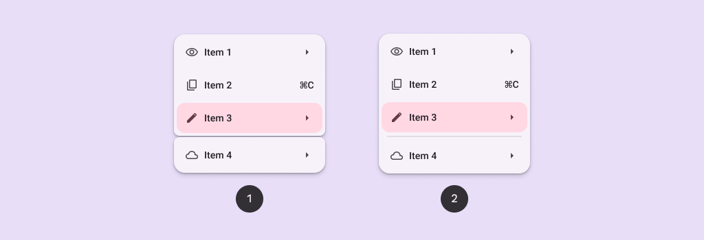
Per saperne di più sugli aggiornamenti di M3 Expressive per i menu, consulta le linee guida per i menu di Material Design 3.
Menu segmentati
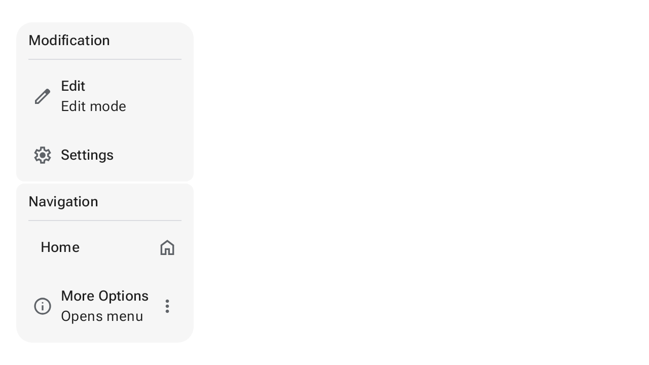
I menu segmentati raggruppano le azioni correlate in sezioni visive distinte separate da spazi o divisori. Lo snippet seguente mostra come implementare un menu a discesa segmentato con DropdownMenuPopup, DropdownMenuGroup e CheckableDropdownMenuItem:
@OptIn(ExperimentalMaterial3Api::class) @Composable fun GroupedMenuSample() { val groupInteractionSource = remember { MutableInteractionSource() } var expanded by remember { mutableStateOf(false) } val groupLabels = listOf("Modification", "Navigation") val groupItemLabels = listOf(listOf("Edit", "Settings"), listOf("Home", "More Options")) val groupItemLeadingIcons = listOf(listOf(AppIcons.Edit, AppIcons.Settings), listOf(null, AppIcons.Info)) val groupItemCheckedLeadingIcons = listOf( listOf(AppIcons.EditFilled, AppIcons.SettingsFilled), listOf(AppIcons.Check, AppIcons.InfoFilled), ) val groupItemTrailingIcons: List<List<ImageVector?>> = listOf(listOf(null, null), listOf(AppIcons.Home, AppIcons.MoreVert)) val groupItemCheckedTrailingIcons: List<List<ImageVector?>> = listOf(listOf(null, null), listOf(AppIcons.HomeFilled, AppIcons.MoreVert)) val groupItemSupportingText: List<List<String?>> = listOf(listOf("Edit mode", null), listOf(null, "Opens menu")) val checked = remember { listOf(mutableStateListOf(false, false), mutableStateListOf(false, false)) } Box(modifier = Modifier.fillMaxSize().wrapContentSize(Alignment.TopStart)) { // Icon button should have a tooltip associated with it for a11y. TooltipBox( positionProvider = TooltipDefaults.rememberTooltipPositionProvider(TooltipAnchorPosition.Above), tooltip = { PlainTooltip { Text("Localized description") } }, state = rememberTooltipState(), ) { IconButton(onClick = { expanded = true }) { Icon(painter = rememberVectorPainter(AppIcons.MoreVert), contentDescription = "Localized description") } } DropdownMenuPopup(expanded = expanded, onDismissRequest = { expanded = false }) { val groupCount = groupLabels.size groupLabels.fastForEachIndexed { groupIndex, label -> DropdownMenuGroup( shapes = MenuDefaults.groupShape(groupIndex, groupCount), interactionSource = groupInteractionSource, ) { MenuDefaults.DropdownMenuGroupLabel { Text(label) } HorizontalDivider(modifier = Modifier.padding(MenuDefaults.HorizontalDividerPadding)) val groupItemCount = groupItemLabels[groupIndex].size groupItemLabels[groupIndex].fastForEachIndexed { itemIndex, itemLabel -> CheckableDropdownMenuItem( text = { Text(itemLabel) }, supportingText = groupItemSupportingText[groupIndex][itemIndex]?.let { supportingText -> { Text(supportingText) } }, shapes = MenuDefaults.itemShape(itemIndex, groupItemCount), leadingIcon = groupItemLeadingIcons[groupIndex][itemIndex]?.let { iconData -> { Icon( painter = rememberVectorPainter(iconData), modifier = Modifier.size(MenuDefaults.LeadingIconSize), contentDescription = null, ) } }, checkedLeadingIcon = { Icon( painter = rememberVectorPainter(groupItemCheckedLeadingIcons[groupIndex][itemIndex]), modifier = Modifier.size(MenuDefaults.LeadingIconSize), contentDescription = null, ) }, trailingContent = if (checked[groupIndex][itemIndex]) { groupItemCheckedTrailingIcons[groupIndex][itemIndex]?.let { iconData -> { Icon( painter = rememberVectorPainter(iconData), modifier = Modifier.size(MenuDefaults.TrailingIconSize), contentDescription = null, ) } } } else { groupItemTrailingIcons[groupIndex][itemIndex]?.let { iconData -> { Icon( painter = rememberVectorPainter(iconData), modifier = Modifier.size(MenuDefaults.TrailingIconSize), contentDescription = null, ) } } }, checked = checked[groupIndex][itemIndex], onCheckedChange = { checked[groupIndex][itemIndex] = it }, ) } } if (groupIndex != groupCount - 1) { Spacer(Modifier.height(MenuDefaults.GroupSpacing)) } } if (checked.last().last()) { DropdownMenuButtonGroup() } } } } @Composable private fun DropdownMenuButtonGroup() { ButtonGroup( overflowIndicator = { menuState -> ButtonGroupDefaults.OverflowIndicator(menuState) }, modifier = Modifier.fillMaxWidth(), horizontalArrangement = Arrangement.spacedBy(2.dp, Alignment.CenterHorizontally), ) { customItem( buttonGroupContent = { FilledIconButton( onClick = {}, colors = IconButtonDefaults.filledIconButtonColors( containerColor = MenuDefaults.groupStandardContainerColor ), ) { Icon(painter = rememberVectorPainter(AppIcons.ThumbUp), contentDescription = "Localized description") } }, menuContent = { DropdownMenuItem( leadingIcon = { Icon(painter = rememberVectorPainter(AppIcons.ThumbUp), contentDescription = null) }, text = { Text("Thumbs up") }, onClick = {}, ) }, ) customItem( buttonGroupContent = { FilledIconButton( onClick = {}, colors = IconButtonDefaults.filledIconButtonColors( containerColor = MenuDefaults.groupStandardContainerColor ), ) { Icon(painter = rememberVectorPainter(AppIcons.ThumbDown), contentDescription = "Localized description") } }, menuContent = { DropdownMenuItem( leadingIcon = { Icon(painter = rememberVectorPainter(AppIcons.ThumbDown), contentDescription = null) }, text = { Text("Thumbs down") }, onClick = {}, ) }, ) customItem( buttonGroupContent = { FilledIconButton( onClick = {}, colors = IconButtonDefaults.filledIconButtonColors( containerColor = MenuDefaults.groupStandardContainerColor ), ) { Icon(painter = rememberVectorPainter(AppIcons.TagFaces), contentDescription = "Localized description") } }, menuContent = { DropdownMenuItem( leadingIcon = { Icon(painter = rememberVectorPainter(AppIcons.TagFaces), contentDescription = null) }, text = { Text("Emotes") }, onClick = {}, ) }, ) } }
Risorse aggiuntive
- Material Design: Menu