

本页面介绍了如何使用现有的 Glance 组件,通过 Glance 处理尺寸并提供灵活且响应迅速的布局。
使用 Box、Column 和 Row
Glance 有三种主要的可组合布局:
Box:将元素叠放在彼此之上。它会转换为RelativeLayout。Column:沿垂直轴将元素依次放置。它会转换为采用垂直方向的LinearLayout。Row:沿水平轴将元素依次放置。它会转换为采用水平屏幕方向的LinearLayout。
Glance 支持 Scaffold 对象。将 Column、Row 和 Box 可组合项放置在给定的 Scaffold 对象中。
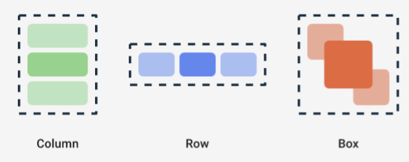
借助这些可组合项,您可以使用修饰符定义其内容的垂直和水平对齐方式,以及宽度、高度、权重或内边距约束。此外,每个子项都可以定义其修饰符,以更改父项内的空间和放置位置。
以下示例展示了如何创建 Row,使其子项在水平方向上均匀分布,如图 1 所示:
Row(modifier = GlanceModifier.fillMaxWidth().padding(16.dp)) { val modifier = GlanceModifier.defaultWeight() Text("first", modifier) Text("second", modifier) Text("third", modifier) }
Row 会填充最大可用宽度,并且由于每个子项的权重相同,因此它们会均匀共享可用空间。您可以定义不同的权重、大小、内边距或对齐方式,以使布局适应您的需求。
使用可滚动的布局
提供响应式内容的另一种方法是使其可滚动。这可以通过 LazyColumn 可组合项实现。借助此可组合项,您可以定义一组要在应用微件的可滚动容器内显示的项目。
以下代码段展示了在 LazyColumn 内定义项目的不同方法。
您可以提供项目数:
// Remember to import Glance Composables // import androidx.glance.appwidget.layout.LazyColumn LazyColumn { items(10) { index: Int -> Text( text = "Item $index", modifier = GlanceModifier.fillMaxWidth() ) } }
提供单个项目:
LazyColumn { item { Text("First Item") } item { Text("Second Item") } }
提供项目列表或数组:
LazyColumn { items(peopleNameList) { name -> Text(name) } }
您还可以结合使用上述示例:
LazyColumn { item { Text("Names:") } items(peopleNameList) { name -> Text(name) } // or in case you need the index: itemsIndexed(peopleNameList) { index, person -> Text("$person at index $index") } }
请注意,前面的代码段未指定 itemId。指定 itemId 有助于提高性能,并从 Android 12 开始通过列表和 appWidget 更新来保持滚动位置(例如,在列表中添加或移除项目时)。以下示例展示了如何指定 itemId:
items( items = peopleList, itemId = { person -> person.id.hashCode().toLong() }) { person -> Text(person.name) }
Snap Scrolling
Snap Scrolling 是一种动画,可让可滚动内容贴靠到微件容器的顶部。
如需实现 Snap Scrolling,请确保满足以下条件:
- 将 Glance 依赖项更新到 1.3.0-alpha02 或更高版本。
- 将
compileSdk设置为 37 或更高版本,因为搭载 Android 17 及更高版本的设备支持 Snap Scrolling。 - 使用
VerticalScrollMode配置LazyColumn。如果设备支持 Snap Scrolling,请使用SnapScrollMatchHeight。否则,请使用Normal。
如果您将 Snap Scrolling 与图片搭配使用,请参阅全出血 图片规范布局。
@Composable fun SnapScrollLayout() { val height = LocalSize.current.height val items = listOf( ColorItem(Color.Red, "Red"), ColorItem(Color.Yellow, "Yellow"), ColorItem(Color.Blue, "Blue") ) val scrollMode = if (Build.VERSION.SDK_INT >= 37) { VerticalScrollMode.SnapScrollMatchHeight(height) } else { VerticalScrollMode.Normal } LazyColumn( verticalScrollMode = scrollMode ) { items(items) { item -> ColorCard(item, height) } } } @Composable private fun ColorCard(item: ColorItem, height: Dp) { Box( modifier = GlanceModifier .background(item.color) .fillMaxWidth() .height(height), contentAlignment = Alignment.Center ) { Text( text = item.name, modifier = GlanceModifier.background(Color.White) ) } }
定义 SizeMode
AppWidget 的大小可能因设备、用户选择或启动器而异,
因此务必提供灵活的布局,如提供
灵活的微件布局页面中所述。Glance 通过 SizeMode 定义和 LocalSize 值简化了此过程。以下部分介绍了这三种模式。
SizeMode.Single
SizeMode.Single 是默认模式。它表示仅提供一种类型的内容;也就是说,即使 AppWidget 的可用大小发生变化,内容大小也不会发生变化。
class MyAppWidget : GlanceAppWidget() { override val sizeMode = SizeMode.Single override suspend fun provideGlance(context: Context, id: GlanceId) { // ... provideContent { MyContent() } } @Composable private fun MyContent() { // Size will be the minimum size or resizable // size defined in the App Widget metadata val size = LocalSize.current // ... } }
使用此模式时,请确保:
- 根据内容大小正确定义最小和最大大小元数据值。
- 内容在预期大小范围内足够灵活。
一般来说,在以下任一情况下,您都应使用此模式:
a) AppWidget 的大小固定,或者 b) 在调整大小时不会更改其内容。
SizeMode.Responsive
此模式相当于提供响应式布局,它允许
GlanceAppWidget定义一组受特定
大小限制的响应式布局。对于每个定义的大小,系统会在创建或更新 AppWidget 时创建内容并将其映射到特定大小。然后,系统会根据可用大小选择 最合适的 内容。
例如,在我们的目标 AppWidget 中,您可以定义三种大小及其内容:
class MyAppWidget : GlanceAppWidget() { companion object { private val SMALL_SQUARE = DpSize(100.dp, 100.dp) private val HORIZONTAL_RECTANGLE = DpSize(250.dp, 100.dp) private val BIG_SQUARE = DpSize(250.dp, 250.dp) } override val sizeMode = SizeMode.Responsive( setOf( SMALL_SQUARE, HORIZONTAL_RECTANGLE, BIG_SQUARE ) ) override suspend fun provideGlance(context: Context, id: GlanceId) { // ... provideContent { MyContent() } } @Composable private fun MyContent() { // Size will be one of the sizes defined above. val size = LocalSize.current Column { if (size.height >= BIG_SQUARE.height) { Text(text = "Where to?", modifier = GlanceModifier.padding(12.dp)) } Row(horizontalAlignment = Alignment.CenterHorizontally) { Button() Button() if (size.width >= HORIZONTAL_RECTANGLE.width) { Button("School") } } if (size.height >= BIG_SQUARE.height) { Text(text = "provided by X") } } } }
在前面的示例中,provideContent 方法被调用了三次,并映射到定义的大小。
- 在第一次调用中,大小评估为
100x100。内容不包含额外的按钮,也不包含顶部和底部文本。 - 在第二次调用中,大小评估为
250x100。内容包含额外的按钮,但不包含顶部和底部文本。 - 在第三次调用中,大小评估为
250x250。内容包含额外的按钮和两个文本。
SizeMode.Responsive 是其他两种模式的组合,可让您在预定义的边界内定义响应式内容。一般来说,当 AppWidget 的大小发生变化时,此模式的性能更好,并且可以实现更平滑的过渡。
下表显示了大小的值,具体取决于 SizeMode 和 AppWidget 的可用大小:
| 可用大小 | 105 x 110 | 203 x 112 | 72 x 72 | 203 x 150 |
|---|---|---|---|---|
SizeMode.Single |
110 x 110 | 110 x 110 | 110 x 110 | 110 x 110 |
SizeMode.Exact |
105 x 110 | 203 x 112 | 72 x 72 | 203 x 150 |
SizeMode.Responsive |
80 x 100 | 80 x 100 | 80 x 100 | 150 x 120 |
| * 确切的值仅用于演示目的。 |
SizeMode.Exact
SizeMode.Exact 相当于 提供确切的布局,它会在每次可用的 AppWidget 大小
发生变化时(例如,当用户在主屏幕中调整 AppWidget 的大小时)请求 GlanceAppWidget 内容。
例如,在目标微件中,如果可用宽度大于某个特定值,则可以添加额外的按钮。
class MyAppWidget : GlanceAppWidget() { override val sizeMode = SizeMode.Exact override suspend fun provideGlance(context: Context, id: GlanceId) { // ... provideContent { MyContent() } } @Composable private fun MyContent() { // Size will be the size of the AppWidget val size = LocalSize.current Column { Text(text = "Where to?", modifier = GlanceModifier.padding(12.dp)) Row(horizontalAlignment = Alignment.CenterHorizontally) { Button() Button() if (size.width > 250.dp) { Button("School") } } } } }
此模式比其他模式更灵活,但有一些注意事项:
- 每次大小发生变化时,都必须完全重新创建
AppWidget。如果内容复杂,这可能会导致性能问题和界面跳动。 - 可用大小可能因启动器的实现而异。 例如,如果启动器未提供大小列表,则使用可能的最小大小。
- 在 Android 12 之前的设备中,大小计算逻辑可能并非在所有情况下都适用。
一般来说,如果无法使用 SizeMode.Responsive(也就是说,一小部分响应式布局不可行),则应使用此模式。
获得丰富的资源
使用 LocalContext.current 访问任何 Android 资源,如以下示例所示:
LocalContext.current.getString(R.string.glance_title)
我们建议直接提供资源 ID,以减小最终
RemoteViews对象的大小并启用动态资源,例如动态
颜色。
可组合项和方法使用“提供程序”(例如 ImageProvider)或使用重载方法(例如 GlanceModifier.background(R.color.blue))接受资源。例如:
Column( modifier = GlanceModifier.background(R.color.default_widget_background) ) { /**...*/ } Image( provider = ImageProvider(R.drawable.ic_logo), contentDescription = "My image", )
处理文本
Glance 1.1.0 包含用于设置文本样式的 API。使用 TextStyle 类的 fontSize、fontWeight 或 fontFamily 属性设置文本样式。
fontFamily 支持所有系统字体,如以下示例所示,但不支持应用中的自定义字体:
Text( style = TextStyle( fontWeight = FontWeight.Bold, fontSize = 18.sp, fontFamily = FontFamily.Monospace ), text = "Example Text" )
添加复合按钮
复合按钮是在 Android 12 中引入的。Glance 支持以下类型的复合按钮的向后兼容性:
这些复合按钮各自显示一个可点击的视图,表示“已选中”状态。
var isApplesChecked by remember { mutableStateOf(false) } var isEnabledSwitched by remember { mutableStateOf(false) } var isRadioChecked by remember { mutableIntStateOf(0) } CheckBox( checked = isApplesChecked, onCheckedChange = { isApplesChecked = !isApplesChecked }, text = "Apples" ) Switch( checked = isEnabledSwitched, onCheckedChange = { isEnabledSwitched = !isEnabledSwitched }, text = "Enabled" ) RadioButton( checked = isRadioChecked == 1, onClick = { isRadioChecked = 1 }, text = "Checked" )
当状态发生变化时,系统会触发提供的 lambda。您可以存储选中状态,如以下示例所示:
class MyAppWidget : GlanceAppWidget() { override suspend fun provideGlance(context: Context, id: GlanceId) { val myRepository = MyRepository.getInstance() provideContent { val scope = rememberCoroutineScope() val saveApple: (Boolean) -> Unit = { scope.launch { myRepository.saveApple(it) } } MyContent(saveApple) } } @Composable private fun MyContent(saveApple: (Boolean) -> Unit) { var isAppleChecked by remember { mutableStateOf(false) } Button( text = "Save", onClick = { saveApple(isAppleChecked) } ) } }
您还可以为 CheckBox、Switch 和 RadioButton 提供 colors 属性,以自定义其颜色:
CheckBox( // ... colors = CheckboxDefaults.colors( checkedColor = ColorProvider(day = colorAccentDay, night = colorAccentNight), uncheckedColor = ColorProvider(day = Color.DarkGray, night = Color.LightGray) ), checked = isChecked, onCheckedChange = { isChecked = !isChecked } ) Switch( // ... colors = SwitchDefaults.colors( checkedThumbColor = ColorProvider(day = Color.Red, night = Color.Cyan), uncheckedThumbColor = ColorProvider(day = Color.Green, night = Color.Magenta), checkedTrackColor = ColorProvider(day = Color.Blue, night = Color.Yellow), uncheckedTrackColor = ColorProvider(day = Color.Magenta, night = Color.Green) ), checked = isChecked, onCheckedChange = { isChecked = !isChecked }, text = "Enabled" ) RadioButton( // ... colors = RadioButtonDefaults.colors( checkedColor = ColorProvider(day = Color.Cyan, night = Color.Yellow), uncheckedColor = ColorProvider(day = Color.Red, night = Color.Blue) ), )
其他组件
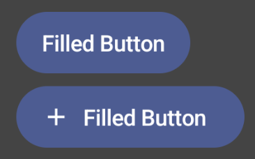
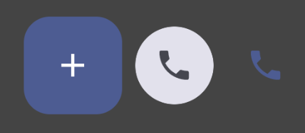
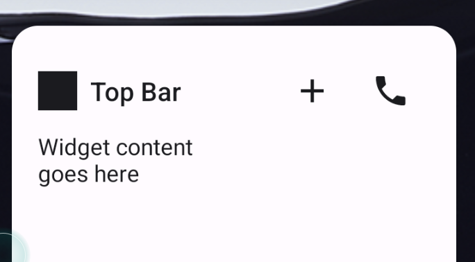
Glance 1.1.0 包含其他组件的版本,如下表所述:
| 名称 | 图片 | 参考链接 | 其他说明 |
|---|---|---|---|
| 填充按钮 |
|
组件 | |
| 空心按钮 |

|
组件 | |
| 图标按钮 |
|
组件 | 主要 / 次要 / 仅限图标 |
| 标题栏 |
|
组件 | |
| Scaffold | Scaffold 和标题栏位于同一演示中。 |
如需详细了解设计规范,请参阅 Figma 上的此 设计套件中的组件设计。
如需详细了解规范布局,请访问规范微件布局。