تنظيم صفحاتك في مجموعات
يمكنك حفظ المحتوى وتصنيفه حسب إعداداتك المفضّلة.
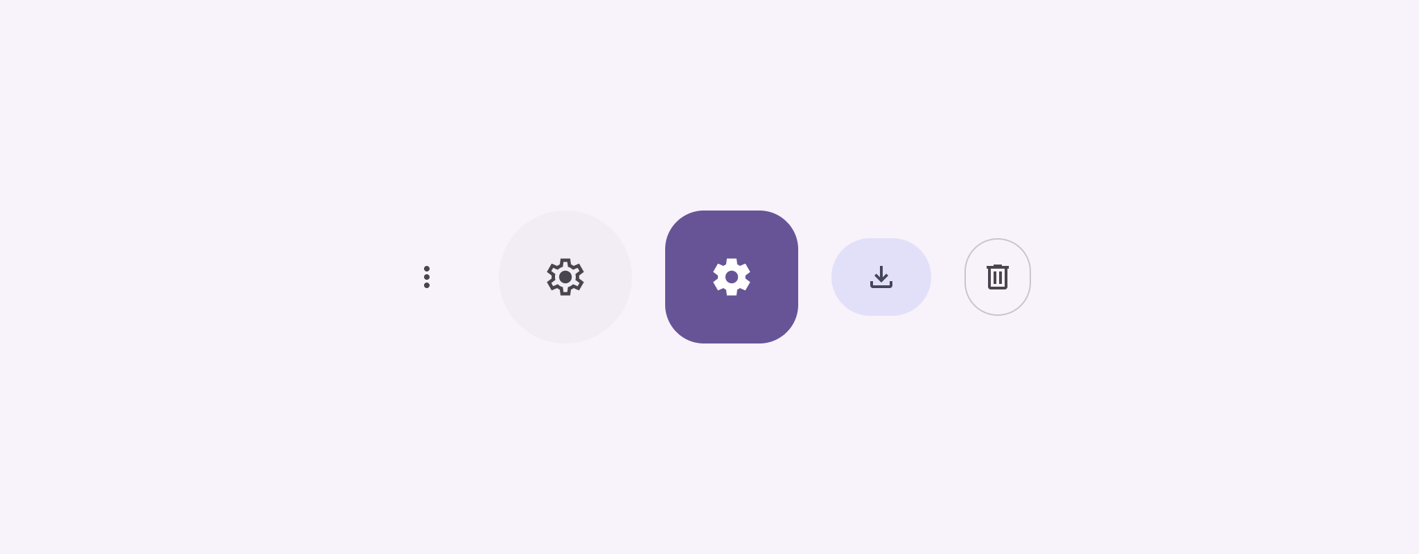
تعرِض أزرار الرموز الإجراءات التي يمكن للمستخدمين اتّخاذها. يجب أن تستخدم أزرار الرموز رمزًا
له معنى واضح، وعادةً ما تمثّل إجراءات شائعة أو يتم استخدامها بشكل متكرّر.
هناك نوعان من أزرار الرموز:
تلقائي: يمكن أن تفتح هذه الأزرار عناصر أخرى، مثل قائمة أو بحث.
التبديل: يمكن أن تمثّل هذه الأزرار إجراءات ثنائية يمكن تفعيلها
أو إيقافها، مثل "مفضّل" أو "إشارة مرجعية".
الشكل 1. أزرار الرموز، التي يكون بعضها ملونًا بالكامل (يشير إلى الاختيار) و
مخطَّطًا.
onClick: دالة LAMBDA يتم تنفيذها عندما ينقر المستخدم على زر الرمز.
enabled: قيمة منطقية تتحكّم في حالة تفعيل الزر عند
false، لا يستجيب الزر لإدخال المستخدم.
content: المحتوى القابل للتجميع داخل الزر، وعادةً ما يكون Icon.
مثال أساسي: زر رمز الإيقاف/التفعيل
يوضّح لك هذا المثال كيفية تنفيذ زر رمز التبديل. يغيّر رمز التبديل
الزر مظهره استنادًا إلى ما إذا كان محدّدًا أو غير محدّد.
@Preview@ComposablefunToggleIconButtonExample(){// isToggled initial value should be read from a view model or persistent storage.varisToggledbyrememberSaveable{mutableStateOf(false)}IconButton(onClick={isToggled=!isToggled}){Icon(painter=if(isToggled)painterResource(R.drawable.favorite_filled)elsepainterResource(R.drawable.favorite),contentDescription=if(isToggled)"Selected icon button"else"Unselected icon button.")}}
ينشئ mutableStateOf(false) عنصر MutableState يحتوي على قيمة
boolean، وهي false في البداية. وهذا يجعل isToggled عنصرًا يحتفظ بالحالة،
ما يعني أنّ Compose يعيد إنشاء واجهة المستخدم كلما تغيّرت قيمته.
يضمن rememberSaveable استمرار حالة isToggled على الرغم من
تغييرات الضبط، مثل تدوير الشاشة.
تحدّد دالة onClick لعنصر IconButton سلوك الزر عند
النقر عليه، ما يؤدي إلى تبديل الحالة بين true وfalse.
تحمِّل مَعلمة painter في العنصر القابل للتجميع Icon بشكل مشروط
painterResource مختلفًا استنادًا إلى حالة isToggled. يؤدي ذلك إلى تغيير
المظهر المرئي للرمز.
إذا كان isToggled هو true، يتم تحميل العنصر القابل للرسم للقلب الممتلئ.
إذا كانت القيمة isToggled هي false، يتم تحميل العنصر القابل للرسم الذي يمثّل قلبًا مخطّطًا.
يتم أيضًا تعديل contentDescription في Icon استنادًا إلى حالة isToggled
لتوفير معلومات مناسبة حول تسهيل الاستخدام.
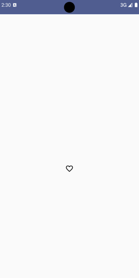
النتيجة
تعرض الصورة التالية زر رمز الإيقاف/التفعيل من المقتطف السابق في
حالته غير المحدّدة:
الشكل 2. زر رمز الإيقاف/التفعيل "العناصر المفضّلة" في حالة عدم اختياره
مثال متقدّم: إجراءات متكرّرة عند الضغط
يوضّح هذا القسم كيفية إنشاء أزرار رموز تؤدي باستمرار إلى تنفيذ
إجراء ما بينما يضغط المستخدم عليها ويُمسكها، بدلاً من تنفيذه
مرة واحدة فقط لكل نقرة.
@ComposablefunMomentaryIconButton(unselectedImage:Int,selectedImage:Int,contentDescription:String,modifier:Modifier=Modifier,stepDelay:Long=100L,// Minimum value is 1L milliseconds.onClick:()->Unit){valinteractionSource=remember{MutableInteractionSource()}valisPressedbyinteractionSource.collectIsPressedAsState()valpressedListenerbyrememberUpdatedState(onClick)LaunchedEffect(isPressed){while(isPressed){delay(stepDelay.coerceIn(1L,Long.MAX_VALUE))pressedListener()}}IconButton(modifier=modifier,onClick=onClick,interactionSource=interactionSource){Icon(painter=if(isPressed)painterResource(id=selectedImage)elsepainterResource(id=unselectedImage),contentDescription=contentDescription,)}}
يأخذ MomentaryIconButton العنصر unselectedImage: Int، وهو معرّف المورد القابل للرسم
للرمز عندما لا يكون الزر مضغوطاً، وselectedImage: Int، وهو
معرّف المورد القابل للرسم للرمز عندما يكون الزر مضغوطاً.
ويستخدم interactionSource لتتبُّع تفاعلات "الضغط" من العميل بشكلٍ خاص.
يكون isPressed صحيحًا عند الضغط على الزر بشكل نشط وخطأ
في الحالات الأخرى. عندما تكون قيمة isPressed هي true، يدخل LaunchedEffect في حلقة.
داخل هذه الحلقة، يتم استخدام delay (مع stepDelay) لإنشاء فترات إيقاف مؤقت
بين الإجراءات المشغِّلة. يضمن coerceIn أن يكون التأخير 1 ملي ثانية على الأقل لمنع تكرار الطلبات بشكل لانهائي.
يتمّ استدعاء pressedListener بعد كل تأخير داخل الحلقة. يؤدي ذلك
إلى تكرار الإجراء.
يستخدم pressedListenerrememberUpdatedState لضمان أنّ onClick
lambda (الإجراء الذي سيتم تنفيذه) هو دائمًا أحدث onClick
تركيبة.
يغيّر الرمز Icon الصورة المعروضة استنادًا إلى ما إذا كان الزر
مضغوطاً حاليًا أم لا.
إذا كانت القيمة isPressed صحيحة، يتم عرض selectedImage.
بخلاف ذلك، يتم عرض unselectedImage.
بعد ذلك، استخدِم هذا الرمز MomentaryIconButton في مثال. يوضّح المقتطف التالي
زرَّين رمزيَّين يتحكّمان في عداد:
@Preview()@ComposablefunMomentaryIconButtonExample(){varpressedCountbyremember{mutableIntStateOf(0)}Row(modifier=Modifier.fillMaxWidth(),verticalAlignment=Alignment.CenterVertically){MomentaryIconButton(unselectedImage=R.drawable.fast_rewind,selectedImage=R.drawable.fast_rewind_filled,stepDelay=100L,onClick={pressedCount-=1},contentDescription="Decrease count button")Spacer(modifier=Modifier)Text("advanced by $pressedCount frames")Spacer(modifier=Modifier)MomentaryIconButton(unselectedImage=R.drawable.fast_forward,selectedImage=R.drawable.fast_forward_filled,contentDescription="Increase count button",stepDelay=100L,onClick={pressedCount+=1})}}
يعرض العنصر القابل للتجميع MomentaryIconButtonExample عنصر Row يحتوي على مثيلَين
MomentaryIconButton وعنصرًا قابلاً للتجميع Text لإنشاء واجهة مستخدم ل
زيادة مقياس وخفضه.
ويحافظ على متغيّر حالة قابل للتغيير pressedCount باستخدام remember و
mutableIntStateOf، ويتم إعداده على القيمة 0. عند تغيير pressedCount، تتم إعادة تركيب أي عناصر تركيبية ترصده (مثل العنصر التركيبى Text) لتعكس القيمة الجديدة.
يؤدي النقر على MomentaryIconButton الأول أو الضغط عليه مع الاستمرار إلى خفض pressedCount.
يؤدي النقر على MomentaryIconButton الثاني أو
الإبقاء عليه إلى زيادة pressedCount.
يستخدم كلا الزرَّين stepDelay تبلغ مدته 100 ملي ثانية، ما يعني أنّ الإجراء onClick
يتكرر كل 100 ملي ثانية أثناء الضغط على أحد الزرَّين.
النتيجة
يعرض الفيديو التالي واجهة المستخدم التي تتضمّن أزرار الرموز والعداد:
الشكل 3. واجهة مستخدم للعداد تتضمّن زرَّي رمز (علامة الإضافة وعلامة الطرح) لزيادة العداد أو إنقاصه
يخضع كل من المحتوى وعيّنات التعليمات البرمجية في هذه الصفحة للتراخيص الموضحّة في ترخيص استخدام المحتوى. إنّ Java وOpenJDK هما علامتان تجاريتان مسجَّلتان لشركة Oracle و/أو الشركات التابعة لها.
تاريخ التعديل الأخير: 2025-08-28 (حسب التوقيت العالمي المتفَّق عليه)
[null,null,["تاريخ التعديل الأخير: 2025-08-28 (حسب التوقيت العالمي المتفَّق عليه)"],[],[],null,["Icon buttons display actions that users can take. Icon buttons must use an icon\nwith a clear meaning, and typically represent common or frequently used actions.\n\nThere are two types of icon buttons:\n\n- **Default**: These buttons can open other elements, such as a menu or search.\n- **Toggle**: These buttons can represent binary actions that can be toggled on or off, such as \"favorite\" or \"bookmark\".\n\n**Figure 1.** Icon buttons, some of which are filled (indicating selection) and outlined.\n\nAPI surface\n\nUse the [`IconButton`](/reference/kotlin/androidx/compose/material3/package-summary#IconButton(kotlin.Function0,androidx.compose.ui.Modifier,kotlin.Boolean,androidx.compose.material3.IconButtonColors,androidx.compose.foundation.interaction.MutableInteractionSource,kotlin.Function1)) composable to implement standard icon buttons. To\ncreate different visual styles like filled, filled tonal, or outlined, use\n[`FilledIconButton`](/reference/kotlin/androidx/compose/material3/package-summary#FilledIconButton(kotlin.Function0,androidx.compose.material3.IconButtonShapes,androidx.compose.ui.Modifier,kotlin.Boolean,androidx.compose.material3.IconButtonColors,androidx.compose.foundation.interaction.MutableInteractionSource,kotlin.Function0)), [`FilledTonalIconButton`](/reference/kotlin/androidx/compose/material3/package-summary#FilledTonalIconButton(kotlin.Function0,androidx.compose.ui.Modifier,kotlin.Boolean,androidx.compose.ui.graphics.Shape,androidx.compose.material3.IconButtonColors,androidx.compose.foundation.interaction.MutableInteractionSource,kotlin.Function0)), and\n[`OutlinedIconButton`](/reference/kotlin/androidx/compose/material3/package-summary#OutlinedIconButton(kotlin.Function0,androidx.compose.material3.IconButtonShapes,androidx.compose.ui.Modifier,kotlin.Boolean,androidx.compose.material3.IconButtonColors,androidx.compose.foundation.BorderStroke,androidx.compose.foundation.interaction.MutableInteractionSource,kotlin.Function0)), respectively.\n\nThe key parameters for `IconButton` include:\n\n- `onClick`: A lambda function that executes when the user taps the icon button.\n- `enabled`: A boolean that controls the enabled state of the button. When `false`, the button does not respond to user input.\n- `content`: The composable content inside the button, typically an `Icon`.\n\nBasic example: Toggle icon button\n\nThis example shows you how to implement a toggle icon button. A toggle icon\nbutton changes its appearance based on whether it's selected or unselected.\n\n\n```kotlin\n@Preview\n@Composable\nfun ToggleIconButtonExample() {\n // isToggled initial value should be read from a view model or persistent storage.\n var isToggled by rememberSaveable { mutableStateOf(false) }\n\n IconButton(\n onClick = { isToggled = !isToggled }\n ) {\n Icon(\n painter = if (isToggled) painterResource(R.drawable.favorite_filled) else painterResource(R.drawable.favorite),\n contentDescription = if (isToggled) \"Selected icon button\" else \"Unselected icon button.\"\n )\n }\n}https://github.com/android/snippets/blob/5673ffc60b614daf028ee936227128eb8c4f9781/compose/snippets/src/main/java/com/example/compose/snippets/components/IconButton.kt#L44-L58\n```\n\n\u003cbr /\u003e\n\nKey points about the code\n\n- The `ToggleIconButtonExample` composable defines a toggleable `IconButton`.\n - `mutableStateOf(false)` creates a `MutableState` object that holds a boolean value, initially `false`. This makes `isToggled` a state holder, meaning Compose recomposes the UI whenever its value changes.\n - `rememberSaveable` ensures the `isToggled` state persists across configuration changes, like screen rotation.\n- The `onClick` lambda of the `IconButton` defines the button's behavior when clicked, toggling the state between `true` and `false`.\n- The [`Icon`](/reference/kotlin/androidx/compose/material3/package-summary#Icon(androidx.compose.ui.graphics.painter.Painter,kotlin.String,androidx.compose.ui.Modifier,androidx.compose.ui.graphics.Color)) composable's `painter` parameter conditionally loads a different `painterResource` based on the `isToggled` state. This changes the visual appearance of the icon.\n - If `isToggled` is `true`, it loads the filled heart drawable.\n - If `isToggled` is `false`, it loads the outlined heart drawable.\n- The `contentDescription` of the `Icon` also updates based on the `isToggled` state to provide appropriate accessibility information.\n\nResult\n\nThe following image shows the toggle icon button from the preceding snippet in\nits unselected state:\n**Figure 2.** A \"favorite\" toggle icon button in its unselected state.\n\nAdvanced example: Repeated actions on press\n\nThis section demonstrates how to create icon buttons that continuously trigger\nan action while the user presses and holds them, rather than just triggering\nonce per click.\n\n\n```kotlin\n@Composable\nfun MomentaryIconButton(\n unselectedImage: Int,\n selectedImage: Int,\n contentDescription: String,\n modifier: Modifier = Modifier,\n stepDelay: Long = 100L, // Minimum value is 1L milliseconds.\n onClick: () -\u003e Unit\n) {\n val interactionSource = remember { MutableInteractionSource() }\n val isPressed by interactionSource.collectIsPressedAsState()\n val pressedListener by rememberUpdatedState(onClick)\n\n LaunchedEffect(isPressed) {\n while (isPressed) {\n delay(stepDelay.coerceIn(1L, Long.MAX_VALUE))\n pressedListener()\n }\n }\n\n IconButton(\n modifier = modifier,\n onClick = onClick,\n interactionSource = interactionSource\n ) {\n Icon(\n painter = if (isPressed) painterResource(id = selectedImage) else painterResource(id = unselectedImage),\n contentDescription = contentDescription,\n )\n }\n}https://github.com/android/snippets/blob/5673ffc60b614daf028ee936227128eb8c4f9781/compose/snippets/src/main/java/com/example/compose/snippets/components/IconButton.kt#L62-L92\n```\n\n\u003cbr /\u003e\n\nKey points about the code\n\n- `MomentaryIconButton` takes an `unselectedImage: Int`, the drawable resource ID for the icon when the button is not pressed, and `selectedImage: Int`, the drawable resource ID for the icon when the button is pressed.\n- It uses an `interactionSource` to specifically track \"press\" interactions from the user.\n- `isPressed` is true when the button is actively being pressed and false otherwise. When `isPressed` is `true`, the `LaunchedEffect` enters a loop.\n - Inside this loop, it uses a `delay` (with `stepDelay`) to create pauses between triggering actions. `coerceIn` ensures the delay is at least 1ms to prevent infinite loops.\n - The `pressedListener` is invoked after each delay within the loop. This makes the action repeat.\n- The `pressedListener` uses `rememberUpdatedState` to ensure that the `onClick` lambda (the action to perform) is always the most up-to-date from the latest composition.\n- The `Icon` changes its displayed image based on whether the button is currently pressed or not.\n - If `isPressed` is true, the `selectedImage` is shown.\n - Otherwise, the `unselectedImage` is shown.\n\nNext, use this `MomentaryIconButton` in an example. The following snippet\ndemonstrates two icon buttons controlling a counter:\n\n\n```kotlin\n@Preview()\n@Composable\nfun MomentaryIconButtonExample() {\n var pressedCount by remember { mutableIntStateOf(0) }\n\n Row(\n modifier = Modifier.fillMaxWidth(),\n verticalAlignment = Alignment.CenterVertically\n ) {\n MomentaryIconButton(\n unselectedImage = R.drawable.fast_rewind,\n selectedImage = R.drawable.fast_rewind_filled,\n stepDelay = 100L,\n onClick = { pressedCount -= 1 },\n contentDescription = \"Decrease count button\"\n )\n Spacer(modifier = Modifier)\n Text(\"advanced by $pressedCount frames\")\n Spacer(modifier = Modifier)\n MomentaryIconButton(\n unselectedImage = R.drawable.fast_forward,\n selectedImage = R.drawable.fast_forward_filled,\n contentDescription = \"Increase count button\",\n stepDelay = 100L,\n onClick = { pressedCount += 1 }\n )\n }\n}https://github.com/android/snippets/blob/5673ffc60b614daf028ee936227128eb8c4f9781/compose/snippets/src/main/java/com/example/compose/snippets/components/IconButton.kt#L96-L123\n```\n\n\u003cbr /\u003e\n\nKey points about the code\n\n- The `MomentaryIconButtonExample` composable displays a `Row` containing two `MomentaryIconButton` instances and a `Text` composable to build a UI for incrementing and decrementing a counter.\n- It maintains a `pressedCount` mutable state variable using `remember` and `mutableIntStateOf`, initialized to 0. When `pressedCount` changes, any composables observing it (like the `Text` composable) recompose to reflect the new value.\n- The first `MomentaryIconButton` decreases `pressedCount` when clicked or held.\n- The second `MomentaryIconButton` increases `pressedCount` when clicked or held.\n- Both buttons use a `stepDelay` of 100 milliseconds, meaning the `onClick` action repeats every 100ms while a button is held.\n\nResult\n\nThe following video shows the UI with the icon buttons and the counter:\n**Figure 3**. A counter UI with two icon buttons (plus and minus) that increment and decrement the counter.\n\nAdditional resources\n\n- [Material 3 - Icon buttons](https://m3.material.io/components/icon-buttons/overview)"]]