
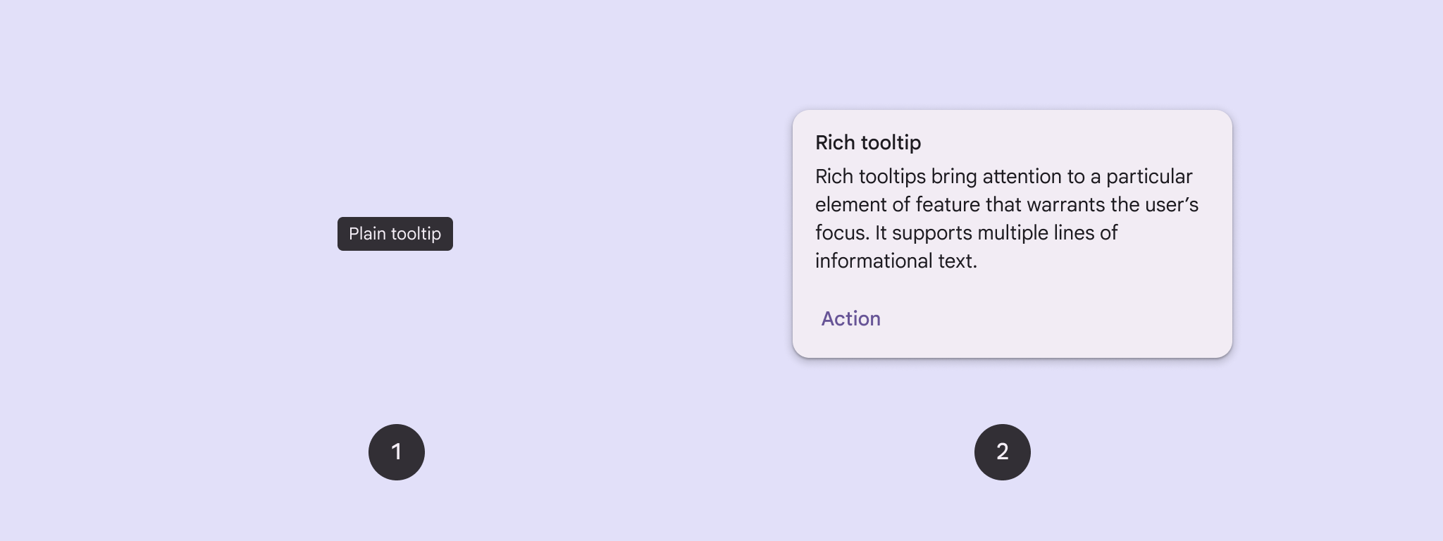
Bir düğmeye veya başka bir kullanıcı arayüzü öğesine bağlam eklemek için ipuçlarını kullanın. İki tür ipucu vardır:
- Düz ipuçları: Simge düğmelerinin öğelerini veya işlemlerini açıklar.
- Zengin ipuçları: Bir özelliğin değerini açıklama gibi daha fazla ayrıntı sağlar. İsteğe bağlı olarak başlık, bağlantı ve düğmeler de içerebilir.
API yüzeyi
Uygulamanızda ipuçlarını uygulamak için TooltipBox composable'ını kullanabilirsiniz.
TooltipBox görünümünü şu ana parametrelerle kontrol edersiniz:
positionProvider: İpucunu, bağlantı içeriğine göre yerleştirir. GenellikleTooltipDefaultskonum sağlayıcısını kullanırsınız veya özel konumlandırma mantığına ihtiyacınız varsa kendi konum sağlayıcınızı kullanabilirsiniz.tooltip: İpucu içeriğini içeren composable. GenelliklePlainTooltipveyaRichTooltipcomposable'larını kullanırsınız.- Simge düğmelerinin öğelerini veya işlemlerini açıklamak için
PlainTooltipkullanın. RichTooltipkullanarak özelliklerin değerini açıklama gibi daha fazla ayrıntı sağlayın. Zengin ipuçları isteğe bağlı olarak başlık, bağlantı ve düğmeler içerebilir.
- Simge düğmelerinin öğelerini veya işlemlerini açıklamak için
state: Bu ipucu için kullanıcı arayüzü mantığını ve öğe durumunu içeren durum tutucu.content: İpucunun bağlı olduğu birleştirilebilir içerik.
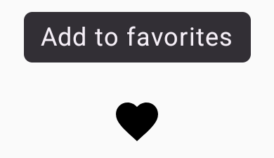
Düz bir ipucu görüntüleme
Bir kullanıcı arayüzü öğesini kısaca açıklamak için düz bir ipucu kullanın. Bu kod snippet'i, "Favorilere ekle" etiketli bir simge düğmesinin üzerinde düz bir ipucu görüntüler:
@Composable fun PlainTooltipExample( modifier: Modifier = Modifier, plainTooltipText: String = "Add to favorites" ) { TooltipBox( modifier = modifier, positionProvider = TooltipDefaults.rememberPlainTooltipPositionProvider(), tooltip = { PlainTooltip { Text(plainTooltipText) } }, state = rememberTooltipState() ) { IconButton(onClick = { /* Do something... */ }) { Icon( imageVector = Icons.Filled.Favorite, contentDescription = "Add to favorites" ) } } }
Kodla ilgili önemli noktalar
TooltipBox, "Favorilere ekle" metnini içeren bir ipucu oluşturur.TooltipDefaults.rememberPlainTooltipPositionProvider(), düz araç ipuçları için varsayılan konumlandırma sağlar.tooltip,PlainTooltipcomposable'ı kullanarak ipucunun içeriğini tanımlayan bir lambda işlevidir.Text(plainTooltipText), ipucundaki metni gösterir.tooltipState, ipucunun durumunu kontrol eder.
IconButtonsimge içeren tıklanabilir bir düğme oluşturur.Icon(...)düğmesinde kalp simgesi gösterilir.- Kullanıcı
IconButtonile etkileşimde bulunduğundaTooltipBox, "Favorilere ekle" metnini içeren ipucunu gösterir. Kullanıcılar, cihaza bağlı olarak aşağıdaki yöntemlerle ipucunu tetikleyebilir: - İmleçle simgenin üzerine gelme
- Mobil cihazda simgeye uzun basma
Sonuç
Bu örnek, bir simgenin üzerinde düz bir ipucu oluşturur:
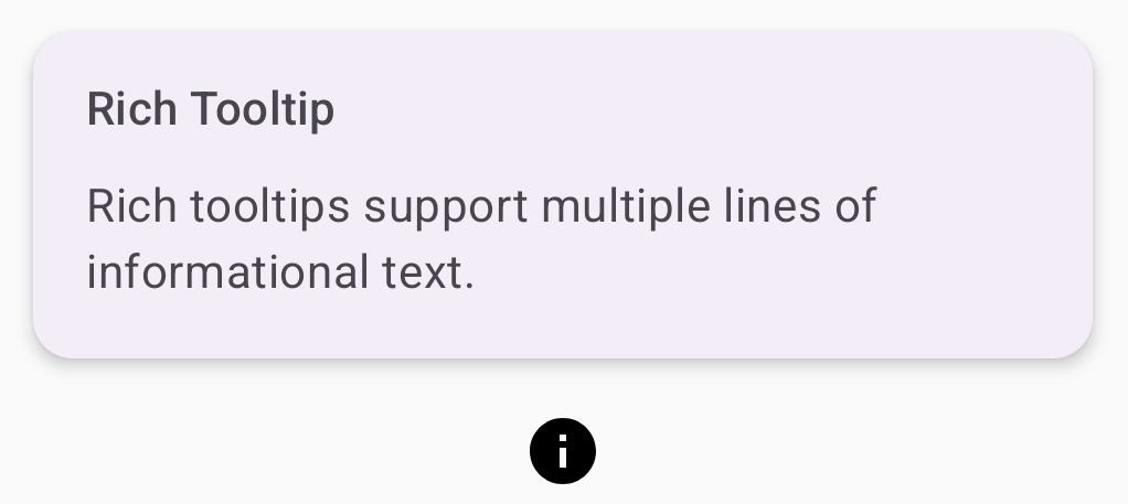
Zengin bir ipucu görüntüleme
Bir kullanıcı arayüzü öğesi hakkında ek bağlam sağlamak için zengin bir ipucu kullanın. Bu örnekte, Icon öğesine sabitlenmiş bir başlığa sahip çok satırlı bir zengin ipucu oluşturuluyor:
@Composable fun RichTooltipExample( modifier: Modifier = Modifier, richTooltipSubheadText: String = "Rich Tooltip", richTooltipText: String = "Rich tooltips support multiple lines of informational text." ) { TooltipBox( modifier = modifier, positionProvider = TooltipDefaults.rememberRichTooltipPositionProvider(), tooltip = { RichTooltip( title = { Text(richTooltipSubheadText) } ) { Text(richTooltipText) } }, state = rememberTooltipState() ) { IconButton(onClick = { /* Icon button's click event */ }) { Icon( imageVector = Icons.Filled.Info, contentDescription = "Show more information" ) } } }
Kodla ilgili önemli noktalar
TooltipBox, kullanıcı etkileşimleriyle ilgili etkinlik işleyicileri yönetir veTooltipStatebuna göre günceller.TooltipState, ipucunun gösterilmesi gerektiğini belirttiğinde ipucu lambda'sı yürütülür veTooltipBox,RichTooltipöğesini gösterir.TooltipBox, hem içerik hem de ipucu için bağlantı ve kapsayıcı görevi görür.- Bu durumda, içerik, dokunma işlemi davranışını sağlayan bir
IconButtonbileşenidir.TooltipBoxiçeriğinde herhangi bir yerde uzun basıldığında (dokunmatik cihazlarda) veya imleçle üzerine gelindiğinde (fare işaretçisiyle olduğu gibi) ipucu görüntülenerek daha fazla bilgi gösterilir.
- Bu durumda, içerik, dokunma işlemi davranışını sağlayan bir
RichTooltipcomposable'ı, başlık ve gövde metni de dahil olmak üzere ipucunun içeriğini tanımlar.TooltipDefaults.rememberRichTooltipPositionProvider(), zengin ipuçları için konumlandırma bilgileri sağlar.
Sonuç
Bu örnekte, bilgi simgesine eklenmiş bir başlığa sahip zengin bir ipucu oluşturulur:
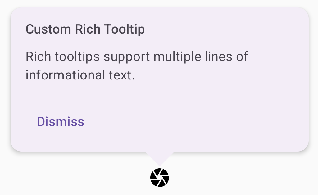
Zengin ipuçlarını özelleştirme
Bu kod snippet'i, kamera simgesi düğmesinin üzerinde başlık, özel işlemler ve özel şapka (ok) içeren zengin bir ipucu görüntüler:
@Composable fun AdvancedRichTooltipExample( modifier: Modifier = Modifier, richTooltipSubheadText: String = "Custom Rich Tooltip", richTooltipText: String = "Rich tooltips support multiple lines of informational text.", richTooltipActionText: String = "Dismiss" ) { val tooltipState = rememberTooltipState() val coroutineScope = rememberCoroutineScope() TooltipBox( modifier = modifier, positionProvider = TooltipDefaults.rememberRichTooltipPositionProvider(), tooltip = { RichTooltip( title = { Text(richTooltipSubheadText) }, action = { Row { TextButton(onClick = { coroutineScope.launch { tooltipState.dismiss() } }) { Text(richTooltipActionText) } } }, ) { Text(richTooltipText) } }, state = tooltipState ) { IconButton(onClick = { coroutineScope.launch { tooltipState.show() } }) { Icon( imageVector = Icons.Filled.Camera, contentDescription = "Open camera" ) } } }
Kodla ilgili önemli noktalar
RichTooltipsimgesi, başlık ve kapatma işlemi içeren bir ipucu gösterir.- Uzun basarak veya fare işaretçisiyle
TooltipBoxiçeriğin üzerine gelerek etkinleştirildiğinde ipucu yaklaşık bir saniye boyunca gösterilir. Ekranın başka bir yerine dokunarak veya kapatma işlemi düğmesini kullanarak bu ipucunu kapatabilirsiniz. - Kapatma işlemi yürütüldüğünde sistem,
tooltipState.dismissişlevini çağırmak için bir eş yordam başlatır. Bu işlem, ipucu gösterilirken işlem yürütülmesinin engellenmediğini doğrular. onClick = coroutineScope.launch { tooltipState.show() } },tooltipState.showkullanarak ipucunu manuel olarak göstermek için bir coroutine başlatır.actionparametresi, bir ipucuna düğme gibi etkileşimli öğeler eklenmesine olanak tanır.caretSizeparametresi, ipucu okunun boyutunu değiştirir.
Sonuç
Bu örnek aşağıdaki sonucu verir:
Ek kaynaklar
- Materyal Tasarım: İpuçları