

В следующих разделах описано, как создать простой виджет приложения с помощью Glance.
Объявите AppWidget в файле Manifest.
После завершения шагов настройки объявите AppWidget и его метаданные в вашем приложении.
Расширьте функциональность обработчика
AppWidget, используяGlanceAppWidgetReceiver:class MyAppWidgetReceiver : GlanceAppWidgetReceiver() { override val glanceAppWidget: GlanceAppWidget = TODO("Create GlanceAppWidget") }
Зарегистрируйте поставщика виджета приложения в файле
AndroidManifest.xmlи в соответствующем файле метаданных:<receiver android:name=".glance.MyReceiver" android:exported="true"> <intent-filter> <action android:name="android.appwidget.action.APPWIDGET_UPDATE" /> </intent-filter> <meta-data android:name="android.appwidget.provider" android:resource="@xml/my_app_widget_info" /> </receiver>
Добавьте метаданные AppWidgetProviderInfo
Далее, следуя инструкциям по созданию виджета , создайте и определите информацию о виджете приложения в файле @xml/my_app_widget_info .
Единственное отличие Glance заключается в отсутствии XML-файла initialLayout , который необходимо определить самостоятельно. Вы можете использовать предопределенный макет загрузки, предоставленный в библиотеке:
<appwidget-provider xmlns:android="http://schemas.android.com/apk/res/android"
android:initialLayout="@layout/glance_default_loading_layout">
</appwidget-provider>
Объявите XML-файл AppWidgetProviderInfo.
The AppWidgetProviderInfo object defines the essential qualities of your widget. Define the AppWidgetProviderInfo in your XML metadata resource file ( res/xml/my_app_widget_info.xml ) inside a <appwidget-provider> element:
<appwidget-provider xmlns:android="http://schemas.android.com/apk/res/android"
    android:minWidth="40dp"
    android:minHeight="40dp"
    android:targetCellWidth="1"
    android:targetCellHeight="1"
    android:maxResizeWidth="250dp"
    android:maxResizeHeight="120dp"
    android:updatePeriodMillis="86400000"
    android:description="@string/example_appwidget_description"
    android:previewLayout="@layout/example_appwidget_preview"
    android:initialLayout="@layout/glance_default_loading_layout"
    android:configure="com.example.android.ExampleAppWidgetConfigurationActivity"
    android:resizeMode="horizontal|vertical"
    android:widgetCategory="home_screen"
    android:widgetFeatures="reconfigurable|configuration_optional">
</appwidget-provider>
Атрибуты размера виджета
The default home screen positions widgets in its window based on a grid of cells that have a defined height and width. Most home screens only let widgets take on sizes that are integer multiples of the grid cells—for example, two cells horizontally by three cells vertically.
The widget sizing attributes let you specify a default size for your widget and provide lower and upper bounds on the size of the widget. In this context, the default size of a widget is the size that the widget takes on when it is first added to the home screen.
В следующей таблице описаны атрибуты <appwidget-provider> , относящиеся к определению размера виджета:
| Атрибуты и описание | |
|---|---|
targetCellWidth и targetCellHeight (Android 12), minWidth и minHeight |
targetCellWidth and targetCellHeight , and minWidth and minHeight —so that your app can fall back to using minWidth and minHeight if the user's device doesn't support targetCellWidth and targetCellHeight . If supported, the targetCellWidth and targetCellHeight attributes take precedence over the minWidth and minHeight attributes. |
minResizeWidth и minResizeHeight | Specify the widget's absolute minimum size. These values specify the size under which the widget is illegible or otherwise unusable. Using these attributes lets the user resize the widget to a size that is smaller than the default widget size. The minResizeWidth attribute is ignored if it is greater than minWidth or if horizontal resizing isn't enabled. See resizeMode . Likewise, the minResizeHeight attribute is ignored if it is greater than minHeight or if vertical resizing isn't enabled. |
maxResizeWidth и maxResizeHeight | Specify the widget's recommended maximum size. If the values aren't a multiple of the grid cell dimensions, they are rounded up to the nearest cell size. The maxResizeWidth attribute is ignored if it is smaller than minWidth or if horizontal resizing isn't enabled. See resizeMode . Likewise, the maxResizeHeight attribute is ignored if it is smaller than minHeight or if vertical resizing isn't enabled. Introduced in Android 12. |
resizeMode | Specifies the rules by which a widget can be resized. You can use this attribute to make home screen widgets resizable horizontally, vertically, or on both axes. Users touch & hold a widget to show its resize handles, then drag the horizontal or vertical handles to change its size on the layout grid. Values for the resizeMode attribute include horizontal , vertical , and none . To declare a widget as resizable horizontally and vertically, use horizontal|vertical . |
Пример
Чтобы проиллюстрировать, как атрибуты в приведенной выше таблице влияют на размер виджета, предположим следующие параметры:
- Размер ячейки сетки составляет 30 знаков после запятой в ширину и 50 знаков после запятой в высоту.
- Предоставляется следующая спецификация атрибутов:
<appwidget-provider xmlns:android="http://schemas.android.com/apk/res/android"
    android:minWidth="80dp"
    android:minHeight="80dp"
    android:targetCellWidth="2"
    android:targetCellHeight="2"
    android:minResizeWidth="40dp"
    android:minResizeHeight="40dp"
    android:maxResizeWidth="120dp"
    android:maxResizeHeight="120dp"
    android:resizeMode="horizontal|vertical" />
Начиная с Android 12:
Используйте атрибуты targetCellWidth и targetCellHeight в качестве размера виджета по умолчанию.
По умолчанию размер виджета составляет 2х2. Размер виджета можно уменьшить до 2х1 или увеличить до 4х3.
Android 11 и ниже:
Используйте атрибуты minWidth и minHeight для вычисления размера виджета по умолчанию.
Ширина по умолчанию = Math.ceil(80 / 30) = 3
Высота по умолчанию = Math.ceil(80 / 50) = 2
По умолчанию размер виджета составляет 3х2. Размер виджета можно уменьшить до 2х1 или увеличить до полноэкранного режима.
Дополнительные атрибуты виджета
В следующей таблице описаны атрибуты <appwidget-provider> , относящиеся к параметрам, отличным от размера виджета.
| Атрибуты и описание | |
|---|---|
updatePeriodMillis | Defines how often the widget framework requests an update from the GlanceAppWidgetReceiver by calling the onUpdate() callback method. We recommend updating as infrequently as possible—no more than once an hour—to conserve the battery. For details, see the When to update widgets section in Glance state management. |
initialLayout | Points to the layout resource that defines the loading layout of the widget before the Glance UI compositions render. You can use the predefined loading layout provided in the library: @layout/glance_default_loading_layout . |
configure | Определяет действие по настройке, которое запускается при добавлении виджета пользователем. См. руководство по реализации действия по настройке . |
description | Задает описание для средства выбора виджета, которое будет отображаться для вашего виджета. Введено в Android 12. |
previewLayout (Android 12) и previewImage (Android 11 и ниже) |
|
autoAdvanceViewId | Указывает идентификатор представления дочернего элемента виджета, который автоматически перемещается в зависимости от хоста виджета. |
widgetCategory | Определяет, может ли ваш виджет отображаться на главном экране ( home_screen ), экране блокировки ( keyguard ) или на обоих. Для Android 5.0 и выше допустимо только значение home_screen . |
widgetFeatures | Объявляет поддерживаемые виджетом функции. Например, если конфигурация вашего виджета является необязательной, укажите одновременно configuration_optional и reconfigurable . |
Определить GlanceAppWidget
Создайте новый класс, наследующий от
GlanceAppWidgetи переопределяющий методprovideGlance. В этом методе вы можете загрузить данные, необходимые для отображения вашего виджета:class MyAppWidget : GlanceAppWidget() { override suspend fun provideGlance(context: Context, id: GlanceId) { // In this method, load data needed to render the AppWidget. // Use `withContext` to switch to another thread for long running // operations. provideContent { // create your AppWidget here Text("Hello World") } } }
Создайте его экземпляр в виджете
glanceAppWidgetв вашемGlanceAppWidgetReceiver:class MyAppWidgetReceiver : GlanceAppWidgetReceiver() { // Let MyAppWidgetReceiver know which GlanceAppWidget to use override val glanceAppWidget: GlanceAppWidget = MyAppWidget() }
Теперь вы успешно настроили AppWidget с помощью Glance.
Для обработки широковещательных сообщений виджетов используйте класс GlanceAppWidgetReceiver.
The GlanceAppWidgetReceiver coordinates widget broadcasts and platform state updates by extending the underlying AppWidgetProvider . It receives platform events when your widget is updated, deleted, enabled, or disabled, translating them into Compose lifecycle requests.
Объявите виджет в манифесте.
Объявите подкласс класса GlanceAppWidgetReceiver в качестве широковещательного приемника в файле AndroidManifest.xml :
<receiver android:name="MyReceiver"
          android:exported="false">
    <intent-filter>
        <action android:name="android.appwidget.action.APPWIDGET_UPDATE" />
    </intent-filter>
    <meta-data android:name="android.appwidget.provider"
               android:resource="@xml/my_app_widget_info" />
</receiver>
The <receiver> element requires the android:name attribute, which specifies the receiver class. The receiver must accept the ACTION_APPWIDGET_UPDATE broadcast action inside the <intent-filter> .
The <meta-data> element must identify its name as android.appwidget.provider , and the android:resource attribute must point to your AppWidgetProviderInfo XML metadata resource ( @xml/my_app_widget_info ).
Реализуйте класс GlanceAppWidgetReceiver.
In Glance, you extend GlanceAppWidgetReceiver instead of AppWidgetProvider directly. Implement it by linking your receiver to your GlanceAppWidget instance. The primary callbacks available in GlanceAppWidgetReceiver operate as follows:
-
onUpdate(): Automatically overridden by Glance to execute composition updates. If you manually overrideonUpdate, you must callsuper.onUpdateto allow Glance to successfully launch composition threads. -
onAppWidgetOptionsChanged(): Вызывается при первом размещении или изменении размера виджета. Glance считывает элементы пакета параметров, чтобы ваш макет плавно подстраивался под размеры во время выполнения. -
onDeleted(Context, IntArray): Вызывается всякий раз, когда пользователь удаляет конкретный экземпляр виджета. -
onEnabled(Context): Срабатывает при успешном создании первого экземпляра вашего виджета. Отлично подходит для выполнения глобальных миграций. -
onDisabled(Context): Вызывается при удалении последнего активного экземпляра поставщика. -
onReceive(Context, Intent): Intercepts every platform broadcast before specific callback methods. You must ensure that any custom receiver logic you write callssuper.onReceive(context, intent)and must never callgoAsyncyourself since Glance automatically routes work asynchronously.
Получать широковещательные намерения виджета
Внутри GlanceAppWidgetReceiver фильтрует и обрабатывает следующие базовые интенты широковещательной рассылки виджетов платформы:
-
ACTION_APPWIDGET_UPDATE -
ACTION_APPWIDGET_DELETED -
ACTION_APPWIDGET_ENABLED -
ACTION_APPWIDGET_DISABLED -
ACTION_APPWIDGET_OPTIONS_CHANGED
Создать пользовательский интерфейс
Следующий фрагмент кода демонстрирует, как создать пользовательский интерфейс:
/* Import Glance Composables In the event there is a name clash with the Compose classes of the same name, you may rename the imports per https://kotlinlang.org/docs/packages.html#imports using the `as` keyword. import androidx.glance.Button import androidx.glance.layout.Column import androidx.glance.layout.Row import androidx.glance.text.Text */ class MyAppWidget : GlanceAppWidget() { override suspend fun provideGlance(context: Context, id: GlanceId) { // Load data needed to render the AppWidget. // Use `withContext` to switch to another thread for long running // operations. provideContent { // create your AppWidget here MyContent() } } @Composable private fun MyContent() { Column( modifier = GlanceModifier.fillMaxSize(), verticalAlignment = Alignment.Top, horizontalAlignment = Alignment.CenterHorizontally ) { Text(text = "Where to?", modifier = GlanceModifier.padding(12.dp)) Row(horizontalAlignment = Alignment.CenterHorizontally) { Button( text = "Home", onClick = actionStartActivity<MyActivity>() ) Button( text = "Work", onClick = actionStartActivity<MyActivity>() ) } } } }
Приведённый выше пример кода выполняет следующие действия:
- В верхнем
Columnэлементы располагаются вертикально один за другим. -
Columnрасширяет свой размер в соответствии с доступным пространством (с помощьюGlanceModifier, выравнивает свое содержимое по верхнему краю (verticalAlignment) и центрирует его по горизонтали (horizontalAlignment). - Содержимое
Columnопределяется с помощью лямбда-функции. Порядок имеет значение.- Первый элемент в
Column— этоTextкомпонент с отступом12.dp. - The second item is a
Row, where items are placed horizontally one after each other, with twoButtonscentered horizontally (horizontalAlignment). The final display depends on the available space. The following image is an example of what it may look like:
- Первый элемент в
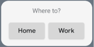
You can change the alignment values or apply different modifier values (such as padding) to change the placement and size of the components. See the reference documentation for a full list of components, parameters, and available modifiers for each class.
Примените закругленные углы.
В Android 12 появились системные параметры для динамической настройки радиусов скругления углов виджетов вашего приложения:
-
system_app_widget_background_radius: Задает радиус скругления углов контейнера фона виджета (никогда не превышает 28 dp). - Внутренний радиус: Чтобы предотвратить обрезку содержимого, рассчитайте пропорциональный радиус для внутреннего содержимого на основе контура фона системы:
systemRadiusValue - widgetPadding
В Glance можно динамически применять свойства изменения радиуса скругления углов в композиции, используя GlanceModifier.cornerRadius(android.R.dimen.system_app_widget_background_radius) .
Для обеспечения обратной совместимости с устройствами под управлением Android 11 (уровень API 30) или более ранних версий реализуйте резервные варианты пользовательских атрибутов и пользовательских ресурсов темы:
/values/attrs.xml<resources> <attr name="backgroundRadius" format="dimension" /> </resources>/values/styles.xml<resources> <style name="MyWidgetTheme"> <item name="backgroundRadius">@dimen/my_background_radius_dimen</item> </style> </resources>/values-31/styles.xml<resources> <style name="MyWidgetTheme" parent="@android:style/Theme.DeviceDefault.DayNight"> <item name="backgroundRadius">@android:dimen/system_app_widget_background_radius</item> </style> </resources>/drawable/my_widget_background.xml<shape xmlns:android="http://schemas.android.com/apk/res/android" android:shape="rectangle"> <corners android:radius="?attr/backgroundRadius" /> </shape>