Stay organized with collections
Save and categorize content based on your preferences.
Tabs allow you to organize groups of related content. There are two types of
tabs:
Primary tabs: Placed at the top of the content pane under a top app bar.
They display the main content destinations, and should be used when just one
set of tabs are needed.
Secondary tabs: Used within a content area to further separate related
content and establish hierarchy. They are necessary when a screen requires
more than one level of tabs.
Figure 1. Primary tabs (1) and secondary tabs (2).
This page shows how to display primary tabs in your app with related screens and
basic navigation.
API surface
Use the Tab, PrimaryTabRow, and SecondaryTabRow composables
to implement tabs. The Tab composable represents an individual tab within the
row, and is typically used inside of a PrimaryTabRow (for primary indicator
tabs) or SecondaryTabRow (for secondary indicator tabs).
Tab includes the following key parameters:
selected: Determines whether the current tab is visually highlighted.
onClick(): A required lambda function that defines the action to be
performed when the user clicks on the tab. This is where you typically handle
navigation events, update the selected tab state, or load corresponding
content.
text: Displays text within the tab. Optional.
icon: Displays an icon within the tab. Optional.
enabled: Controls whether the tab is enabled and can be interacted with. If
set to false, the tab appears in a disabled state and won't respond to
clicks.
Example: Tab-based navigation
The following snippet implements a top navigation bar with tabs to navigate
between different screens in an app:
Content and code samples on this page are subject to the licenses described in the Content License. Java and OpenJDK are trademarks or registered trademarks of Oracle and/or its affiliates.
Last updated 2025-08-20 UTC.
[null,null,["Last updated 2025-08-20 UTC."],[],[],null,["# Tabs allow you to organize groups of related content. There are two types of\ntabs:\n\n- **Primary tabs**: Placed at the top of the content pane under a top app bar. They display the main content destinations, and should be used when just one set of tabs are needed.\n- **Secondary tabs**: Used within a content area to further separate related content and establish hierarchy. They are necessary when a screen requires more than one level of tabs.\n\n**Figure 1.** Primary tabs (1) and secondary tabs (2).\n\nThis page shows how to display primary tabs in your app with related screens and\nbasic navigation.\n\nAPI surface\n-----------\n\nUse the [`Tab`](/reference/kotlin/androidx/compose/material3/package-summary#Tab(kotlin.Boolean,kotlin.Function0,androidx.compose.ui.Modifier,kotlin.Boolean,kotlin.Function0,kotlin.Function0,androidx.compose.ui.graphics.Color,androidx.compose.ui.graphics.Color,androidx.compose.foundation.interaction.MutableInteractionSource)), [`PrimaryTabRow`](/reference/kotlin/androidx/compose/material3/package-summary#PrimaryTabRow(kotlin.Int,androidx.compose.ui.Modifier,androidx.compose.ui.graphics.Color,androidx.compose.ui.graphics.Color,kotlin.Function1,kotlin.Function0,kotlin.Function0)), and [`SecondaryTabRow`](/reference/kotlin/androidx/compose/material3/package-summary#SecondaryTabRow(kotlin.Int,androidx.compose.ui.Modifier,androidx.compose.ui.graphics.Color,androidx.compose.ui.graphics.Color,kotlin.Function1,kotlin.Function0,kotlin.Function0)) composables\nto implement tabs. The `Tab` composable represents an individual tab within the\nrow, and is typically used inside of a `PrimaryTabRow` (for primary indicator\ntabs) or `SecondaryTabRow` (for secondary indicator tabs).\n\n`Tab` includes the following key parameters:\n\n- `selected`: Determines whether the current tab is visually highlighted.\n- `onClick()`: A required lambda function that defines the action to be performed when the user clicks on the tab. This is where you typically handle navigation events, update the selected tab state, or load corresponding content.\n- `text`: Displays text within the tab. Optional.\n- `icon`: Displays an icon within the tab. Optional.\n- `enabled`: Controls whether the tab is enabled and can be interacted with. If set to false, the tab appears in a disabled state and won't respond to clicks.\n\nExample: Tab-based navigation\n-----------------------------\n\nThe following snippet implements a top navigation bar with tabs to navigate\nbetween different screens in an app:\n| **Note:** The [full source code](https://github.com/android/snippets/blob/main/compose/snippets/src/main/java/com/example/compose/snippets/components/Navigation.kt) includes the code that establishes the basic navigation structure for the following example.\n\n\n```kotlin\n@Composable\nfun NavigationTabExample(modifier: Modifier = Modifier) {\n val navController = rememberNavController()\n val startDestination = Destination.SONGS\n var selectedDestination by rememberSaveable { mutableIntStateOf(startDestination.ordinal) }\n\n Scaffold(modifier = modifier) { contentPadding -\u003e\n PrimaryTabRow(selectedTabIndex = selectedDestination, modifier = Modifier.padding(contentPadding)) {\n Destination.entries.forEachIndexed { index, destination -\u003e\n Tab(\n selected = selectedDestination == index,\n onClick = {\n navController.navigate(route = destination.route)\n selectedDestination = index\n },\n text = {\n Text(\n text = destination.label,\n maxLines = 2,\n overflow = TextOverflow.Ellipsis\n )\n }\n )\n }\n }\n AppNavHost(navController, startDestination)\n }\n}https://github.com/android/snippets/blob/dd30aee903e8c247786c064faab1a9ca8d10b46e/compose/snippets/src/main/java/com/example/compose/snippets/components/Navigation.kt#L186-L213\n```\n\n\u003cbr /\u003e\n\n### Key points\n\n- `PrimaryTabRow` displays a horizontal row of tabs, with each tab corresponding to a `Destination`.\n- `val navController = rememberNavController()` creates and remembers an instance of [`NavHostController`](/reference/androidx/navigation/NavHostController), which manages the navigation within a [`NavHost`](/reference/androidx/navigation/NavHost).\n- `var selectedDestination by rememberSaveable {\n mutableIntStateOf(startDestination.ordinal) }` manages the state of the selected tab.\n - `startDestination.ordinal` gets the numerical index (position) of the `Destination.SONGS` enum entry.\n- When you click a tab, the `onClick` lambda calls `navController.navigate(route = destination.route)` to navigate to the corresponding screen.\n- The `onClick` lambda of the `Tab` updates the `selectedDestination` state to visually highlight the clicked tab.\n- It calls the `AppNavHost` composable, passing the `navController` and `startDestination`, to display the actual content of the selected screen.
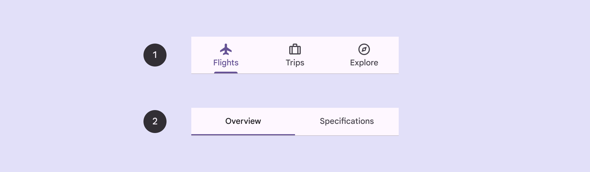
\n\n### Result\n\nThe following image shows the result of the previous snippet:\n**Figure 2.** 3 tabs--- Songs, Album, and Playlist--- arranged horizontally.\n\nAdditional resources\n--------------------\n\n- [Material 3 - Tabs](https://m3.material.io/components/tabs/guidelines)\n- [Navigation with Compose](/develop/ui/compose/navigation)"]]