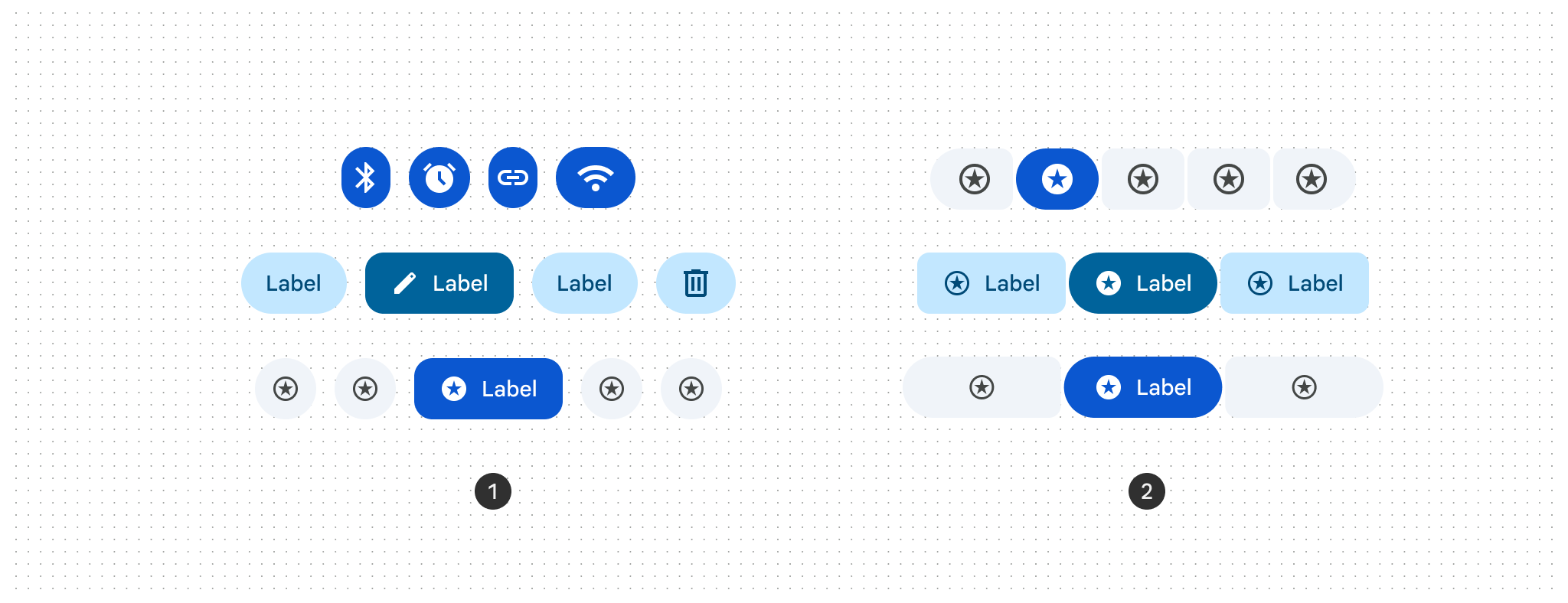
Button groups organize buttons and add interactions between them by applying coordinated shape, motion, and width changes to buttons and icon buttons. There are two variants of button groups:
- Standard button group: Adds interaction between adjacent buttons so they respond to each other when pressed.
- Connected button group: Groups toggle buttons to let users select options, switch views, or sort elements on a page.
Using button groups
- Applies shape morphing when buttons are pressed or selected.
- Connected button groups replace segmented buttons.
- Works with all button sizes: extra small (XS), small (S), medium (M), large (L), and extra large (XL).
- Supports single-select, multi-select, and selection-required patterns.
Standard button group
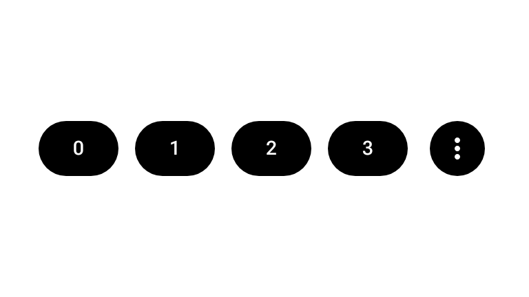
Use the ButtonGroup composable to place buttons in a horizontal sequence
that expands the pressed item, compresses neighboring items, and moves extra
items into an overflow menu when space is limited. Button groups should stay on
a single line rather than wrapping to a second line.
The following snippet demonstrates how to implement a standard button group with an overflow menu indicator:
@Composable fun ButtonGroupSample() { val numButtons = 10 ButtonGroup( overflowIndicator = { menuState -> ButtonGroupDefaults.OverflowIndicator(menuState = menuState) } ) { for (i in 0 until numButtons) { clickableItem(onClick = {}, label = "$i") } } }
Connected button group
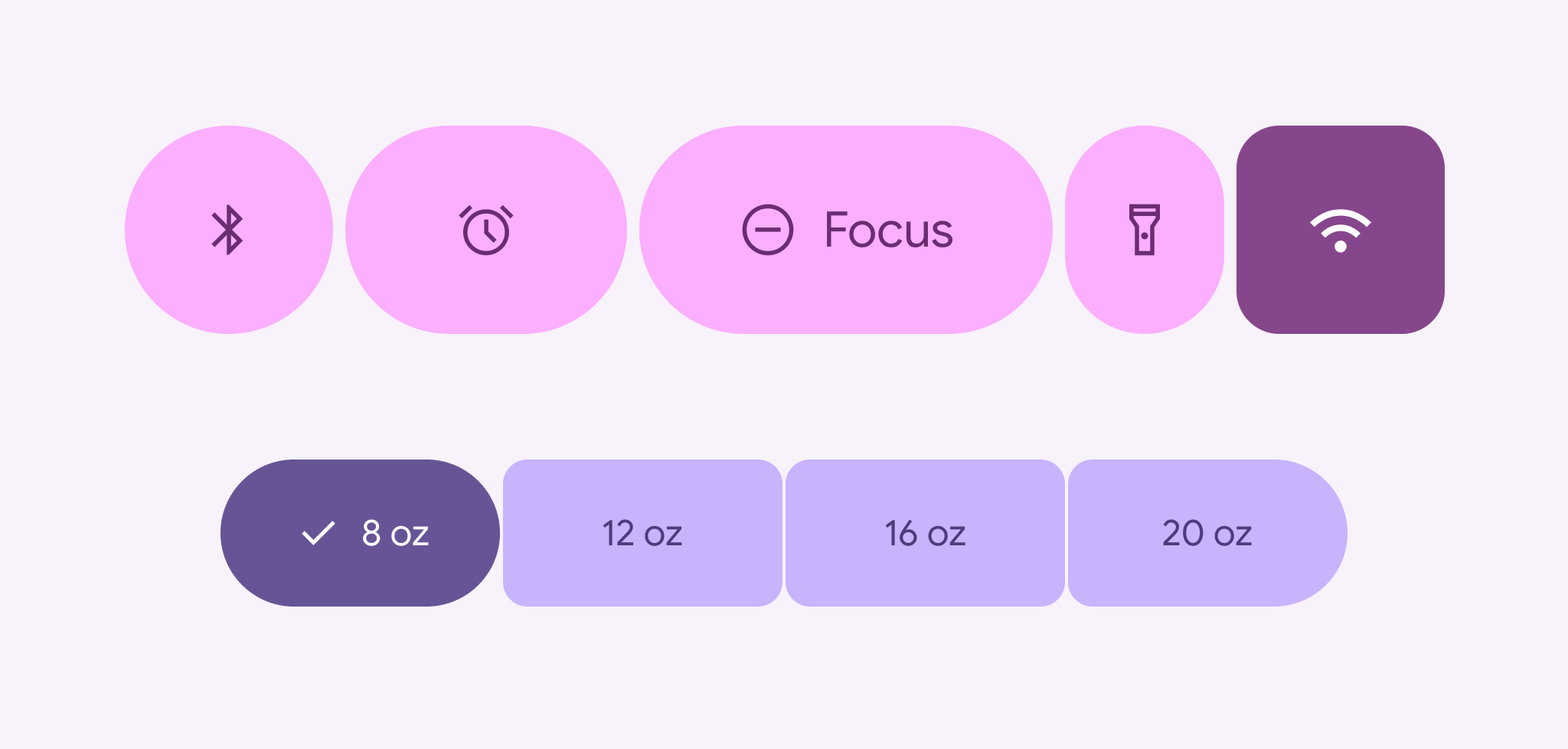
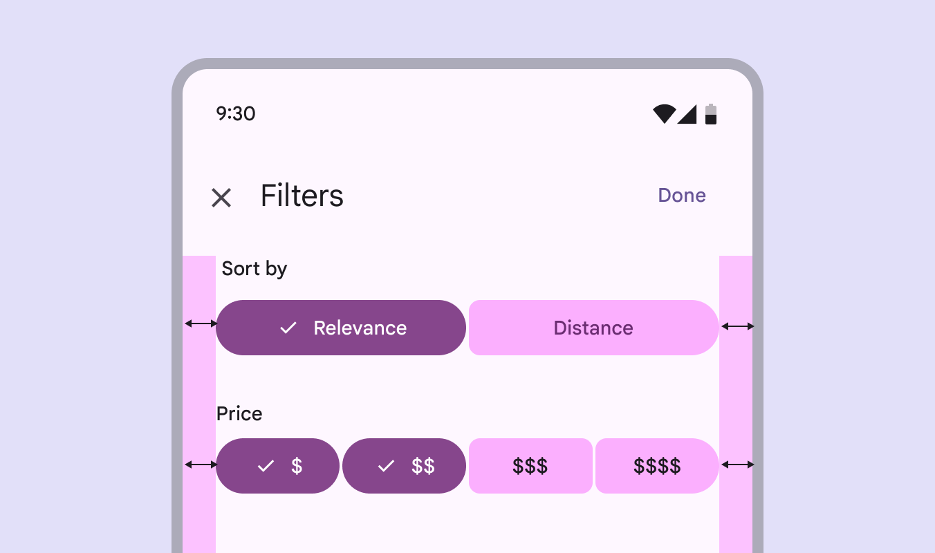
Use connected button groups for single-select or multi-select patterns built
with ToggleButton composables and ButtonGroupDefaults connected
shapes.
Single-select
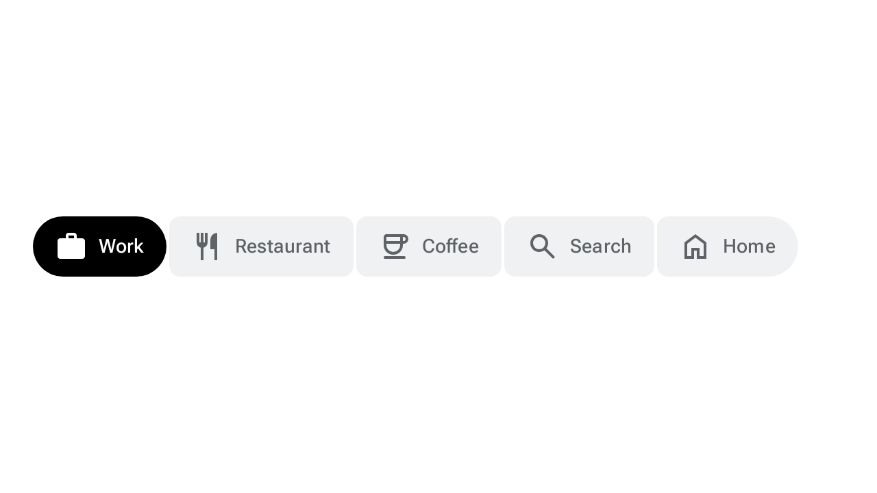
Use a single-select connected button group when the user chooses one option from
a mutually exclusive set. The following snippet implements a single-select
connected button group using ToggleButton and Role.RadioButton:
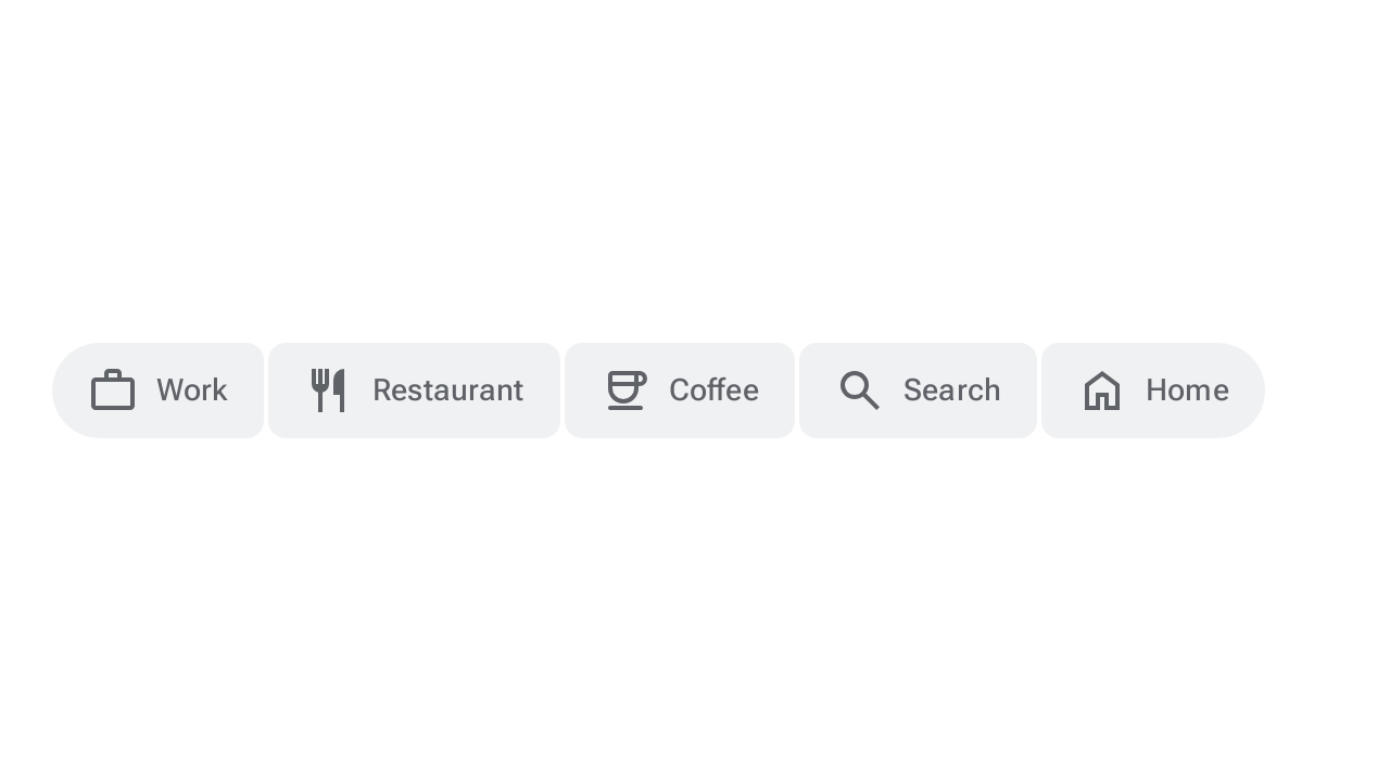
@Composable fun SingleSelectConnectedButtonGroupSample() { val options = listOf("Work", "Restaurant", "Coffee", "Search", "Home") val unCheckedIcons = listOf( AppIcons.Work, AppIcons.Restaurant, AppIcons.Coffee, AppIcons.Search, AppIcons.Home, ) val checkedIcons = listOf( AppIcons.WorkFilled, AppIcons.Restaurant, AppIcons.CoffeeFilled, AppIcons.Search, AppIcons.HomeFilled, ) var selectedIndex by remember { mutableIntStateOf(0) } FlexBox( modifier = Modifier.padding(horizontal = 8.dp).fillMaxWidth(), config = { direction(FlexDirection.Row) wrap(FlexWrap.Wrap) columnGap(ButtonGroupDefaults.ConnectedSpaceBetween) rowGap(2.dp) }, ) { options.forEachIndexed { index, label -> ToggleButton( checked = selectedIndex == index, onCheckedChange = { selectedIndex = index }, shapes = when (index) { 0 -> ButtonGroupDefaults.connectedLeadingButtonShapes() options.lastIndex -> ButtonGroupDefaults.connectedTrailingButtonShapes() else -> ButtonGroupDefaults.connectedMiddleButtonShapes() }, modifier = Modifier.semantics { role = Role.RadioButton }, ) { Icon( painter = rememberVectorPainter( if (selectedIndex == index) checkedIcons[index] else unCheckedIcons[index] ), contentDescription = null, ) Spacer(Modifier.size(ToggleButtonDefaults.IconSpacing)) Text(label) } } } }
Multi-select
Use a multi-select connected button group when the user can toggle zero or more
options independently. The following snippet implements a multi-select connected
button group using ToggleButton and mutableStateListOf:
@Composable fun MultiSelectConnectedButtonGroupSample() { val options = listOf("Work", "Restaurant", "Coffee", "Search", "Home") val unCheckedIcons = listOf( AppIcons.Work, AppIcons.Restaurant, AppIcons.Coffee, AppIcons.Search, AppIcons.Home, ) val checkedIcons = listOf( AppIcons.WorkFilled, AppIcons.Restaurant, AppIcons.CoffeeFilled, AppIcons.Search, AppIcons.HomeFilled, ) val checked = remember { mutableStateListOf(false, false, false, false, false) } FlexBox( modifier = Modifier.padding(horizontal = 8.dp).fillMaxWidth(), config = { direction(FlexDirection.Row) wrap(FlexWrap.Wrap) columnGap(ButtonGroupDefaults.ConnectedSpaceBetween) rowGap(2.dp) }, ) { options.forEachIndexed { index, label -> ToggleButton( checked = checked[index], onCheckedChange = { checked[index] = it }, shapes = when (index) { 0 -> ButtonGroupDefaults.connectedLeadingButtonShapes() options.lastIndex -> ButtonGroupDefaults.connectedTrailingButtonShapes() else -> ButtonGroupDefaults.connectedMiddleButtonShapes() }, ) { Icon( painter = rememberVectorPainter( if (checked[index]) checkedIcons[index] else unCheckedIcons[index] ), contentDescription = null, ) Spacer(Modifier.size(ToggleButtonDefaults.IconSpacing)) Text(label) } } } }