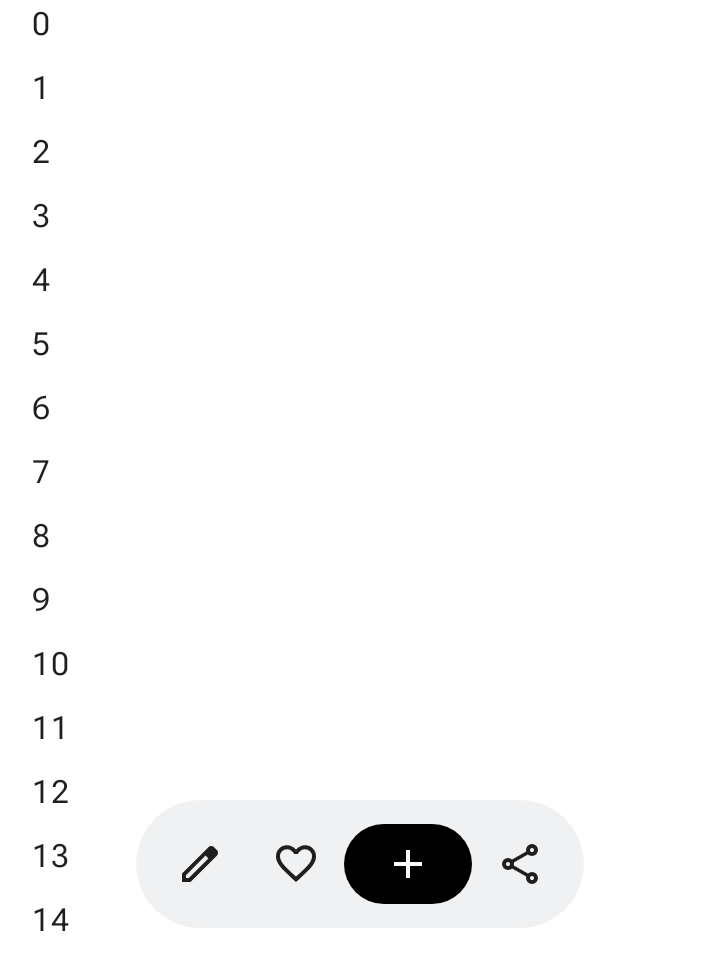
The floating toolbar floats above the body content. It's best used for contextual actions relevant to the body content or the specific page.
You can position a floating toolbar anywhere on the screen to float over the rest of the content, offering versatile placement and space for multiple actions.
Using the floating toolbar
- Floating toolbars show controls relevant to the current page.
- Floating toolbars can act as navigation controls between related pages in a product hierarchy.
- If more actions are needed, use an overflow menu.
- The floating toolbar's container should remain fully visible on screen.
- Choose the most essential actions to show on screen by default.
Layout and colors
Floating toolbars can be horizontal (HorizontalFloatingToolbar) or
vertical (VerticalFloatingToolbar), and can use standard or vibrant
color schemes from FloatingToolbarDefaults.
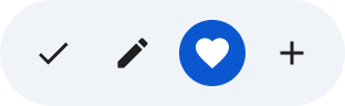

Floating toolbar with a FAB
Use an accompanying floating action button (FAB) for the highest-priority action in the view, or to complement the toolbar's controls.
Examples
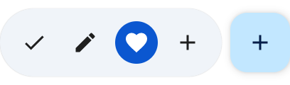
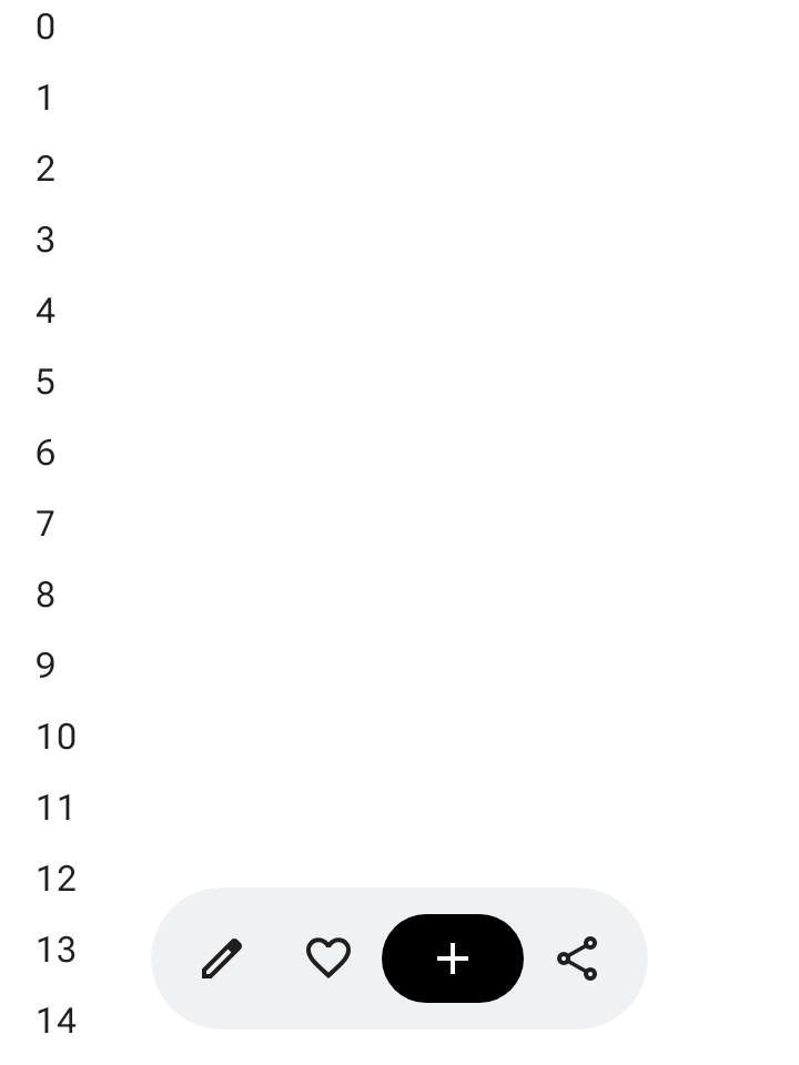
Expandable horizontal floating toolbar
Apply Modifier.floatingToolbarVerticalNestedScroll to a scrollable container
so HorizontalFloatingToolbar automatically collapses its leading and
trailing actions when the user scrolls down and expands when scrolling up:
@Composable fun ExpandableHorizontalFloatingToolbarSample() { var expanded by rememberSaveable { mutableStateOf(true) } Scaffold { innerPadding -> Box(Modifier.padding(innerPadding)) { HorizontalFloatingToolbar( modifier = Modifier.align(Alignment.BottomCenter) .offset(y = -FloatingToolbarDefaults.ScreenOffset) .zIndex(1f), expanded = expanded, leadingContent = { IconButton(onClick = { /* doSomething() */ }) { Icon(painter = rememberVectorPainter(AppIcons.Edit), contentDescription = "Edit") } IconButton(onClick = { /* doSomething() */ }) { Icon(painter = rememberVectorPainter(AppIcons.Favorite), contentDescription = "Favorite") } }, trailingContent = { IconButton(onClick = { /* doSomething() */ }) { Icon(painter = rememberVectorPainter(AppIcons.Share), contentDescription = "Share") } }, content = { FilledIconButton( modifier = Modifier.width(64.dp), onClick = { /* doSomething() */ }, ) { Icon(painter = rememberVectorPainter(AppIcons.Add), contentDescription = "Add") } }, ) // ... } } }
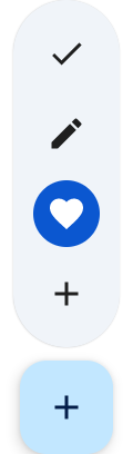
Expandable vertical floating toolbar
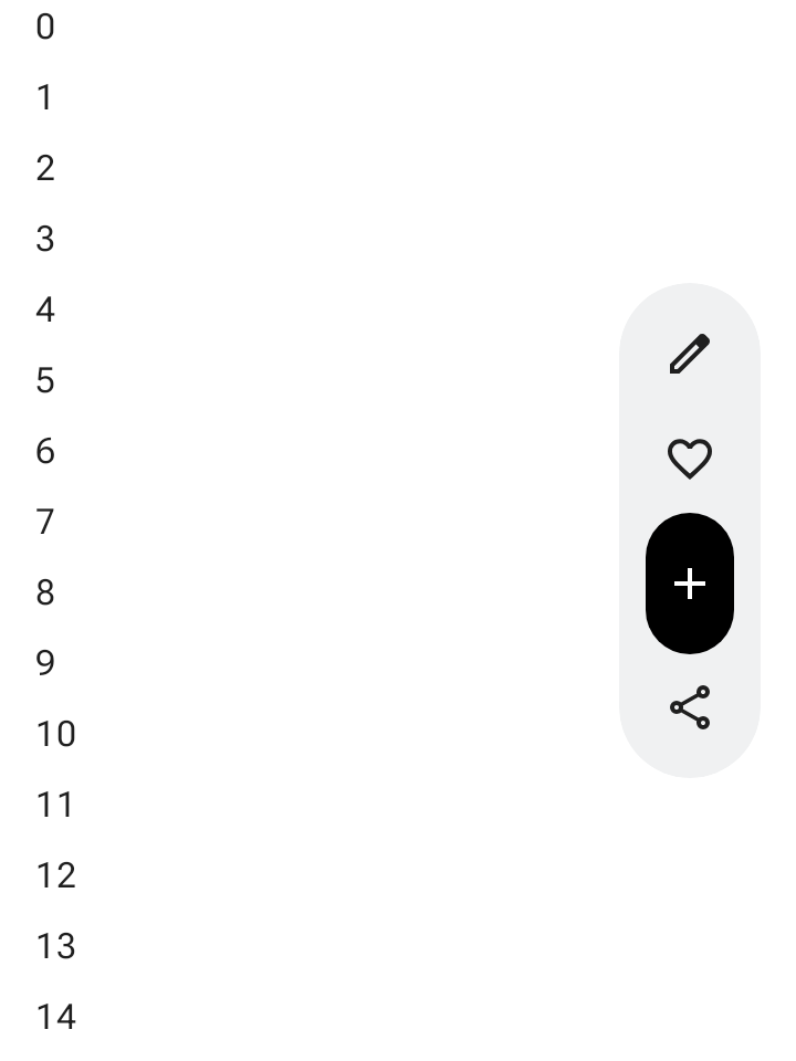
Use VerticalFloatingToolbar anchored to the side of the screen when
vertical layout space suits your screen hierarchy. Like the horizontal variant,
it can expand and collapse in response to scroll gestures:
@Composable fun ExpandableVerticalFloatingToolbarSample() { var expanded by rememberSaveable { mutableStateOf(true) } Scaffold { innerPadding -> Box(Modifier.padding(innerPadding)) { VerticalFloatingToolbar( modifier = Modifier.align(Alignment.CenterEnd) .offset(x = -FloatingToolbarDefaults.ScreenOffset) .zIndex(1f), expanded = expanded, leadingContent = { IconButton(onClick = { /* doSomething() */ }) { Icon(painter = rememberVectorPainter(AppIcons.Edit), contentDescription = "Edit") } IconButton(onClick = { /* doSomething() */ }) { Icon(painter = rememberVectorPainter(AppIcons.Favorite), contentDescription = "Favorite") } }, trailingContent = { IconButton(onClick = { /* doSomething() */ }) { Icon(painter = rememberVectorPainter(AppIcons.Share), contentDescription = "Share") } }, content = { FilledIconButton( modifier = Modifier.height(64.dp), onClick = { /* doSomething() */ }, ) { Icon(painter = rememberVectorPainter(AppIcons.Add), contentDescription = "Add") } }, ) // ... } } }
Scrollable floating toolbar
To slide the entire floating toolbar off screen while scrolling rather than
collapsing its items, pass FloatingToolbarDefaults.exitAlwaysScrollBehavior to
both Modifier.nestedScroll and the toolbar's scrollBehavior parameter:
@Composable fun ScrollableHorizontalFloatingToolbarSample() { val exitAlwaysScrollBehavior = FloatingToolbarDefaults.exitAlwaysScrollBehavior( exitDirection = FloatingToolbarExitDirection.Bottom ) Scaffold(modifier = Modifier.nestedScroll(exitAlwaysScrollBehavior)) { innerPadding -> Box(Modifier.padding(innerPadding)) { HorizontalFloatingToolbar( modifier = Modifier.align(Alignment.BottomCenter) .offset(y = -FloatingToolbarDefaults.ScreenOffset) .zIndex(1f), expanded = true, leadingContent = { IconButton(onClick = { /* doSomething() */ }) { Icon(painter = rememberVectorPainter(AppIcons.Edit), contentDescription = "Edit") } IconButton(onClick = { /* doSomething() */ }) { Icon(painter = rememberVectorPainter(AppIcons.Favorite), contentDescription = "Favorite") } }, trailingContent = { IconButton(onClick = { /* doSomething() */ }) { Icon(painter = rememberVectorPainter(AppIcons.Share), contentDescription = "Share") } }, content = { FilledIconButton( modifier = Modifier.width(64.dp), onClick = { /* doSomething() */ }, ) { Icon(painter = rememberVectorPainter(AppIcons.Add), contentDescription = "Add") } }, scrollBehavior = exitAlwaysScrollBehavior, ) // ... } } }