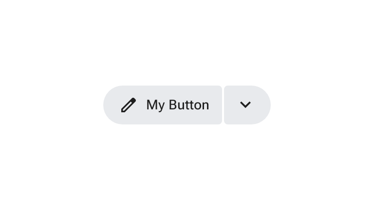
A split button defines a two-button group where the leading button performs a primary action and the trailing button opens a secondary set of contextually related options.
When activated, the trailing menu button rotates its icon and changes shape. Split buttons can be placed alone or alongside other buttons of the same size.
Using split buttons
- Opens a menu to give users secondary options related to the primary action.
- Works alone or alongside standard buttons and icon buttons.
- Typically opens a menu, but can be customized to open other components such as cards.
- Supports the same five sizes as buttons and icon buttons: extra small (XS), small (S), medium (M), large (L), and extra large (XL).
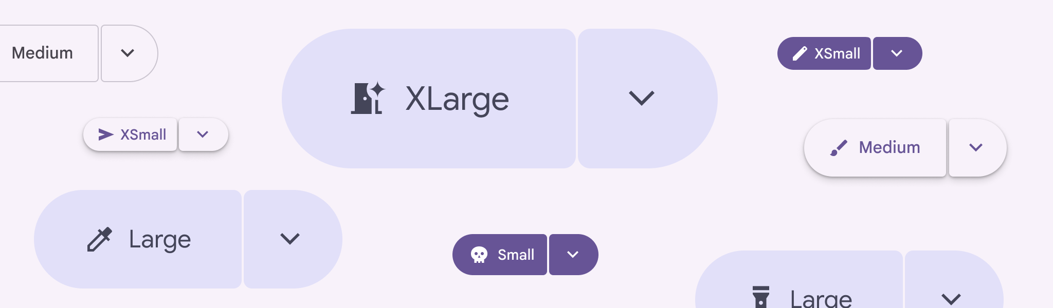
Examples
Filled split button
A filled split button is the high-emphasis variant used for important or final
actions. The following snippet implements a filled split button using
SplitButtonLayout with SplitButtonDefaults.LeadingButton and
SplitButtonDefaults.TrailingButton:
@Composable fun FilledSplitButtonSample() { var checked by rememberSaveable { mutableStateOf(false) } SplitButtonLayout( leadingButton = { SplitButtonDefaults.LeadingButton(onClick = { /* Do Nothing */ }) { Icon( painter = rememberVectorPainter(AppIcons.Edit), modifier = Modifier.size(SplitButtonDefaults.LeadingIconSize), contentDescription = null, ) Spacer(Modifier.size(ButtonDefaults.IconSpacing)) Text("My Button") } }, trailingButton = { SplitButtonDefaults.TrailingButton( checked = checked, onCheckedChange = { checked = it }, modifier = Modifier.semantics { stateDescription = if (checked) "Expanded" else "Collapsed" contentDescription = "Toggle Button" }, ) { val rotation: Float by animateFloatAsState( targetValue = if (checked) 180f else 0f, label = "Trailing Icon Rotation", ) Icon( painter = rememberVectorPainter(AppIcons.KeyboardArrowDown), modifier = Modifier.size(SplitButtonDefaults.TrailingIconSize).graphicsLayer { this.rotationZ = rotation }, contentDescription = null, ) } }, ) }
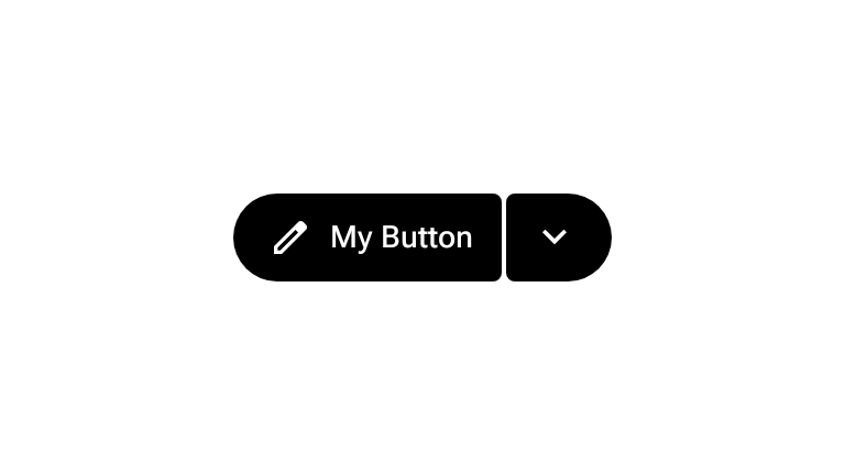
Tonal split button
A tonal split button is the medium-emphasis variant of a split button. The
following snippet uses SplitButtonDefaults.TonalLeadingButton and
SplitButtonDefaults.TonalTrailingButton inside SplitButtonLayout:
@Composable fun TonalSplitButtonSample() { var checked by rememberSaveable { mutableStateOf(false) } SplitButtonLayout( leadingButton = { SplitButtonDefaults.TonalLeadingButton(onClick = { /* Do Nothing */ }) { Icon( painter = rememberVectorPainter(AppIcons.Edit), modifier = Modifier.size(SplitButtonDefaults.LeadingIconSize), contentDescription = null, ) Spacer(Modifier.size(ButtonDefaults.IconSpacing)) Text("My Button") } }, trailingButton = { SplitButtonDefaults.TonalTrailingButton( checked = checked, onCheckedChange = { checked = it }, modifier = Modifier.semantics { stateDescription = if (checked) "Expanded" else "Collapsed" contentDescription = "Toggle Button" }, ) { val rotation: Float by animateFloatAsState( targetValue = if (checked) 180f else 0f, label = "Trailing Icon Rotation", ) Icon( painter = rememberVectorPainter(AppIcons.KeyboardArrowDown), modifier = Modifier.size(SplitButtonDefaults.TrailingIconSize).graphicsLayer { this.rotationZ = rotation }, contentDescription = null, ) } }, ) }