

नेविगेशन रेल की मदद से, बड़ी स्क्रीन वाले डिवाइसों पर चलने वाले ऐप्लिकेशन में डेस्टिनेशन ऐक्सेस किए जा सकते हैं. आपको नेविगेशन रेल का इस्तेमाल इनके लिए करना चाहिए:
- टॉप-लेवल डेस्टिनेशन, जिन्हें ऐप्लिकेशन में कहीं से भी ऐक्सेस किया जा सकता है
- तीन से सात मुख्य डेस्टिनेशन
- टैबलेट या डेस्कटॉप लेआउट

इस पेज पर, अपने ऐप्लिकेशन में रेल दिखाने का तरीका बताया गया है. साथ ही, इससे जुड़ी स्क्रीन और बुनियादी नेविगेशन के बारे में भी बताया गया है.
एपीआई सरफ़ेस
अपने ऐप्लिकेशन में रेल लागू करने के लिए, NavigationRailItem के साथ NavigationRail कंपोज़ेबल का इस्तेमाल करें. NavigationRailItem, रेल कॉलम में मौजूद एक रेल आइटम को दिखाता है.
NavigationRailItem में ये मुख्य पैरामीटर शामिल हैं:
selected: इससे यह तय होता है कि मौजूदा रेल आइटम को विज़ुअल तौर पर हाइलाइट किया गया है या नहीं.onClick(): यह एक ज़रूरी lambda फ़ंक्शन है. इससे यह तय होता है कि जब उपयोगकर्ता रेल आइटम पर क्लिक करे, तो क्या कार्रवाई की जाए. यहां आम तौर पर, नेविगेशन इवेंट मैनेज किए जाते हैं, चुनी गई रेल आइटम की स्थिति अपडेट की जाती है या उससे जुड़ा कॉन्टेंट लोड किया जाता है.label: रेल आइटम में टेक्स्ट दिखाता है. ज़रूरी नहीं.icon: रेल आइटम में एक आइकॉन दिखाता है. ज़रूरी नहीं.
उदाहरण: रेल-आधारित नेविगेशन
नीचे दिए गए स्निपेट में नेविगेशन रेल लागू की गई है, ताकि उपयोगकर्ता ऐप्लिकेशन में अलग-अलग स्क्रीन के बीच नेविगेट कर सकें:
@Composable fun NavigationRailExample(modifier: Modifier = Modifier) { val navController = rememberNavController() val startDestination = Destination.SONGS var selectedDestination by rememberSaveable { mutableIntStateOf(startDestination.ordinal) } Scaffold(modifier = modifier) { contentPadding -> NavigationRail(modifier = Modifier.padding(contentPadding)) { Destination.entries.forEachIndexed { index, destination -> NavigationRailItem( selected = selectedDestination == index, onClick = { navController.navigate(route = destination.route) selectedDestination = index }, icon = { Icon( destination.icon, contentDescription = destination.contentDescription ) }, label = { Text(destination.label) } ) } } AppNavHost(navController, startDestination) } }
खास बातें
NavigationRail, रेल आइटम का एक वर्टिकल कॉलम दिखाता है. इसमें हर आइटम,Destinationसे जुड़ा होता है.val navController = rememberNavController(),NavHostControllerका एक इंस्टेंस बनाता है और उसे याद रखता है. यह इंस्टेंस,NavHostमें नेविगेशन को मैनेज करता है.var selectedDestination by rememberSaveable { mutableIntStateOf(startDestination.ordinal) }, चुने गए रेल आइटम की स्थिति को मैनेज करता है.startDestination.ordinal,Destination.SONGSenum एंट्री का न्यूमेरिक इंडेक्स (पोज़िशन) दिखाता है.
- जब किसी रेल आइटम पर क्लिक किया जाता है, तो उससे जुड़ी स्क्रीन पर जाने के लिए
navController.navigate(route =
destination.route)
को कॉल किया जाता है. NavigationRailItemकाonClickलैम्ब्डा,selectedDestinationस्टेट को अपडेट करता है, ताकि क्लिक किए गए रेल आइटम को विज़ुअल तौर पर हाइलाइट किया जा सके.- यह
AppNavHostकंपोज़ेबल को कॉल करता है. साथ ही, चुनी गई स्क्रीन का असल कॉन्टेंट दिखाने के लिए,navControllerऔरstartDestinationको पास करता है.
नतीजा
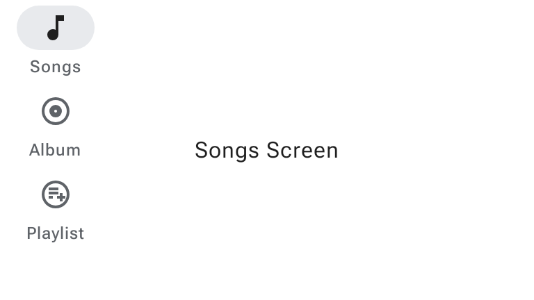
नीचे दी गई इमेज में, पिछले स्निपेट का नतीजा दिखाया गया है:
M3 Expressive अपडेट
Material 3 Expressive में WideNavigationRail और ModalWideNavigationRail को शामिल किया गया है. ये स्टैंडर्ड NavigationRail के साथ-साथ, अतिरिक्त विकल्पों के तौर पर छोटा और बड़ा किए जाने की सुविधा के साथ काम करते हैं.

नेविगेशन रेल के लिए, M3 एक्सप्रेसिव अपडेट के बारे में ज़्यादा जानने के लिए, मटीरियल डिज़ाइन 3 के नेविगेशन रेल से जुड़े दिशा-निर्देश देखें.
छोटा और बड़ा किया गया चौड़ा नेविगेशन रेल
चौड़ी नेविगेशन रेल के दो स्टेटस होते हैं: छोटा किया गया और बड़ा किया गया. जब उपयोगकर्ता मेन्यू बटन चुनता है, तो ये स्टेटस एक-दूसरे में बदल सकते हैं. यहां दिए गए स्निपेट में, WideNavigationRail को लागू करने का तरीका बताया गया है. यह स्निपेट, छोटा और बड़ा होने के बीच ऐनिमेशन दिखाता है:
@Composable fun WideNavigationRailResponsiveSample() { var selectedItem by remember { mutableIntStateOf(0) } val items = listOf("Home", "Search", "Settings") val selectedIcons = listOf(AppIcons.HomeFilled, AppIcons.Search, AppIcons.SettingsFilled) val unselectedIcons = listOf(AppIcons.Home, AppIcons.Search, AppIcons.Settings) val state = rememberWideNavigationRailState() val scope = rememberCoroutineScope() Row(Modifier.fillMaxWidth()) { WideNavigationRail( state = state, header = { IconButton( modifier = Modifier .padding(start = 24.dp) .semantics { // The button must announce the expanded or collapsed state of the rail // for accessibility. stateDescription = if (state.currentValue == WideNavigationRailValue.Expanded) "Expanded" else "Collapsed" }, onClick = { scope.launch { if (state.targetValue == WideNavigationRailValue.Expanded) state.collapse() else state.expand() } }, ) { if (state.targetValue == WideNavigationRailValue.Expanded) { Icon(painter = rememberVectorPainter(AppIcons.MenuOpen), "Collapse rail") } else { Icon(painter = rememberVectorPainter(AppIcons.Menu), "Expand rail") } } }, ) { items.forEachIndexed { index, item -> WideNavigationRailItem( railExpanded = state.targetValue == WideNavigationRailValue.Expanded, icon = { val imageVector = if (selectedItem == index) { selectedIcons[index] } else { unselectedIcons[index] } Icon( painter = rememberVectorPainter(imageVector), contentDescription = null ) }, label = { Text(item) }, selected = selectedItem == index, onClick = { selectedItem = index }, ) } } val textString = if (state.currentValue == WideNavigationRailValue.Expanded) "expanded" else "collapsed" Column { Text(modifier = Modifier.padding(16.dp), text = "The rail is $textString.") } } }

मोडल वाइड नेविगेशन रेल
बड़ा किया गया नेविगेशन रेल, स्टैंडर्ड या मॉडल हो सकता है. मॉडल कॉन्फ़िगरेशन, मुख्य कॉन्टेंट को ओवरलैप करता है और मेन्यू आइकॉन से खुलता है. यहां दिए गए स्निपेट में, ModalWideNavigationRail को लागू करने का तरीका बताया गया है:
@Composable fun ModalWideNavigationRailSample() { var selectedItem by remember { mutableIntStateOf(0) } val items = listOf("Home", "Search", "Settings") val selectedIcons = listOf(AppIcons.HomeFilled, AppIcons.Search, AppIcons.SettingsFilled) val unselectedIcons = listOf(AppIcons.Home, AppIcons.Search, AppIcons.Settings) val state = rememberWideNavigationRailState() val scope = rememberCoroutineScope() Row(Modifier.fillMaxWidth()) { ModalWideNavigationRail( state = state, // Note: the value of expandedHeaderTopPadding depends on the layout of your screen in // order to achieve the best alignment. expandedHeaderTopPadding = 64.dp, header = { IconButton( modifier = Modifier .padding(start = 24.dp) .semantics { // The button must announce the expanded or collapsed state of the rail // for accessibility. stateDescription = if (state.currentValue == WideNavigationRailValue.Expanded) "Expanded" else "Collapsed" }, onClick = { scope.launch { if (state.targetValue == WideNavigationRailValue.Expanded) state.collapse() else state.expand() } }, ) { if (state.targetValue == WideNavigationRailValue.Expanded) Icon(painter = rememberVectorPainter(AppIcons.MenuOpen), "Collapse rail") else Icon(painter = rememberVectorPainter(AppIcons.Menu), "Expand rail") } }, ) { items.forEachIndexed { index, item -> WideNavigationRailItem( railExpanded = state.targetValue == WideNavigationRailValue.Expanded, icon = { Icon( painter = rememberVectorPainter(if (selectedItem == index) selectedIcons[index] else unselectedIcons[index]), contentDescription = null, ) }, label = { Text(item) }, selected = selectedItem == index, onClick = { selectedItem = index }, ) } } val textString = if (state.currentValue == WideNavigationRailValue.Expanded) "expanded" else "collapsed" Column { Text(modifier = Modifier.padding(16.dp), text = "The rail is $textString.") } } }

खारिज किया जा सकने वाला मोडल वाइड नेविगेशन रेल
Android पर, पीछे जाने पर झलक दिखाने वाले हाथ के जेस्चर की मदद से, उपयोगकर्ता स्क्रीन पर बाईं या दाईं ओर स्वाइप करके, पीछे जा सकते हैं या मॉडल कॉम्पोनेंट को खारिज कर सकते हैं. यहां दिए गए स्निपेट में, hideOnCollapse = true को सेट करके, खारिज किए जा सकने वाले ModalWideNavigationRail को लागू करने का तरीका बताया गया है:
@Composable fun DismissibleModalWideNavigationRailSample() { var selectedItem by remember { mutableIntStateOf(0) } val items = listOf("Home", "Search", "Settings") val selectedIcons = listOf(AppIcons.HomeFilled, AppIcons.Search, AppIcons.SettingsFilled) val unselectedIcons = listOf(AppIcons.Home, AppIcons.Search, AppIcons.Settings) val state = rememberWideNavigationRailState() val scope = rememberCoroutineScope() Row(Modifier.fillMaxSize()) { ModalWideNavigationRail(state = state, hideOnCollapse = true) { items.forEachIndexed { index, item -> WideNavigationRailItem( railExpanded = true, icon = { Icon( painter = rememberVectorPainter(if (selectedItem == index) selectedIcons[index] else unselectedIcons[index]), contentDescription = null, ) }, label = { Text(item) }, selected = selectedItem == index, onClick = { selectedItem = index scope.launch { state.collapse() } }, ) } } Column(Modifier.fillMaxWidth(), horizontalAlignment = Alignment.CenterHorizontally) { val currentPage = items.get(selectedItem) Button(onClick = { scope.launch { state.expand() } }, Modifier.padding(32.dp)) { Text(text = "$currentPage Page\nOpen modal rail", textAlign = TextAlign.Center) } } } }
