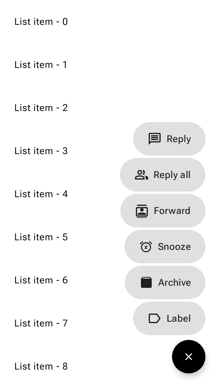
懸浮動作按鈕 (FAB) 選單會從 FAB 開啟,在 Material 3 中顯示多個相關動作。
這樣一來,使用者就能輕鬆存取主要動作,同時隱藏不必要的次要動作,保持 UI 簡潔,取代快速撥號和堆疊的小型 FAB。
使用懸浮動作按鈕選單
- 從 FAB 開啟,在畫面上顯示兩到六個相關動作。
- 所有 FAB 大小都使用同一個 FAB 選單大小。
- 不適用於延伸的 FAB。
- 支援主要、次要和第三色組合。

範例
FAB 選單範例
將 FloatingActionButtonMenu 與 ToggleFloatingActionButton 搭配使用,即可展開及收合 FloatingActionButtonMenuItem 動作清單。下列程式碼片段會在向下捲動清單時隱藏切換 FAB,並在輕觸時展開選單:
@Composable fun FloatingActionButtonMenuSample() { val listState = rememberLazyListState() val fabVisible by remember { derivedStateOf { listState.firstVisibleItemIndex == 0 } } Box { LazyColumn(state = listState, modifier = Modifier.fillMaxSize()) { for (index in 0 until 100) { item { Text(text = "List item - $index", modifier = Modifier.padding(24.dp)) } } } val items = listOf( AppIcons.Message to "Reply", AppIcons.People to "Reply all", AppIcons.Contacts to "Forward", AppIcons.Snooze to "Snooze", AppIcons.Archive to "Archive", AppIcons.Label to "Label", ) var fabMenuExpanded by rememberSaveable { mutableStateOf(false) } FloatingActionButtonMenu( modifier = Modifier.align(Alignment.BottomEnd), expanded = fabMenuExpanded, button = { ToggleFloatingActionButton( modifier = Modifier.semantics { traversalIndex = -1f stateDescription = if (fabMenuExpanded) "Expanded" else "Collapsed" contentDescription = "Toggle menu" } .animateFloatingActionButton( visible = fabVisible || fabMenuExpanded, alignment = Alignment.BottomEnd, ), checked = fabMenuExpanded, onCheckedChange = { fabMenuExpanded = !fabMenuExpanded }, ) { val imageVector by remember { derivedStateOf { if (checkedProgress > 0.5f) AppIcons.Close else AppIcons.Add } } Icon( painter = rememberVectorPainter(imageVector), contentDescription = null, modifier = Modifier.animateIcon({ checkedProgress }), ) } }, ) { items.forEach { item -> FloatingActionButtonMenuItem( onClick = { fabMenuExpanded = false }, icon = { Icon(painter = rememberVectorPainter(item.first), contentDescription = null) }, text = { Text(text = item.second) }, ) } } } }