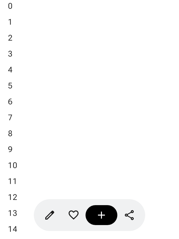
סרגל הכלים הצף מופיע מעל תוכן גוף המסמך. הוא מתאים במיוחד לפעולות לפי הקשר שרלוונטיות לתוכן של גוף ההודעה או לדף הספציפי.
אפשר למקם סרגל כלים צף בכל מקום במסך, כך שהוא יצוף מעל שאר התוכן. זה מאפשר גמישות במיקום ומשאיר מקום לפעולות מרובות.
שימוש בסרגל הכלים הצף
- בסרגלי כלים צפים מופיעים פקדים שרלוונטיים לדף הנוכחי.
- סרגלי כלים צפים יכולים לשמש כלחצני ניווט בין דפים קשורים בהיררכיית המוצר.
- אם צריך פעולות נוספות, משתמשים בתפריט האפשרויות הנוספות.
- הקונטיינר של סרגל הכלים הצף צריך להישאר גלוי לגמרי במסך.
- בוחרים את הפעולות הכי חשובות שיוצגו במסך כברירת מחדל.
פריסה וצבעים
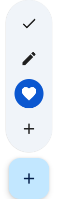
סרגלי כלים צפים יכולים להיות אופקיים (HorizontalFloatingToolbar) או אנכיים (VerticalFloatingToolbar), ואפשר להשתמש בהם בערכות צבעים רגילות או תוססות מ-FloatingToolbarDefaults.
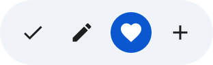
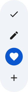
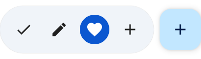
סרגל כלים צף עם לחצן פעולה צף (FAB)
אפשר להשתמש בכפתור פעולה צף (FAB) נלווה לפעולה בעלת העדיפות הגבוהה ביותר בתצוגה, או כדי להשלים את אמצעי הבקרה של סרגל הכלים.
דוגמאות
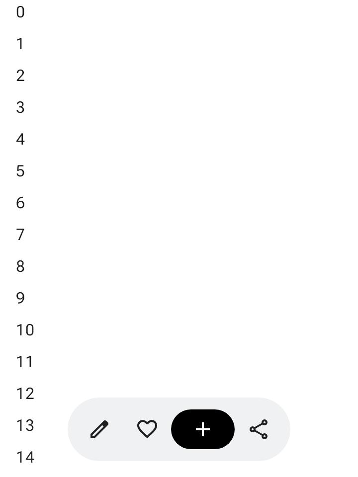
סרגל כלים צף אופקי שניתן להרחבה
כדי ש-HorizontalFloatingToolbar יכווץ באופן אוטומטי את הפעולות בתחילת ובסוף הרשימה כשהמשתמש גולל למטה, וירחיב אותן כשהוא גולל למעלה, צריך להחיל את Modifier.floatingToolbarVerticalNestedScroll על קונטיינר שניתן לגלילה:
@Composable fun ExpandableHorizontalFloatingToolbarSample() { var expanded by rememberSaveable { mutableStateOf(true) } Scaffold { innerPadding -> Box(Modifier.padding(innerPadding)) { HorizontalFloatingToolbar( modifier = Modifier.align(Alignment.BottomCenter) .offset(y = -FloatingToolbarDefaults.ScreenOffset) .zIndex(1f), expanded = expanded, leadingContent = { IconButton(onClick = { /* doSomething() */ }) { Icon(painter = rememberVectorPainter(AppIcons.Edit), contentDescription = "Edit") } IconButton(onClick = { /* doSomething() */ }) { Icon(painter = rememberVectorPainter(AppIcons.Favorite), contentDescription = "Favorite") } }, trailingContent = { IconButton(onClick = { /* doSomething() */ }) { Icon(painter = rememberVectorPainter(AppIcons.Share), contentDescription = "Share") } }, content = { FilledIconButton( modifier = Modifier.width(64.dp), onClick = { /* doSomething() */ }, ) { Icon(painter = rememberVectorPainter(AppIcons.Add), contentDescription = "Add") } }, ) // ... } } }
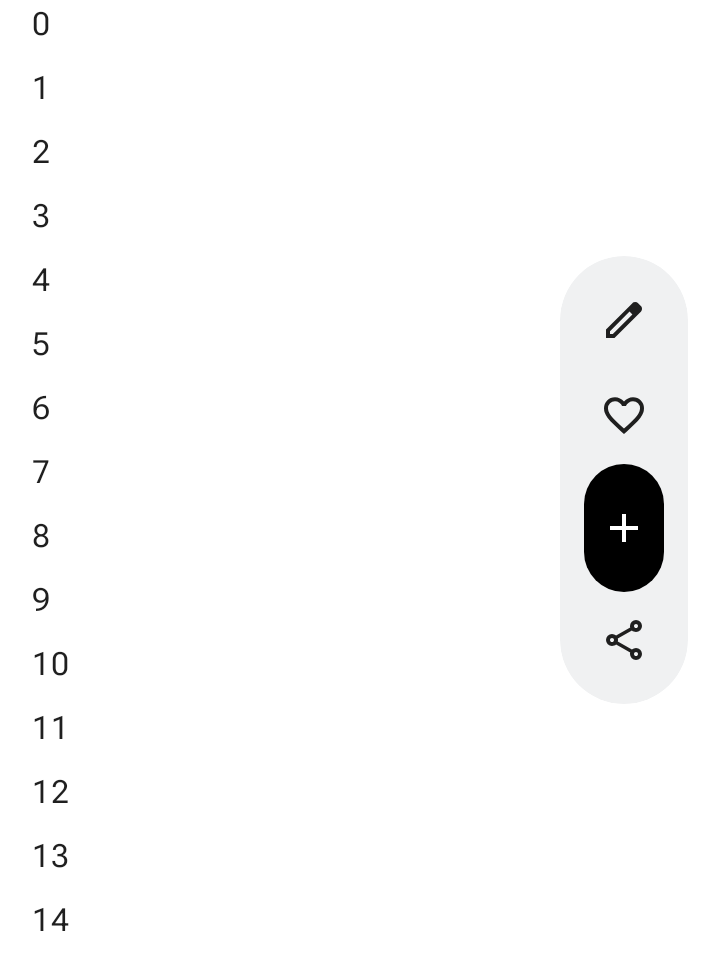
סרגל כלים צף אנכי שניתן להרחיב
השתמשו בVerticalFloatingToolbar שמעוגן לצד המסך כשפריסה אנכית מתאימה להיררכיית המסך. כמו הגרסה האופקית,
היא יכולה להתרחב ולהתכווץ בתגובה לתנועות גלילה:
@Composable fun ExpandableVerticalFloatingToolbarSample() { var expanded by rememberSaveable { mutableStateOf(true) } Scaffold { innerPadding -> Box(Modifier.padding(innerPadding)) { VerticalFloatingToolbar( modifier = Modifier.align(Alignment.CenterEnd) .offset(x = -FloatingToolbarDefaults.ScreenOffset) .zIndex(1f), expanded = expanded, leadingContent = { IconButton(onClick = { /* doSomething() */ }) { Icon(painter = rememberVectorPainter(AppIcons.Edit), contentDescription = "Edit") } IconButton(onClick = { /* doSomething() */ }) { Icon(painter = rememberVectorPainter(AppIcons.Favorite), contentDescription = "Favorite") } }, trailingContent = { IconButton(onClick = { /* doSomething() */ }) { Icon(painter = rememberVectorPainter(AppIcons.Share), contentDescription = "Share") } }, content = { FilledIconButton( modifier = Modifier.height(64.dp), onClick = { /* doSomething() */ }, ) { Icon(painter = rememberVectorPainter(AppIcons.Add), contentDescription = "Add") } }, ) // ... } } }
סרגל כלים צף שניתן לגלול בו
כדי להזיז את כל סרגל הכלים הצף אל מחוץ למסך בזמן הגלילה במקום לכווץ את הפריטים שלו, מעבירים את הערך FloatingToolbarDefaults.exitAlwaysScrollBehavior גם ל-Modifier.nestedScroll וגם לפרמטר scrollBehavior של סרגל הכלים:
@Composable fun ScrollableHorizontalFloatingToolbarSample() { val exitAlwaysScrollBehavior = FloatingToolbarDefaults.exitAlwaysScrollBehavior( exitDirection = FloatingToolbarExitDirection.Bottom ) Scaffold(modifier = Modifier.nestedScroll(exitAlwaysScrollBehavior)) { innerPadding -> Box(Modifier.padding(innerPadding)) { HorizontalFloatingToolbar( modifier = Modifier.align(Alignment.BottomCenter) .offset(y = -FloatingToolbarDefaults.ScreenOffset) .zIndex(1f), expanded = true, leadingContent = { IconButton(onClick = { /* doSomething() */ }) { Icon(painter = rememberVectorPainter(AppIcons.Edit), contentDescription = "Edit") } IconButton(onClick = { /* doSomething() */ }) { Icon(painter = rememberVectorPainter(AppIcons.Favorite), contentDescription = "Favorite") } }, trailingContent = { IconButton(onClick = { /* doSomething() */ }) { Icon(painter = rememberVectorPainter(AppIcons.Share), contentDescription = "Share") } }, content = { FilledIconButton( modifier = Modifier.width(64.dp), onClick = { /* doSomething() */ }, ) { Icon(painter = rememberVectorPainter(AppIcons.Add), contentDescription = "Add") } }, scrollBehavior = exitAlwaysScrollBehavior, ) // ... } } }