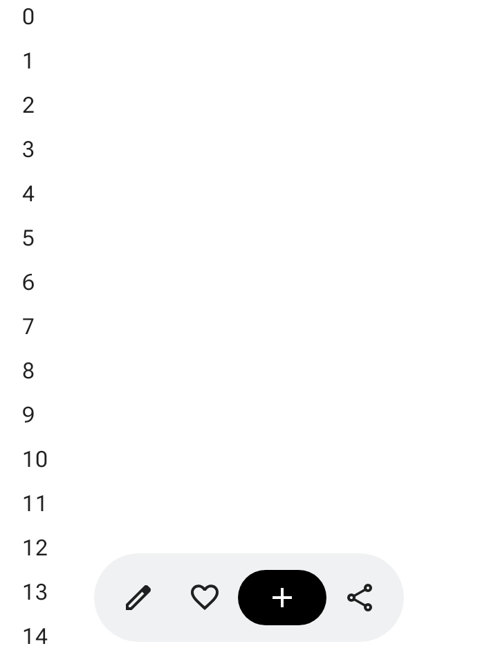
플로팅 툴바는 본문 콘텐츠 위에 떠 있습니다. 본문 콘텐츠 또는 특정 페이지와 관련된 상황별 작업에 사용하는 것이 가장 좋습니다.
화면의 어느 위치에나 플로팅 툴바를 배치하여 나머지 콘텐츠 위에 플로팅할 수 있으므로 다양한 배치와 여러 작업을 위한 공간을 제공할 수 있습니다.
플로팅 툴바 사용하기
- 플로팅 툴바에는 현재 페이지와 관련된 컨트롤이 표시됩니다.
- 플로팅 툴바는 제품 계층 구조에서 관련 페이지 간의 탐색 컨트롤 역할을 할 수 있습니다.
- 더 많은 작업이 필요한 경우 더보기 메뉴를 사용합니다.
- 플로팅 툴바의 컨테이너는 화면에 완전히 표시되어야 합니다.
- 화면에 기본으로 표시할 가장 중요한 작업을 선택합니다.
레이아웃 및 색상
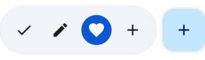
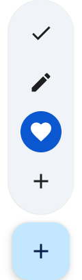
플로팅 툴바는 가로(HorizontalFloatingToolbar) 또는 세로(VerticalFloatingToolbar)일 수 있으며 FloatingToolbarDefaults의 표준 또는 선명한 색 구성표를 사용할 수 있습니다.


FAB가 있는 플로팅 툴바
뷰에서 우선순위가 가장 높은 작업에 플로팅 작업 버튼(FAB)을 사용하거나 툴바의 컨트롤을 보완합니다.
예
확장 가능한 가로 플로팅 툴바
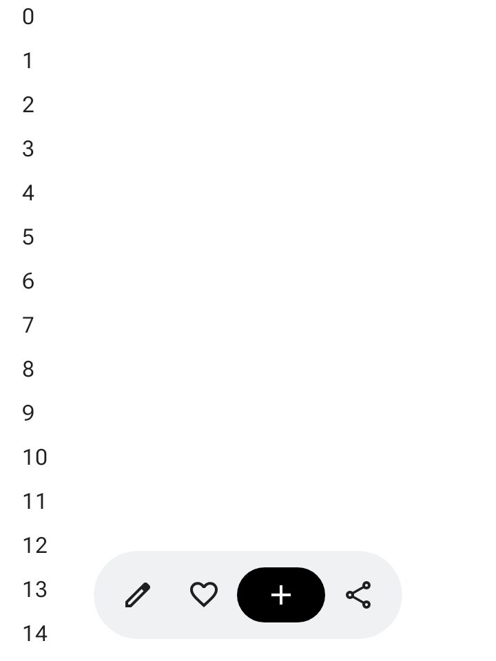
스크롤 가능한 컨테이너에 Modifier.floatingToolbarVerticalNestedScroll을 적용하여 사용자가 아래로 스크롤할 때 HorizontalFloatingToolbar가 선행 및 후행 작업을 자동으로 접고 위로 스크롤할 때 펼치도록 합니다.
@Composable fun ExpandableHorizontalFloatingToolbarSample() { var expanded by rememberSaveable { mutableStateOf(true) } Scaffold { innerPadding -> Box(Modifier.padding(innerPadding)) { HorizontalFloatingToolbar( modifier = Modifier.align(Alignment.BottomCenter) .offset(y = -FloatingToolbarDefaults.ScreenOffset) .zIndex(1f), expanded = expanded, leadingContent = { IconButton(onClick = { /* doSomething() */ }) { Icon(painter = rememberVectorPainter(AppIcons.Edit), contentDescription = "Edit") } IconButton(onClick = { /* doSomething() */ }) { Icon(painter = rememberVectorPainter(AppIcons.Favorite), contentDescription = "Favorite") } }, trailingContent = { IconButton(onClick = { /* doSomething() */ }) { Icon(painter = rememberVectorPainter(AppIcons.Share), contentDescription = "Share") } }, content = { FilledIconButton( modifier = Modifier.width(64.dp), onClick = { /* doSomething() */ }, ) { Icon(painter = rememberVectorPainter(AppIcons.Add), contentDescription = "Add") } }, ) // ... } } }
확장 가능한 세로 플로팅 툴바
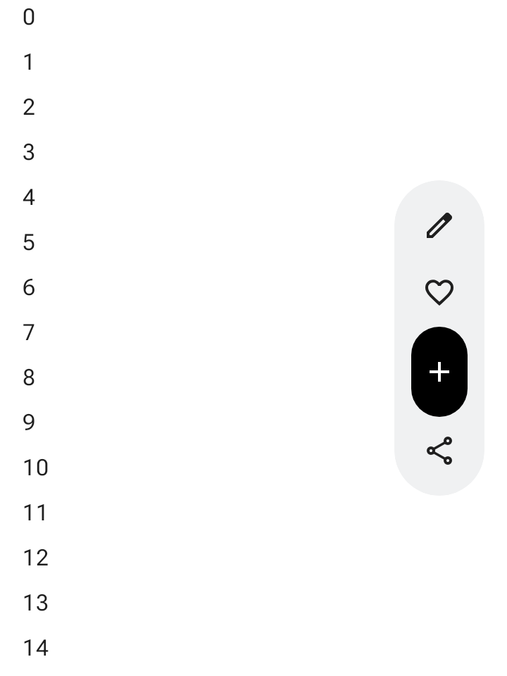
세로 레이아웃 공간이 화면 계층 구조에 적합한 경우 화면 측면에 고정된 VerticalFloatingToolbar을 사용합니다. 가로 변형과 마찬가지로 스크롤 동작에 따라 펼치고 접을 수 있습니다.
@Composable fun ExpandableVerticalFloatingToolbarSample() { var expanded by rememberSaveable { mutableStateOf(true) } Scaffold { innerPadding -> Box(Modifier.padding(innerPadding)) { VerticalFloatingToolbar( modifier = Modifier.align(Alignment.CenterEnd) .offset(x = -FloatingToolbarDefaults.ScreenOffset) .zIndex(1f), expanded = expanded, leadingContent = { IconButton(onClick = { /* doSomething() */ }) { Icon(painter = rememberVectorPainter(AppIcons.Edit), contentDescription = "Edit") } IconButton(onClick = { /* doSomething() */ }) { Icon(painter = rememberVectorPainter(AppIcons.Favorite), contentDescription = "Favorite") } }, trailingContent = { IconButton(onClick = { /* doSomething() */ }) { Icon(painter = rememberVectorPainter(AppIcons.Share), contentDescription = "Share") } }, content = { FilledIconButton( modifier = Modifier.height(64.dp), onClick = { /* doSomething() */ }, ) { Icon(painter = rememberVectorPainter(AppIcons.Add), contentDescription = "Add") } }, ) // ... } } }
스크롤 가능한 플로팅 툴바
스크롤하는 동안 항목을 접는 대신 전체 플로팅 툴바를 화면 밖으로 슬라이드하려면 FloatingToolbarDefaults.exitAlwaysScrollBehavior를 Modifier.nestedScroll 및 툴바의 scrollBehavior 매개변수에 모두 전달합니다.
@Composable fun ScrollableHorizontalFloatingToolbarSample() { val exitAlwaysScrollBehavior = FloatingToolbarDefaults.exitAlwaysScrollBehavior( exitDirection = FloatingToolbarExitDirection.Bottom ) Scaffold(modifier = Modifier.nestedScroll(exitAlwaysScrollBehavior)) { innerPadding -> Box(Modifier.padding(innerPadding)) { HorizontalFloatingToolbar( modifier = Modifier.align(Alignment.BottomCenter) .offset(y = -FloatingToolbarDefaults.ScreenOffset) .zIndex(1f), expanded = true, leadingContent = { IconButton(onClick = { /* doSomething() */ }) { Icon(painter = rememberVectorPainter(AppIcons.Edit), contentDescription = "Edit") } IconButton(onClick = { /* doSomething() */ }) { Icon(painter = rememberVectorPainter(AppIcons.Favorite), contentDescription = "Favorite") } }, trailingContent = { IconButton(onClick = { /* doSomething() */ }) { Icon(painter = rememberVectorPainter(AppIcons.Share), contentDescription = "Share") } }, content = { FilledIconButton( modifier = Modifier.width(64.dp), onClick = { /* doSomething() */ }, ) { Icon(painter = rememberVectorPainter(AppIcons.Add), contentDescription = "Add") } }, scrollBehavior = exitAlwaysScrollBehavior, ) // ... } } }