

As colunas de navegação dão acesso a destinos em apps executados em dispositivos com telas grandes. Use as colunas de navegação para:
- Destinos de nível superior que precisam ser acessíveis em qualquer lugar de um app
- De três a sete destinos principais
- Layouts para tablet ou computador

Nesta página, mostramos como exibir barras no app com telas relacionadas e navegação básica.
Superfície da API
Use o elemento combinável NavigationRail com NavigationRailItem para
implementar uma coluna no seu aplicativo. O NavigationRailItem representa um
único item na coluna de barra.
O NavigationRailItem inclui os seguintes parâmetros principais:
selected: determina se o item atual da barra de navegação está destacado visualmente.onClick(): uma função lambda obrigatória que define a ação a ser executada quando o usuário clica no item da coluna. É aqui que você geralmente processa eventos de navegação, atualiza o estado do item de coluna selecionado ou carrega o conteúdo correspondente.label: mostra o texto no item da coluna. Opcional.icon: mostra um ícone no item da coluna. Opcional.
Exemplo: navegação baseada em trilhos
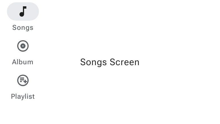
O snippet a seguir implementa uma coluna de navegação para que os usuários possam navegar entre diferentes telas em um app:
@Composable fun NavigationRailExample(modifier: Modifier = Modifier) { val navController = rememberNavController() val startDestination = Destination.SONGS var selectedDestination by rememberSaveable { mutableIntStateOf(startDestination.ordinal) } Scaffold(modifier = modifier) { contentPadding -> NavigationRail(modifier = Modifier.padding(contentPadding)) { Destination.entries.forEachIndexed { index, destination -> NavigationRailItem( selected = selectedDestination == index, onClick = { navController.navigate(route = destination.route) selectedDestination = index }, icon = { Icon( destination.icon, contentDescription = destination.contentDescription ) }, label = { Text(destination.label) } ) } } AppNavHost(navController, startDestination) } }
Pontos principais
NavigationRailmostra uma coluna vertical de itens de coluna, em que cada item corresponde a umDestination.val navController = rememberNavController()cria e lembra uma instância deNavHostController, que gerencia a navegação em umNavHost.var selectedDestination by rememberSaveable { mutableIntStateOf(startDestination.ordinal) }gerencia o estado do item de coluna selecionado.startDestination.ordinalrecebe o índice numérico (posição) da entrada do tipo enumeradoDestination.SONGS.
- Quando um item da coluna é clicado,
navController.navigate(route =
destination.route)
é chamado para navegar até a tela correspondente. - A lambda
onClickdoNavigationRailItematualiza o estadoselectedDestinationpara destacar visualmente o item da coluna clicado. - Ele chama o elemento combinável
AppNavHost, transmitindonavControllerestartDestination, para mostrar o conteúdo real da tela selecionada.
Resultado
A imagem a seguir mostra o resultado do snippet anterior:
Atualização do M3 Expressive
O Material 3 Expressive apresenta WideNavigationRail e
ModalWideNavigationRail, que oferecem suporte a estados recolhidos e expandidos como
opções adicionais ao lado do NavigationRail padrão.

Para mais informações sobre as atualizações do M3 Expressive para colunas de navegação, consulte as diretrizes de colunas de navegação do Material Design 3.
Coluna de navegação ampla recolhida e expandida
Uma coluna de navegação ampla tem dois estados, recolhido e expandido, que podem
se transformar um no outro quando o usuário seleciona o botão de menu. O snippet
abaixo demonstra como implementar um WideNavigationRail que anima
entre os estados recolhido e expandido:
@Composable fun WideNavigationRailResponsiveSample() { var selectedItem by remember { mutableIntStateOf(0) } val items = listOf("Home", "Search", "Settings") val selectedIcons = listOf(AppIcons.HomeFilled, AppIcons.Search, AppIcons.SettingsFilled) val unselectedIcons = listOf(AppIcons.Home, AppIcons.Search, AppIcons.Settings) val state = rememberWideNavigationRailState() val scope = rememberCoroutineScope() Row(Modifier.fillMaxWidth()) { WideNavigationRail( state = state, header = { IconButton( modifier = Modifier .padding(start = 24.dp) .semantics { // The button must announce the expanded or collapsed state of the rail // for accessibility. stateDescription = if (state.currentValue == WideNavigationRailValue.Expanded) "Expanded" else "Collapsed" }, onClick = { scope.launch { if (state.targetValue == WideNavigationRailValue.Expanded) state.collapse() else state.expand() } }, ) { if (state.targetValue == WideNavigationRailValue.Expanded) { Icon(painter = rememberVectorPainter(AppIcons.MenuOpen), "Collapse rail") } else { Icon(painter = rememberVectorPainter(AppIcons.Menu), "Expand rail") } } }, ) { items.forEachIndexed { index, item -> WideNavigationRailItem( railExpanded = state.targetValue == WideNavigationRailValue.Expanded, icon = { val imageVector = if (selectedItem == index) { selectedIcons[index] } else { unselectedIcons[index] } Icon( painter = rememberVectorPainter(imageVector), contentDescription = null ) }, label = { Text(item) }, selected = selectedItem == index, onClick = { selectedItem = index }, ) } } val textString = if (state.currentValue == WideNavigationRailValue.Expanded) "expanded" else "collapsed" Column { Text(modifier = Modifier.padding(16.dp), text = "The rail is $textString.") } } }

Coluna de navegação modal ampla
A coluna de navegação expandida pode ser padrão ou modal. A configuração modal
sobrepõe o conteúdo do corpo e é aberta em um ícone de menu. O snippet abaixo
demonstra como implementar um ModalWideNavigationRail:
@Composable fun ModalWideNavigationRailSample() { var selectedItem by remember { mutableIntStateOf(0) } val items = listOf("Home", "Search", "Settings") val selectedIcons = listOf(AppIcons.HomeFilled, AppIcons.Search, AppIcons.SettingsFilled) val unselectedIcons = listOf(AppIcons.Home, AppIcons.Search, AppIcons.Settings) val state = rememberWideNavigationRailState() val scope = rememberCoroutineScope() Row(Modifier.fillMaxWidth()) { ModalWideNavigationRail( state = state, // Note: the value of expandedHeaderTopPadding depends on the layout of your screen in // order to achieve the best alignment. expandedHeaderTopPadding = 64.dp, header = { IconButton( modifier = Modifier .padding(start = 24.dp) .semantics { // The button must announce the expanded or collapsed state of the rail // for accessibility. stateDescription = if (state.currentValue == WideNavigationRailValue.Expanded) "Expanded" else "Collapsed" }, onClick = { scope.launch { if (state.targetValue == WideNavigationRailValue.Expanded) state.collapse() else state.expand() } }, ) { if (state.targetValue == WideNavigationRailValue.Expanded) Icon(painter = rememberVectorPainter(AppIcons.MenuOpen), "Collapse rail") else Icon(painter = rememberVectorPainter(AppIcons.Menu), "Expand rail") } }, ) { items.forEachIndexed { index, item -> WideNavigationRailItem( railExpanded = state.targetValue == WideNavigationRailValue.Expanded, icon = { Icon( painter = rememberVectorPainter(if (selectedItem == index) selectedIcons[index] else unselectedIcons[index]), contentDescription = null, ) }, label = { Text(item) }, selected = selectedItem == index, onClick = { selectedItem = index }, ) } } val textString = if (state.currentValue == WideNavigationRailValue.Expanded) "expanded" else "collapsed" Column { Text(modifier = Modifier.padding(16.dp), text = "The rail is $textString.") } } }

Coluna de navegação ampla modal dispensável
No Android, os gestos de volta preditivos permitem que os usuários deslizem para a esquerda ou direita na tela
para voltar ou dispensar componentes modais. O snippet abaixo demonstra como
implementar um ModalWideNavigationRail dispensável definindo
hideOnCollapse = true:
@Composable fun DismissibleModalWideNavigationRailSample() { var selectedItem by remember { mutableIntStateOf(0) } val items = listOf("Home", "Search", "Settings") val selectedIcons = listOf(AppIcons.HomeFilled, AppIcons.Search, AppIcons.SettingsFilled) val unselectedIcons = listOf(AppIcons.Home, AppIcons.Search, AppIcons.Settings) val state = rememberWideNavigationRailState() val scope = rememberCoroutineScope() Row(Modifier.fillMaxSize()) { ModalWideNavigationRail(state = state, hideOnCollapse = true) { items.forEachIndexed { index, item -> WideNavigationRailItem( railExpanded = true, icon = { Icon( painter = rememberVectorPainter(if (selectedItem == index) selectedIcons[index] else unselectedIcons[index]), contentDescription = null, ) }, label = { Text(item) }, selected = selectedItem == index, onClick = { selectedItem = index scope.launch { state.collapse() } }, ) } } Column(Modifier.fillMaxWidth(), horizontalAlignment = Alignment.CenterHorizontally) { val currentPage = items.get(selectedItem) Button(onClick = { scope.launch { state.expand() } }, Modifier.padding(32.dp)) { Text(text = "$currentPage Page\nOpen modal rail", textAlign = TextAlign.Center) } } } }
