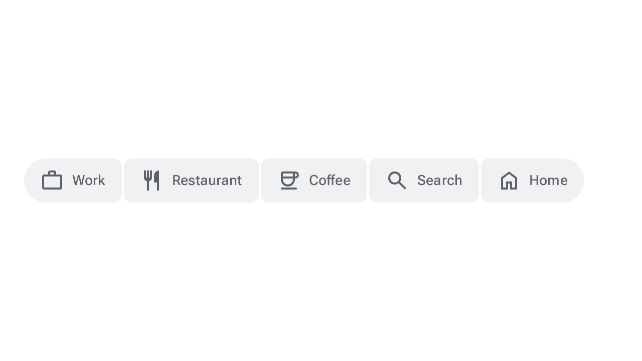
ボタングループは、ボタンを整理し、ボタンとアイコンボタンに調整された形状、モーション、幅の変更を適用することで、ボタン間のインタラクションを追加します。ボタン グループには次の 2 つのバリエーションがあります。
- 標準ボタングループ: 隣接するボタン間のインタラクションを追加して、ボタンが押されたときに相互に反応するようにします。
- 接続されたボタングループ: 切り替えボタンをグループ化して、ユーザーがオプションを選択したり、ビューを切り替えたり、ページ上の要素を並べ替えたりできるようにします。
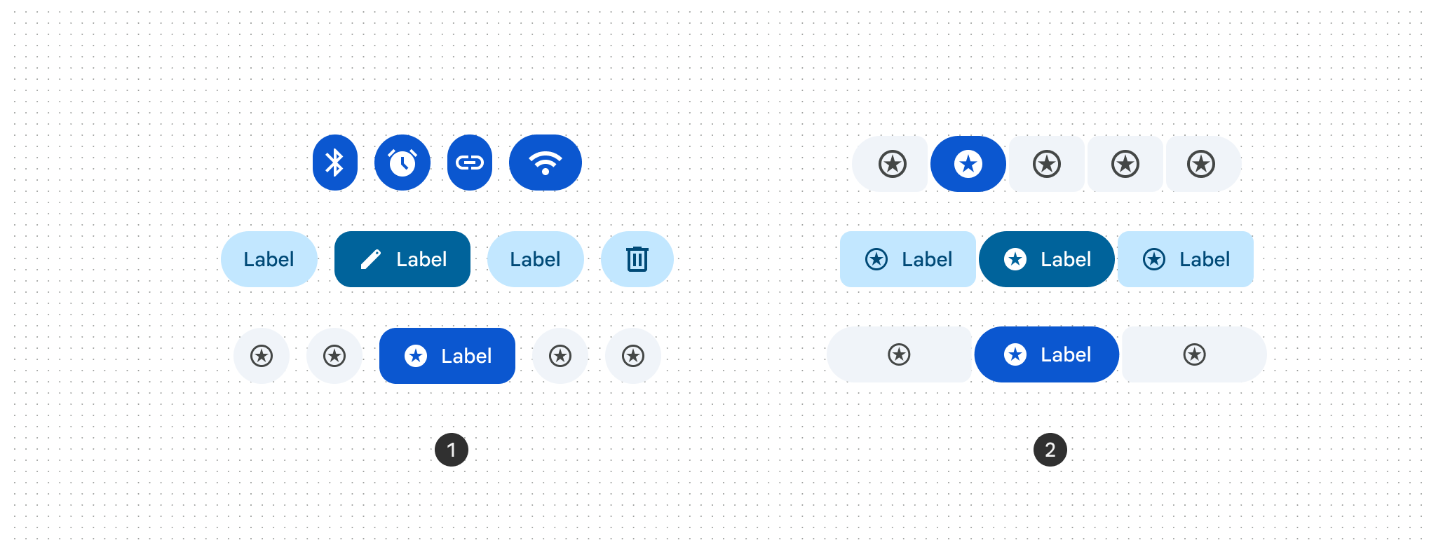
ボタン グループの使用
- ボタンが押されたとき、または選択されたときに、シェイプ モーフィングを適用します。
- セグメント化されたボタンが、接続されたボタン グループに置き換えられます。
- すべてのボタンサイズ(特小(XS)、小(S)、中(M)、大(L)、特大(XL))に対応しています。
- 単一選択、複数選択、選択必須のパターンをサポートしています。
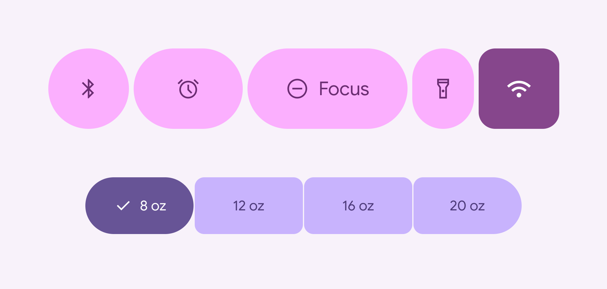
標準ボタン グループ
ButtonGroup コンポーザブルを使用すると、ボタンを水平方向に配置できます。このコンポーザブルは、スペースが限られている場合に、押されたアイテムを拡大し、隣接するアイテムを縮小し、余分なアイテムをオーバーフロー メニューに移動します。ボタングループは、2 行目に折り返すのではなく、1 行に収める必要があります。
次のスニペットは、オーバーフロー メニュー インジケーターを含む標準のボタン グループを実装する方法を示しています。
@Composable fun ButtonGroupSample() { val numButtons = 10 ButtonGroup( overflowIndicator = { menuState -> ButtonGroupDefaults.OverflowIndicator(menuState = menuState) } ) { for (i in 0 until numButtons) { clickableItem(onClick = {}, label = "$i") } } }
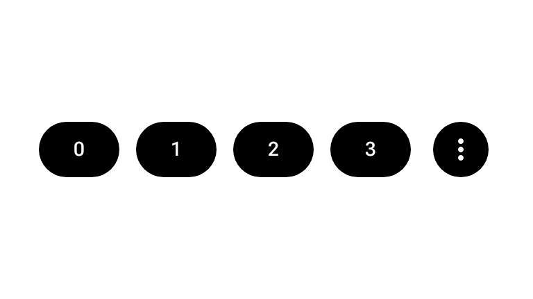
接続されたボタン グループ
ToggleButton コンポーザブルと ButtonGroupDefaults 接続シェイプで構築された単一選択または複数選択のパターンには、接続されたボタン グループを使用します。
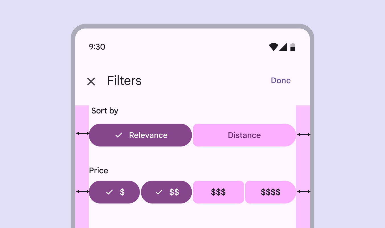
単一選択
ユーザーが相互に排他的なセットから 1 つのオプションを選択する場合は、単一選択の連結ボタン グループを使用します。次のスニペットは、ToggleButton と Role.RadioButton を使用して、単一選択の連結ボタングループを実装しています。
@Composable fun SingleSelectConnectedButtonGroupSample() { val options = listOf("Work", "Restaurant", "Coffee", "Search", "Home") val unCheckedIcons = listOf( AppIcons.Work, AppIcons.Restaurant, AppIcons.Coffee, AppIcons.Search, AppIcons.Home, ) val checkedIcons = listOf( AppIcons.WorkFilled, AppIcons.Restaurant, AppIcons.CoffeeFilled, AppIcons.Search, AppIcons.HomeFilled, ) var selectedIndex by remember { mutableIntStateOf(0) } FlexBox( modifier = Modifier.padding(horizontal = 8.dp).fillMaxWidth(), config = { direction(FlexDirection.Row) wrap(FlexWrap.Wrap) columnGap(ButtonGroupDefaults.ConnectedSpaceBetween) rowGap(2.dp) }, ) { options.forEachIndexed { index, label -> ToggleButton( checked = selectedIndex == index, onCheckedChange = { selectedIndex = index }, shapes = when (index) { 0 -> ButtonGroupDefaults.connectedLeadingButtonShapes() options.lastIndex -> ButtonGroupDefaults.connectedTrailingButtonShapes() else -> ButtonGroupDefaults.connectedMiddleButtonShapes() }, modifier = Modifier.semantics { role = Role.RadioButton }, ) { Icon( painter = rememberVectorPainter( if (selectedIndex == index) checkedIcons[index] else unCheckedIcons[index] ), contentDescription = null, ) Spacer(Modifier.size(ToggleButtonDefaults.IconSpacing)) Text(label) } } } }
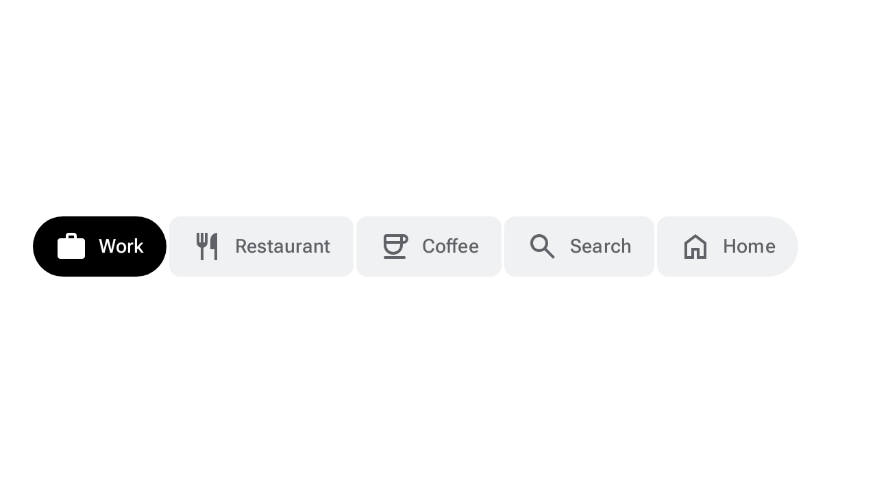
複数選択
ユーザーが 0 個以上のオプションを個別に切り替えることができる場合は、複数選択の連結ボタン グループを使用します。次のスニペットは、ToggleButton と mutableStateListOf を使用して、複数選択の接続ボタン グループを実装しています。
@Composable fun MultiSelectConnectedButtonGroupSample() { val options = listOf("Work", "Restaurant", "Coffee", "Search", "Home") val unCheckedIcons = listOf( AppIcons.Work, AppIcons.Restaurant, AppIcons.Coffee, AppIcons.Search, AppIcons.Home, ) val checkedIcons = listOf( AppIcons.WorkFilled, AppIcons.Restaurant, AppIcons.CoffeeFilled, AppIcons.Search, AppIcons.HomeFilled, ) val checked = remember { mutableStateListOf(false, false, false, false, false) } FlexBox( modifier = Modifier.padding(horizontal = 8.dp).fillMaxWidth(), config = { direction(FlexDirection.Row) wrap(FlexWrap.Wrap) columnGap(ButtonGroupDefaults.ConnectedSpaceBetween) rowGap(2.dp) }, ) { options.forEachIndexed { index, label -> ToggleButton( checked = checked[index], onCheckedChange = { checked[index] = it }, shapes = when (index) { 0 -> ButtonGroupDefaults.connectedLeadingButtonShapes() options.lastIndex -> ButtonGroupDefaults.connectedTrailingButtonShapes() else -> ButtonGroupDefaults.connectedMiddleButtonShapes() }, ) { Icon( painter = rememberVectorPainter( if (checked[index]) checkedIcons[index] else unCheckedIcons[index] ), contentDescription = null, ) Spacer(Modifier.size(ToggleButtonDefaults.IconSpacing)) Text(label) } } } }