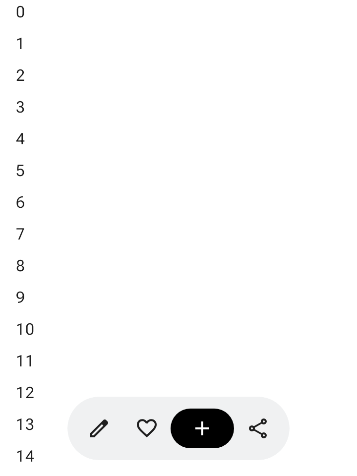
フローティング ツールバーは、本文コンテンツの上にフローティング表示されます。本文のコンテンツや特定のページに関連するコンテキスト アクションに最適です。
フローティング ツールバーは、画面上の任意の場所に配置して、他のコンテンツの上にフローティングさせることができます。これにより、複数のアクションを配置するスペースを柔軟に確保できます。
フローティング ツールバーの使用
- フローティング ツールバーには、現在のページに関連するコントロールが表示されます。
- フローティング ツールバーは、プロダクト階層内の関連ページ間のナビゲーション コントロールとして機能します。
- さらにアクションが必要な場合は、オーバーフロー メニューを使用します。
- フローティング ツールバーのコンテナは、画面に完全に表示されたままにする必要があります。
- デフォルトで画面に表示する最も重要なアクションを選択します。
レイアウトと色
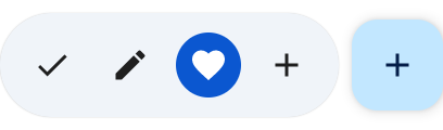
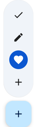
フローティング ツールバーは、水平(HorizontalFloatingToolbar)または垂直(VerticalFloatingToolbar)に配置でき、FloatingToolbarDefaults の標準または鮮やかなカラーパターンを使用できます。
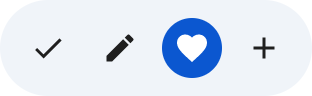

FAB を含むフローティング ツールバー
ビューで優先度が最も高いアクションを実行する場合や、ツールバーのコントロールを補完する場合は、フローティング アクション ボタン(FAB)を使用します。
例
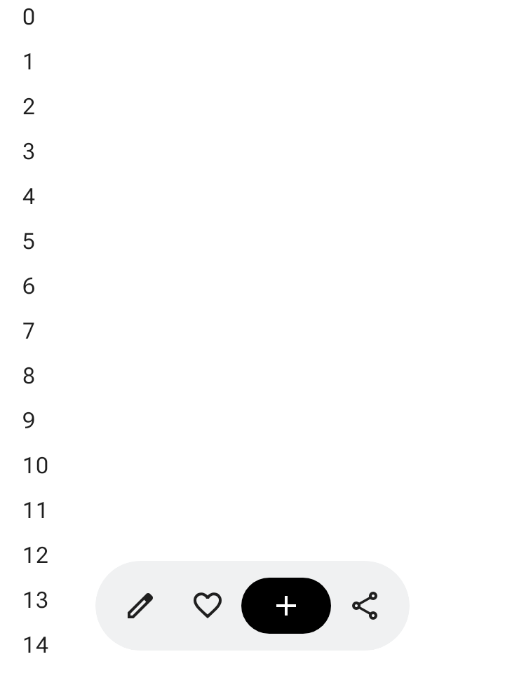
展開可能な水平フローティング ツールバー
Modifier.floatingToolbarVerticalNestedScroll をスクロール可能なコンテナに適用して、ユーザーが下にスクロールすると HorizontalFloatingToolbar が先頭と末尾のアクションを自動的に折りたたみ、上にスクロールすると展開するようにします。
@Composable fun ExpandableHorizontalFloatingToolbarSample() { var expanded by rememberSaveable { mutableStateOf(true) } Scaffold { innerPadding -> Box(Modifier.padding(innerPadding)) { HorizontalFloatingToolbar( modifier = Modifier.align(Alignment.BottomCenter) .offset(y = -FloatingToolbarDefaults.ScreenOffset) .zIndex(1f), expanded = expanded, leadingContent = { IconButton(onClick = { /* doSomething() */ }) { Icon(painter = rememberVectorPainter(AppIcons.Edit), contentDescription = "Edit") } IconButton(onClick = { /* doSomething() */ }) { Icon(painter = rememberVectorPainter(AppIcons.Favorite), contentDescription = "Favorite") } }, trailingContent = { IconButton(onClick = { /* doSomething() */ }) { Icon(painter = rememberVectorPainter(AppIcons.Share), contentDescription = "Share") } }, content = { FilledIconButton( modifier = Modifier.width(64.dp), onClick = { /* doSomething() */ }, ) { Icon(painter = rememberVectorPainter(AppIcons.Add), contentDescription = "Add") } }, ) // ... } } }
展開可能な垂直フローティング ツールバー
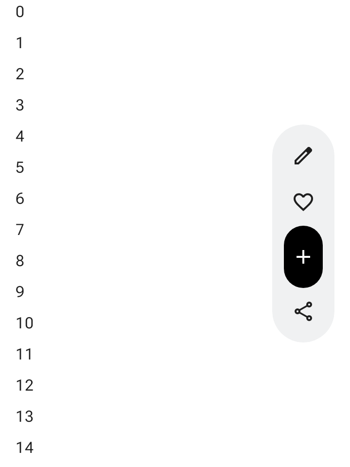
画面の階層に縦向きのレイアウト スペースが適している場合は、画面の横に固定された VerticalFloatingToolbar を使用します。水平方向のバリエーションと同様に、スクロール操作に応じて展開したり折りたたんだりできます。
@Composable fun ExpandableVerticalFloatingToolbarSample() { var expanded by rememberSaveable { mutableStateOf(true) } Scaffold { innerPadding -> Box(Modifier.padding(innerPadding)) { VerticalFloatingToolbar( modifier = Modifier.align(Alignment.CenterEnd) .offset(x = -FloatingToolbarDefaults.ScreenOffset) .zIndex(1f), expanded = expanded, leadingContent = { IconButton(onClick = { /* doSomething() */ }) { Icon(painter = rememberVectorPainter(AppIcons.Edit), contentDescription = "Edit") } IconButton(onClick = { /* doSomething() */ }) { Icon(painter = rememberVectorPainter(AppIcons.Favorite), contentDescription = "Favorite") } }, trailingContent = { IconButton(onClick = { /* doSomething() */ }) { Icon(painter = rememberVectorPainter(AppIcons.Share), contentDescription = "Share") } }, content = { FilledIconButton( modifier = Modifier.height(64.dp), onClick = { /* doSomething() */ }, ) { Icon(painter = rememberVectorPainter(AppIcons.Add), contentDescription = "Add") } }, ) // ... } } }
スクロール可能なフローティング ツールバー
スクロール中にフローティング ツールバー全体を画面外にスライドさせるには、アイテムを折りたたむのではなく、Modifier.nestedScroll とツールバーの scrollBehavior パラメータの両方に FloatingToolbarDefaults.exitAlwaysScrollBehavior を渡します。
@Composable fun ScrollableHorizontalFloatingToolbarSample() { val exitAlwaysScrollBehavior = FloatingToolbarDefaults.exitAlwaysScrollBehavior( exitDirection = FloatingToolbarExitDirection.Bottom ) Scaffold(modifier = Modifier.nestedScroll(exitAlwaysScrollBehavior)) { innerPadding -> Box(Modifier.padding(innerPadding)) { HorizontalFloatingToolbar( modifier = Modifier.align(Alignment.BottomCenter) .offset(y = -FloatingToolbarDefaults.ScreenOffset) .zIndex(1f), expanded = true, leadingContent = { IconButton(onClick = { /* doSomething() */ }) { Icon(painter = rememberVectorPainter(AppIcons.Edit), contentDescription = "Edit") } IconButton(onClick = { /* doSomething() */ }) { Icon(painter = rememberVectorPainter(AppIcons.Favorite), contentDescription = "Favorite") } }, trailingContent = { IconButton(onClick = { /* doSomething() */ }) { Icon(painter = rememberVectorPainter(AppIcons.Share), contentDescription = "Share") } }, content = { FilledIconButton( modifier = Modifier.width(64.dp), onClick = { /* doSomething() */ }, ) { Icon(painter = rememberVectorPainter(AppIcons.Add), contentDescription = "Add") } }, scrollBehavior = exitAlwaysScrollBehavior, ) // ... } } }