
LevelIndicator
Functions summary
Unit |
@ComposableCreates a |
Functions
LevelIndicator
@Composable
fun LevelIndicator(
    value: () -> Float,
    modifier: Modifier = Modifier,
    enabled: Boolean = true,
    colors: LevelIndicatorColors = LevelIndicatorDefaults.colors(),
    strokeWidth: Dp = LevelIndicatorDefaults.StrokeWidth,
    sweepAngle: @FloatRange(from = 0.0, to = 360.0) Float = LevelIndicatorDefaults.SweepAngle,
    reverseDirection: Boolean = false
): Unit
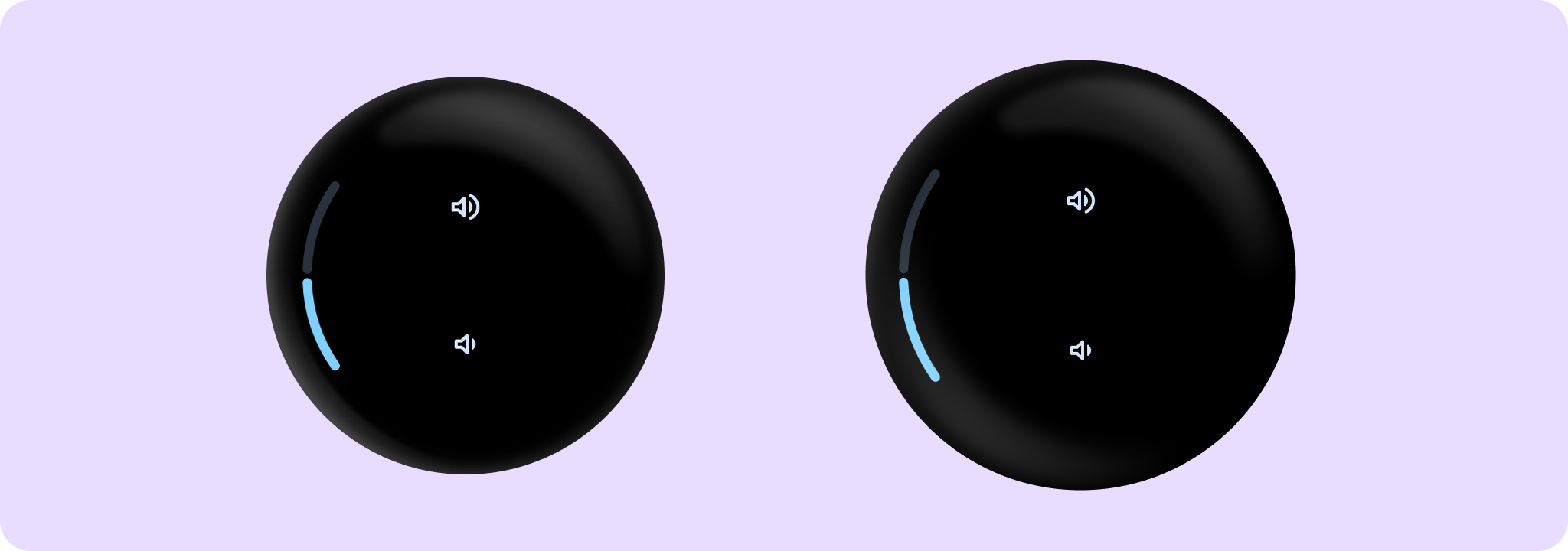
Creates a LevelIndicator for screens that that control a setting such as volume with either rotating side button, rotating bezel.
Example of LevelIndicator:
import androidx.compose.foundation.layout.Arrangement
import androidx.compose.foundation.layout.Box
import androidx.compose.foundation.layout.Column
import androidx.compose.foundation.layout.fillMaxSize
import androidx.compose.foundation.layout.padding
import androidx.compose.runtime.mutableFloatStateOf
import androidx.compose.runtime.remember
import androidx.compose.ui.Alignment
import androidx.compose.ui.Modifier
import androidx.compose.ui.unit.dp
import androidx.wear.compose.material3.IconButton
import androidx.wear.compose.material3.LevelIndicator
import androidx.wear.compose.material3.StepperDefaults
import androidx.wear.compose.material3.samples.icons.VolumeDownIcon
import androidx.wear.compose.material3.samples.icons.VolumeUpIcon

var value by remember { mutableFloatStateOf(0.5f) }
Box(modifier = Modifier.fillMaxSize()) {
    Column(
        verticalArrangement = Arrangement.SpaceEvenly,
        horizontalAlignment = Alignment.CenterHorizontally,
        modifier = Modifier.fillMaxSize(),
    ) {
        IconButton(
            modifier = Modifier.padding(horizontal = 16.dp),
            enabled = value < 1f,
            onClick = { value += 0.1f },
        ) {
            VolumeUpIcon(StepperDefaults.IconSize)
        }
        IconButton(
            modifier = Modifier.padding(horizontal = 16.dp),
            enabled = value > 0f,
            onClick = { value -= 0.1f },
        ) {
            VolumeDownIcon(StepperDefaults.IconSize)
        }
    }
    LevelIndicator(value = { value }, modifier = Modifier.align(Alignment.CenterStart))
}
| Parameters | |
|---|---|
value: () -> Float |
Value of the indicator as a fraction in the range 0,1. Values outside of the range 0,1 will be coerced. |
modifier: Modifier = Modifier |
Modifier to be applied to the component |
enabled: Boolean = true |
Controls the enabled state of |
colors: LevelIndicatorColors = LevelIndicatorDefaults.colors() |
|
strokeWidth: Dp = LevelIndicatorDefaults.StrokeWidth |
The stroke width for the indicator and track strokes |
sweepAngle: @FloatRange(from = 0.0, to = 360.0) Float = LevelIndicatorDefaults.SweepAngle |
The angle covered by the curved LevelIndicator, in degrees |
reverseDirection: Boolean = false |
Reverses direction of PositionIndicator if true |