
FilledIconButton
Functions summary
Unit |
@ComposableWear Material |
Functions
FilledIconButton
@Composable
fun FilledIconButton(
    onClick: () -> Unit,
    modifier: Modifier = Modifier,
    onLongClick: (() -> Unit)? = null,
    onLongClickLabel: String? = null,
    enabled: Boolean = true,
    shapes: IconButtonShapes = IconButtonDefaults.shapes(),
    colors: IconButtonColors = IconButtonDefaults.filledIconButtonColors(),
    border: BorderStroke? = null,
    interactionSource: MutableInteractionSource? = null,
    content: @Composable BoxScope.() -> Unit
): Unit
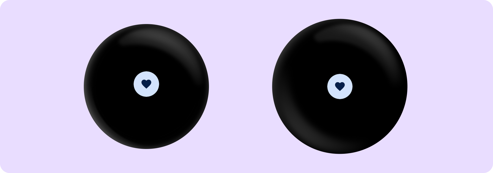
Wear Material FilledIconButton is a circular, icon-only button with a colored background and a contrasting content color. It offers a single slot to take an icon or image.
Set the size of the FilledIconButton with Modifier.touchTargetAwareSize to ensure that the recommended minimum touch target size is available.
The recommended IconButton sizes are IconButtonDefaults.DefaultButtonSize, IconButtonDefaults.LargeButtonSize, IconButtonDefaults.SmallButtonSize and IconButtonDefaults.ExtraSmallButtonSize.
Use IconButtonDefaults.iconSizeFor to determine the icon size for a given IconButton size, or refer to icon sizes IconButtonDefaults.SmallIconSize, IconButtonDefaults.DefaultIconSize, IconButtonDefaults.LargeIconSize directly.
FilledIconButton can be enabled or disabled. A disabled button will not respond to click events.
Example of FilledIconButton:
import androidx.compose.material.icons.Icons
import androidx.compose.material.icons.filled.Favorite
import androidx.wear.compose.material3.FilledIconButton
import androidx.wear.compose.material3.Icon
import androidx.wear.compose.material3.IconButton

FilledIconButton(onClick = { /* Do something */ }) {
    Icon(imageVector = Icons.Filled.Favorite, contentDescription = "Favorite icon")
}
| Parameters | |
|---|---|
onClick: () -> Unit |
Will be called when the user clicks the button. |
modifier: Modifier = Modifier |
Modifier to be applied to the button. |
onLongClick: (() -> Unit)? = null |
Called when this button is long clicked (long-pressed). When this callback is set, |
onLongClickLabel: String? = null |
Semantic / accessibility label for the |
enabled: Boolean = true |
Controls the enabled state of the button. When |
shapes: IconButtonShapes = IconButtonDefaults.shapes() |
Defines the shape for this button. Defaults to a static shape based on |
colors: IconButtonColors = IconButtonDefaults.filledIconButtonColors() |
|
border: BorderStroke? = null |
Optional |
interactionSource: MutableInteractionSource? = null |
an optional hoisted |
content: @Composable BoxScope.() -> Unit |
The content displayed on the icon button, expected to be icon or image. |