
Picker
Functions summary
Unit |
@ComposableA scrollable list of items to pick from. |
Functions
Picker
@Composable
fun Picker(
    state: PickerState,
    contentDescription: (() -> String)?,
    modifier: Modifier = Modifier,
    readOnly: Boolean = false,
    readOnlyLabel: (@Composable BoxScope.() -> Unit)? = null,
    onSelected: () -> Unit = {},
    verticalSpacing: Dp = 0.dp,
    gradientRatio: @FloatRange(from = 0.0, to = 0.5) Float = PickerDefaults.GradientRatio,
    gradientColor: Color = MaterialTheme.colorScheme.background,
    userScrollEnabled: Boolean = true,
    rotaryScrollableBehavior: RotaryScrollableBehavior? = PickerDefaults.rotarySnapBehavior(state),
    option: @Composable PickerScope.(index: Int) -> Unit
): Unit
A scrollable list of items to pick from. By default, items will be repeated "infinitely" in both directions, unless PickerState#repeatItems is specified as false.
Picker supports rotary input by default. Rotary input allows users to scroll the content of the Picker - by using a crown or a rotating bezel on their Wear OS device. It can be modified or turned off using the rotaryScrollableBehavior parameter.
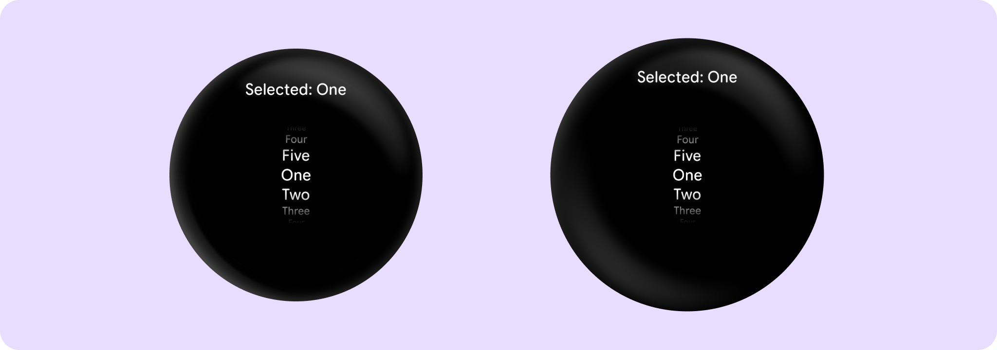
Example of a simple picker to select one of five options:
import androidx.compose.foundation.gestures.Orientation
import androidx.compose.foundation.gestures.scrollable
import androidx.compose.foundation.layout.Box
import androidx.compose.foundation.layout.fillMaxSize
import androidx.compose.foundation.layout.padding
import androidx.compose.foundation.layout.size
import androidx.compose.runtime.derivedStateOf
import androidx.compose.runtime.remember
import androidx.compose.ui.Alignment
import androidx.compose.ui.Modifier
import androidx.compose.ui.unit.dp
import androidx.wear.compose.material3.Picker
import androidx.wear.compose.material3.Text
import androidx.wear.compose.material3.rememberPickerState

val items = listOf("One", "Two", "Three", "Four", "Five")
val state = rememberPickerState(items.size)
// We forward scroll gestures from the whole screen to the Picker which makes this sample
// accessible for 2-finger vertical scrolling.
Box(
    modifier =
        Modifier.fillMaxSize()
            .scrollable(
                state = state,
                orientation = Orientation.Vertical,
                reverseDirection = true,
            ),
    contentAlignment = Alignment.Center,
) {
    val selectedLabel by remember {
        derivedStateOf { "Selected: ${items[state.selectedOptionIndex]}" }
    }
    Text(
        modifier = Modifier.align(Alignment.TopCenter).padding(top = 10.dp),
        text = selectedLabel,
    )
    Picker(
        modifier = Modifier.size(100.dp, 100.dp),
        state = state,
        contentDescription = { "${state.selectedOptionIndex + 1}" },
    ) {
        Text(items[it])
    }
}
Example of a sample picker group with an hour and minute picker (24 hour format):
import androidx.compose.animation.AnimatedContent
import androidx.compose.foundation.layout.Arrangement
import androidx.compose.foundation.layout.Column
import androidx.compose.foundation.layout.Spacer
import androidx.compose.foundation.layout.fillMaxWidth
import androidx.compose.foundation.layout.size
import androidx.compose.runtime.mutableIntStateOf
import androidx.compose.runtime.remember
import androidx.compose.ui.Alignment
import androidx.compose.ui.Modifier
import androidx.compose.ui.unit.dp
import androidx.wear.compose.material3.PickerGroup
import androidx.wear.compose.material3.Text
import androidx.wear.compose.material3.rememberPickerState

var selectedPickerIndex by remember { mutableIntStateOf(0) }
val pickerStateHour = rememberPickerState(initialNumberOfOptions = 24)
val pickerStateMinute = rememberPickerState(initialNumberOfOptions = 60)
Column(
    modifier = Modifier.fillMaxWidth(),
    verticalArrangement = Arrangement.Center,
    horizontalAlignment = Alignment.CenterHorizontally,
) {
    Spacer(modifier = Modifier.size(30.dp))
    val label = if (selectedPickerIndex == 0) "Hours" else "Minutes"
    AnimatedContent(targetState = label) { targetText -> Text(text = targetText) }
    Spacer(modifier = Modifier.size(10.dp))
    PickerGroup(
        selectedPickerState =
            if (selectedPickerIndex == 0) pickerStateHour else pickerStateMinute,
        autoCenter = false,
    ) {
        PickerGroupItem(
            pickerState = pickerStateHour,
            selected = selectedPickerIndex == 0,
            onSelected = { selectedPickerIndex = 0 },
            option = { optionIndex, _ -> Text(text = "%02d".format(optionIndex)) },
            contentDescription = { "Hours" },
            modifier = Modifier.size(80.dp, 100.dp),
        )

        PickerGroupItem(
            pickerState = pickerStateMinute,
            selected = selectedPickerIndex == 1,
            onSelected = { selectedPickerIndex = 1 },
            option = { optionIndex, _ -> Text(text = "%02d".format(optionIndex)) },
            contentDescription = { "Minutes" },
            modifier = Modifier.size(80.dp, 100.dp),
        )
    }
}

| Parameters | |
|---|---|
state: PickerState |
The state of the component |
contentDescription: (() -> String)? |
A block which computes text used by accessibility services to describe what the selected option represents. This text should be localized, such as by using |
modifier: Modifier = Modifier |
|
readOnly: Boolean = false |
Determines whether the |
readOnlyLabel: (@Composable BoxScope.() -> Unit)? = null |
A slot for providing a label, displayed above the selected option when the |
onSelected: () -> Unit = {} |
Action triggered when the Picker is selected by clicking. Used by accessibility semantics, which facilitates implementation of multi-picker screens. |
verticalSpacing: Dp = 0.dp |
The amount of vertical spacing in |
gradientRatio: @FloatRange(from = 0.0, to = 0.5) Float = PickerDefaults.GradientRatio |
The size relative to the Picker height that the top and bottom gradients take. These gradients blur the picker content on the top and bottom. The default is 0.33, so the top 1/3 and the bottom 1/3 of the picker are taken by gradients. Should be between 0.0 and 0.5. Use 0.0 to disable the gradient. |
gradientColor: Color = MaterialTheme.colorScheme.background |
Should be the color outside of the Picker, so there is continuity. If using custom background (gradients, images), gradientColor must be set to |
userScrollEnabled: Boolean = true |
Determines whether the picker should be scrollable or not. When userScrollEnabled = true, picker is scrollable. This is different from |
rotaryScrollableBehavior: RotaryScrollableBehavior? = PickerDefaults.rotarySnapBehavior(state) |
Parameter for changing rotary behavior. We recommend to use |
option: @Composable PickerScope.(index: Int) -> Unit |
A block which describes the content. Inside this block you can reference |