
Button
Functions summary
Unit |
@ComposableBase level Wear Material3 |
Unit |
@ComposableBase level Wear Material3 |
Unit |
@ComposableWear Material3 |
Unit |
@ComposableWear Material3 |
Functions
Button
@Composable
fun Button(
    onClick: () -> Unit,
    modifier: Modifier = Modifier,
    onLongClick: (() -> Unit)? = null,
    onLongClickLabel: String? = null,
    enabled: Boolean = true,
    shape: Shape = ButtonDefaults.shape,
    colors: ButtonColors = ButtonDefaults.buttonColors(),
    border: BorderStroke? = null,
    contentPadding: PaddingValues = ButtonDefaults.ContentPadding,
    interactionSource: MutableInteractionSource? = null,
    transformation: SurfaceTransformation? = null,
    content: @Composable RowScope.() -> Unit
): Unit
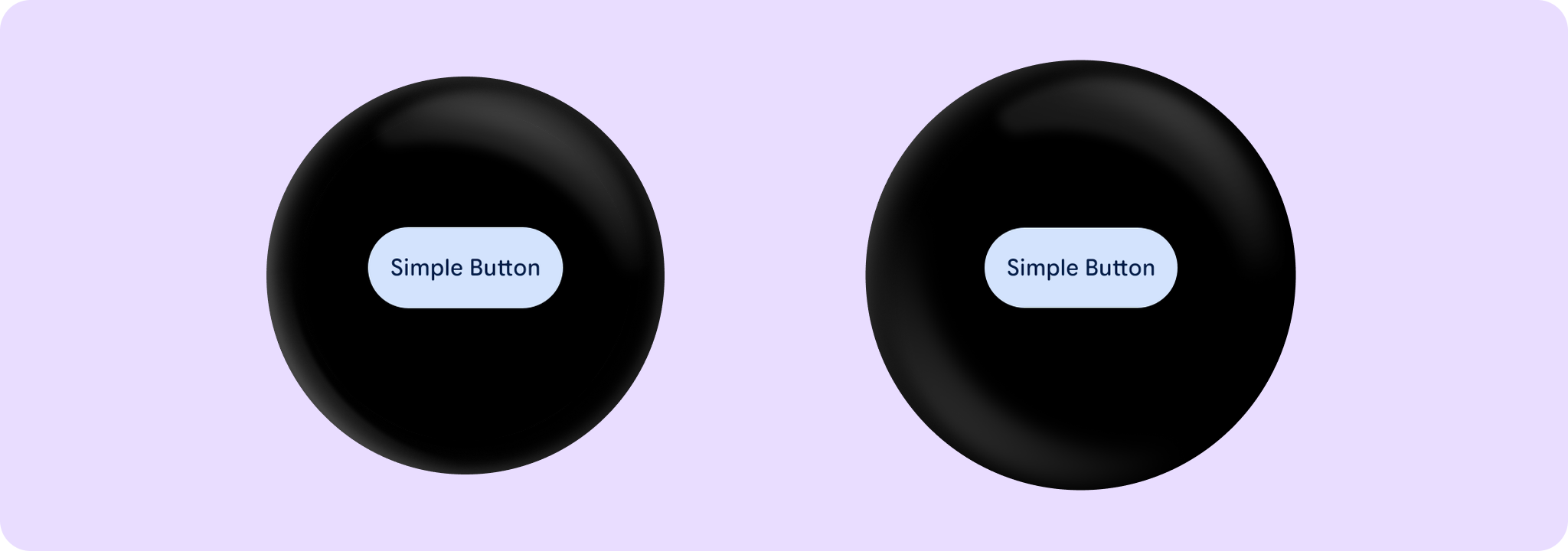
Base level Wear Material3 Button that offers a single slot to take any content. Used as the container for more opinionated Button components that take specific content such as icons and labels.
The Button is stadium-shaped by default and its standard height is designed to take 2 lines of text of Typography.labelMedium style. With localisation and/or large font sizes, the text can extend to a maximum of 3 lines in which case, the Button height adjusts to accommodate the contents.
Button takes the ButtonDefaults.buttonColors color scheme by default, with colored background, contrasting content color and no border. This is a high-emphasis button for the primary, most important or most common action on a screen.
Other recommended buttons with ButtonColors for different levels of emphasis are: FilledTonalButton which defaults to ButtonDefaults.filledTonalButtonColors, OutlinedButton which defaults to ButtonDefaults.outlinedButtonColors and ChildButton which defaults to ButtonDefaults.childButtonColors. For a background image, see the overload of Button with a containerPainter parameter.
Button can be enabled or disabled. A disabled button will not respond to click events.
Example of a Button:
import androidx.compose.ui.semantics.onClick
import androidx.wear.compose.material3.Button
import androidx.wear.compose.material3.Text

Button(onClick = { /* Do something */ }, label = { Text("Simple Button") }, modifier = modifier)
| Parameters | |
|---|---|
onClick: () -> Unit |
Will be called when the user clicks the button |
modifier: Modifier = Modifier |
Modifier to be applied to the button |
onLongClick: (() -> Unit)? = null |
Called when this button is long clicked (long-pressed). When this callback is set, |
onLongClickLabel: String? = null |
Semantic / accessibility label for the |
enabled: Boolean = true |
Controls the enabled state of the button. When |
shape: Shape = ButtonDefaults.shape |
Defines the button's shape. It is strongly recommended to use the default as this shape is a key characteristic of the Wear Material3 Theme |
colors: ButtonColors = ButtonDefaults.buttonColors() |
|
border: BorderStroke? = null |
Optional |
contentPadding: PaddingValues = ButtonDefaults.ContentPadding |
The spacing values to apply internally between the container and the content |
interactionSource: MutableInteractionSource? = null |
an optional hoisted |
transformation: SurfaceTransformation? = null |
Transformation to be used when button appears inside a container that needs to dynamically change its content separately from the background. |
content: @Composable RowScope.() -> Unit |
Slot for composable body content displayed on the Button |
Button
@Composable
fun Button(
    onClick: () -> Unit,
    containerPainter: Painter,
    modifier: Modifier = Modifier,
    onLongClick: (() -> Unit)? = null,
    onLongClickLabel: String? = null,
    enabled: Boolean = true,
    disabledContainerPainter: Painter = ButtonDefaults.disabledContainerPainter(containerPainter),
    shape: Shape = ButtonDefaults.shape,
    colors: ButtonColors = ButtonDefaults.buttonWithContainerPainterColors(),
    border: BorderStroke? = null,
    contentPadding: PaddingValues = ButtonDefaults.ContentPadding,
    interactionSource: MutableInteractionSource? = null,
    transformation: SurfaceTransformation? = null,
    content: @Composable RowScope.() -> Unit
): Unit
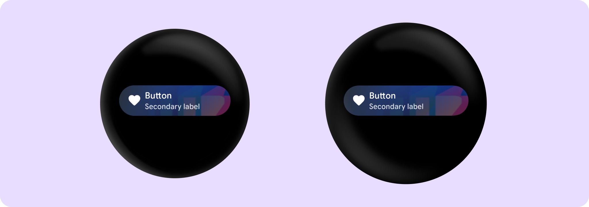
Base level Wear Material3 Button that offers parameters for container image backgrounds, with a single slot to take any content.
An Image background is a means to reinforce the meaning of information in a Button. Buttons should have a content color that contrasts with the background image and scrim.
This Button takes containerPainter for the image background to be drawn when the button is enabled and disabledContainerPainter for the image background when the button is disabled (The ButtonColors containerColor and disabledContainerColor properties are ignored). It is recommended to use ButtonDefaults.containerPainter to create the painters so that a scrim is drawn on top of the container image, ensuring that any content above the background is legible.
The Button is Stadium-shaped by default and has a max height designed to take no more than two lines of text of Typography.labelMedium style. With localisation and/or large font sizes, the text can extend to a maximum of 3 lines in which case, the Button height adjusts to accommodate the contents.
Button can be enabled or disabled. A disabled button will not respond to click events.
Example of a Button with an image background:
import androidx.compose.ui.res.painterResource
import androidx.compose.ui.semantics.onClick
import androidx.wear.compose.material3.Button
import androidx.wear.compose.material3.ButtonDefaults
import androidx.wear.compose.material3.Icon
import androidx.wear.compose.material3.Text

Button(
    onClick = { /* Do something */ },
    containerPainter =
        ButtonDefaults.containerPainter(
            image = painterResource(id = R.drawable.backgroundimage)
        ),
    enabled = enabled,
    label = { Text("Button") },
    secondaryLabel = { Text("Secondary label") },
    icon = {
        Icon(
            painter = painterResource(R.drawable.ic_favorite_rounded),
            contentDescription = "Favorite icon",
        )
    },
    modifier = modifier,
)
| Parameters | |
|---|---|
onClick: () -> Unit |
Will be called when the user clicks the button |
containerPainter: Painter |
The |
modifier: Modifier = Modifier |
Modifier to be applied to the button |
onLongClick: (() -> Unit)? = null |
Called when this button is long clicked (long-pressed). When this callback is set, |
onLongClickLabel: String? = null |
Semantic / accessibility label for the |
enabled: Boolean = true |
Controls the enabled state of the button. When |
disabledContainerPainter: Painter = ButtonDefaults.disabledContainerPainter(containerPainter) |
|
shape: Shape = ButtonDefaults.shape |
Defines the button's shape. It is strongly recommended to use the default as this shape is a key characteristic of the Wear Material3 Theme |
colors: ButtonColors = ButtonDefaults.buttonWithContainerPainterColors() |
|
border: BorderStroke? = null |
Optional |
contentPadding: PaddingValues = ButtonDefaults.ContentPadding |
The spacing values to apply internally between the container and the content |
interactionSource: MutableInteractionSource? = null |
an optional hoisted |
transformation: SurfaceTransformation? = null |
Transformation to be used when button appears inside a container that needs to dynamically change its content separately from the background. |
content: @Composable RowScope.() -> Unit |
Slot for composable body content displayed on the Button |
Button
@Composable
fun Button(
    onClick: () -> Unit,
    modifier: Modifier = Modifier,
    onLongClick: (() -> Unit)? = null,
    onLongClickLabel: String? = null,
    secondaryLabel: (@Composable RowScope.() -> Unit)? = null,
    icon: (@Composable BoxScope.() -> Unit)? = null,
    enabled: Boolean = true,
    shape: Shape = ButtonDefaults.shape,
    colors: ButtonColors = ButtonDefaults.buttonColors(),
    border: BorderStroke? = null,
    contentPadding: PaddingValues = ButtonDefaults.ContentPadding,
    interactionSource: MutableInteractionSource? = null,
    transformation: SurfaceTransformation? = null,
    label: @Composable RowScope.() -> Unit
): Unit
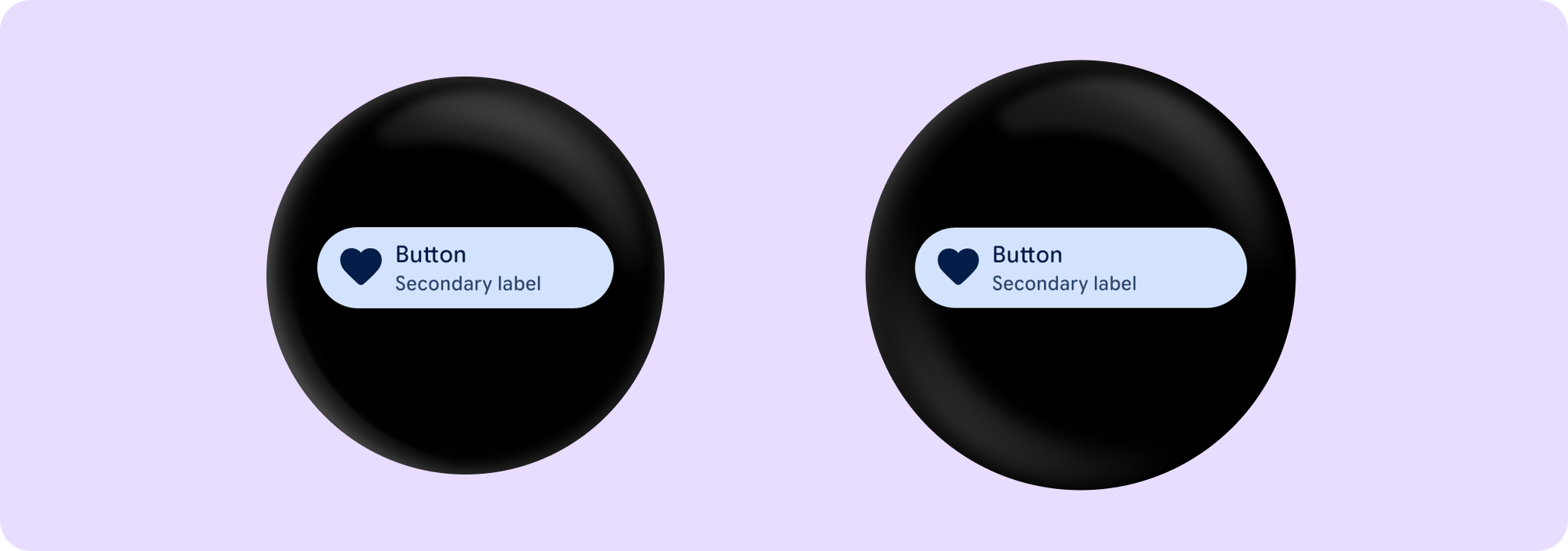
Wear Material3 Button that offers three slots and a specific layout for an icon, label and secondaryLabel. The icon and secondaryLabel are optional. The items are laid out with the icon, if provided, at the start of a row, with a column next containing the two label slots.
The Button is stadium-shaped by default and its standard height is designed to take 2 lines of text of Typography.labelMedium style - either a two-line label or both a single line label and a secondary label. With localisation and/or large font sizes, the Button height adjusts to accommodate the contents. The label and secondary label should be consistently aligned.
If a icon is provided then the labels should be "start" aligned, e.g. left aligned in ltr so that the text starts next to the icon.
Button takes the ButtonDefaults.buttonColors color scheme by default, with colored background, contrasting content color and no border. This is a high-emphasis button for the primary, most important or most common action on a screen.
Other recommended buttons with ButtonColors for different levels of emphasis are: FilledTonalButton which defaults to ButtonDefaults.filledTonalButtonColors, OutlinedButton which defaults to ButtonDefaults.outlinedButtonColors and ChildButton which defaults to ButtonDefaults.childButtonColors. For a background image, see the overload of Button with a containerPainter parameter.
Button can be enabled or disabled. A disabled button will not respond to click events.
Example of a Button with an icon and secondary label:
import androidx.compose.foundation.layout.size
import androidx.compose.ui.Modifier
import androidx.compose.ui.res.painterResource
import androidx.compose.ui.semantics.onClick
import androidx.wear.compose.material3.Button
import androidx.wear.compose.material3.ButtonDefaults
import androidx.wear.compose.material3.Icon
import androidx.wear.compose.material3.Text

Button(
    onClick = { /* Do something */ },
    label = { Text("Button") },
    secondaryLabel = { Text("Secondary label") },
    icon = {
        Icon(
            painter = painterResource(R.drawable.ic_favorite_rounded),
            contentDescription = "Favorite icon",
            modifier = Modifier.size(ButtonDefaults.IconSize),
        )
    },
    modifier = modifier,
)

Example of a Button with a large icon and adjusted content padding:
import androidx.compose.foundation.layout.size
import androidx.compose.ui.Modifier
import androidx.compose.ui.res.painterResource
import androidx.compose.ui.semantics.onClick
import androidx.wear.compose.material3.Button
import androidx.wear.compose.material3.ButtonDefaults
import androidx.wear.compose.material3.Icon
import androidx.wear.compose.material3.Text

// When customising the icon size, it is recommended to also specify
// the associated content padding
Button(
    onClick = { /* Do something */ },
    enabled = enabled,
    label = { Text("Button") },
    secondaryLabel = { Text("Secondary label") },
    icon = {
        Icon(
            painter = painterResource(R.drawable.ic_favorite_rounded),
            contentDescription = "Favorite icon",
            modifier = Modifier.size(ButtonDefaults.LargeIconSize),
        )
    },
    contentPadding = ButtonDefaults.ButtonWithLargeIconContentPadding,
    modifier = modifier,
)
Example of a Button with an extra large icon and adjusted content padding:
import androidx.compose.foundation.layout.size
import androidx.compose.ui.Modifier
import androidx.compose.ui.res.painterResource
import androidx.compose.ui.semantics.onClick
import androidx.wear.compose.material3.Button
import androidx.wear.compose.material3.ButtonDefaults
import androidx.wear.compose.material3.Icon
import androidx.wear.compose.material3.Text

// When customising the icon size, it is recommended to also specify
// the associated content padding
Button(
    onClick = { /* Do something */ },
    enabled = enabled,
    label = { Text("Button") },
    secondaryLabel = { Text("Secondary label") },
    icon = {
        Icon(
            painter = painterResource(R.drawable.ic_favorite_rounded),
            contentDescription = "Favorite icon",
            modifier = Modifier.size(ButtonDefaults.ExtraLargeIconSize),
        )
    },
    contentPadding = ButtonDefaults.ButtonWithExtraLargeIconContentPadding,
    modifier = modifier,
)

| Parameters | |
|---|---|
onClick: () -> Unit |
Will be called when the user clicks the button |
modifier: Modifier = Modifier |
Modifier to be applied to the button |
onLongClick: (() -> Unit)? = null |
Called when this button is long clicked (long-pressed). When this callback is set, |
onLongClickLabel: String? = null |
Semantic / accessibility label for the |
secondaryLabel: (@Composable RowScope.() -> Unit)? = null |
A slot for providing the button's secondary label. The contents are expected to be text which is "start" aligned if there is an icon preset and "start" or "center" aligned if not. label and secondaryLabel contents should be consistently aligned. |
icon: (@Composable BoxScope.() -> Unit)? = null |
A slot for providing the button's icon. The contents are expected to be a horizontally and vertically aligned icon of size |
enabled: Boolean = true |
Controls the enabled state of the button. When |
shape: Shape = ButtonDefaults.shape |
Defines the button's shape. It is strongly recommended to use the default as this shape is a key characteristic of the Wear Material3 Theme |
colors: ButtonColors = ButtonDefaults.buttonColors() |
|
border: BorderStroke? = null |
Optional |
contentPadding: PaddingValues = ButtonDefaults.ContentPadding |
The spacing values to apply internally between the container and the content |
interactionSource: MutableInteractionSource? = null |
an optional hoisted |
transformation: SurfaceTransformation? = null |
Transformation to be used when button appears inside a container that needs to dynamically change its content separately from the background. |
label: @Composable RowScope.() -> Unit |
A slot for providing the button's main label. The contents are expected to be text which is "start" aligned if there is an icon preset and "start" or "center" aligned if not. |
Button
@Composable
fun Button(
    onClick: () -> Unit,
    containerPainter: Painter,
    modifier: Modifier = Modifier,
    onLongClick: (() -> Unit)? = null,
    onLongClickLabel: String? = null,
    secondaryLabel: (@Composable RowScope.() -> Unit)? = null,
    icon: (@Composable BoxScope.() -> Unit)? = null,
    enabled: Boolean = true,
    disabledContainerPainter: Painter = ButtonDefaults.disabledContainerPainter(containerPainter),
    shape: Shape = ButtonDefaults.shape,
    colors: ButtonColors = ButtonDefaults.buttonWithContainerPainterColors(),
    border: BorderStroke? = null,
    contentPadding: PaddingValues = ButtonDefaults.ContentPadding,
    interactionSource: MutableInteractionSource? = null,
    transformation: SurfaceTransformation? = null,
    label: @Composable RowScope.() -> Unit
): Unit
Wear Material3 Button that offers parameters for container image backgrounds, with three slots and a specific layout for an icon, label and secondaryLabel. The icon and secondaryLabel are optional. The items are laid out with the icon, if provided, at the start of a row, with a column next containing the two label slots.
An image background is a means to reinforce the meaning of information in a Button. Buttons should have a content color that contrasts with the background image and scrim.
This Button takes containerPainter for the container image background to be drawn when the button is enabled and disabledContainerPainter for the image background when the button is disabled (the ButtonColors containerColor and disabledContainerColor properties are ignored). It is recommended to use ButtonDefaults.containerPainter to create the painters so that a scrim is drawn on top of the container image, ensuring that any content above the background is legible.
The Button is stadium-shaped by default and its standard height is designed to take 2 lines of text of Typography.labelMedium style - either a two-line label or both a single line label and a secondary label. With localisation and/or large font sizes, the Button height adjusts to accommodate the contents. The label and secondary label should be consistently aligned.
Button can be enabled or disabled. A disabled button will not respond to click events.
Example of a Button with an image background, an icon and a secondary label:
import androidx.compose.ui.res.painterResource
import androidx.compose.ui.semantics.onClick
import androidx.wear.compose.material3.Button
import androidx.wear.compose.material3.ButtonDefaults
import androidx.wear.compose.material3.Icon
import androidx.wear.compose.material3.Text

Button(
    onClick = { /* Do something */ },
    containerPainter =
        ButtonDefaults.containerPainter(
            image = painterResource(id = R.drawable.backgroundimage)
        ),
    enabled = enabled,
    label = { Text("Button") },
    secondaryLabel = { Text("Secondary label") },
    icon = {
        Icon(
            painter = painterResource(R.drawable.ic_favorite_rounded),
            contentDescription = "Favorite icon",
        )
    },
    modifier = modifier,
)
| Parameters | |
|---|---|
onClick: () -> Unit |
Will be called when the user clicks the button |
containerPainter: Painter |
The |
modifier: Modifier = Modifier |
Modifier to be applied to the button |
onLongClick: (() -> Unit)? = null |
Called when this button is long clicked (long-pressed). When this callback is set, |
onLongClickLabel: String? = null |
Semantic / accessibility label for the |
secondaryLabel: (@Composable RowScope.() -> Unit)? = null |
A slot for providing the button's secondary label. The contents are expected to be text which is "start" aligned if there is an icon preset and "start" or "center" aligned if not. label and secondaryLabel contents should be consistently aligned. |
icon: (@Composable BoxScope.() -> Unit)? = null |
A slot for providing the button's icon. The contents are expected to be a horizontally and vertically aligned icon of size |
enabled: Boolean = true |
Controls the enabled state of the button. When |
disabledContainerPainter: Painter = ButtonDefaults.disabledContainerPainter(containerPainter) |
|
shape: Shape = ButtonDefaults.shape |
Defines the button's shape. It is strongly recommended to use the default as this shape is a key characteristic of the Wear Material3 Theme |
colors: ButtonColors = ButtonDefaults.buttonWithContainerPainterColors() |
|
border: BorderStroke? = null |
Optional |
contentPadding: PaddingValues = ButtonDefaults.ContentPadding |
The spacing values to apply internally between the container and the content |
interactionSource: MutableInteractionSource? = null |
an optional hoisted |
transformation: SurfaceTransformation? = null |
Transformation to be used when button appears inside a container that needs to dynamically change its content separately from the background. |
label: @Composable RowScope.() -> Unit |
A slot for providing the button's main label. The contents are expected to be text which is "start" aligned if there is an icon preset and "start" or "center" aligned if not. |